
Power Bi Blog


Power BI Blog: Metric Visuals Updated
4 August 2022

Power BI Blog: New DAX Function - NETWORKDAYS
28 July 2022


Power BI Blog: Datamarts
14 July 2022

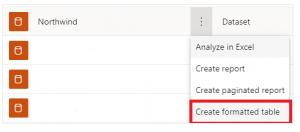
Power BI Blog: Data Hub
7 July 2022

Power BI Blog: Power BI Metrics
30 June 2022
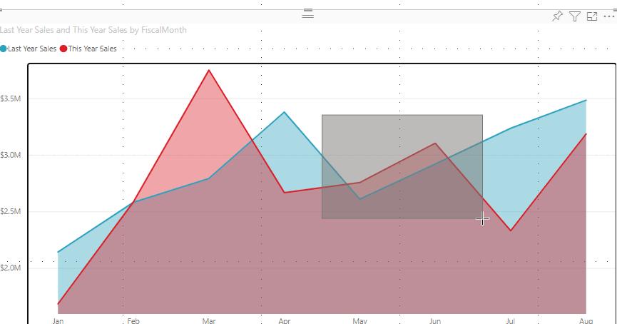
Power BI Blog: Data Point Rectangle Select
16 June 2022
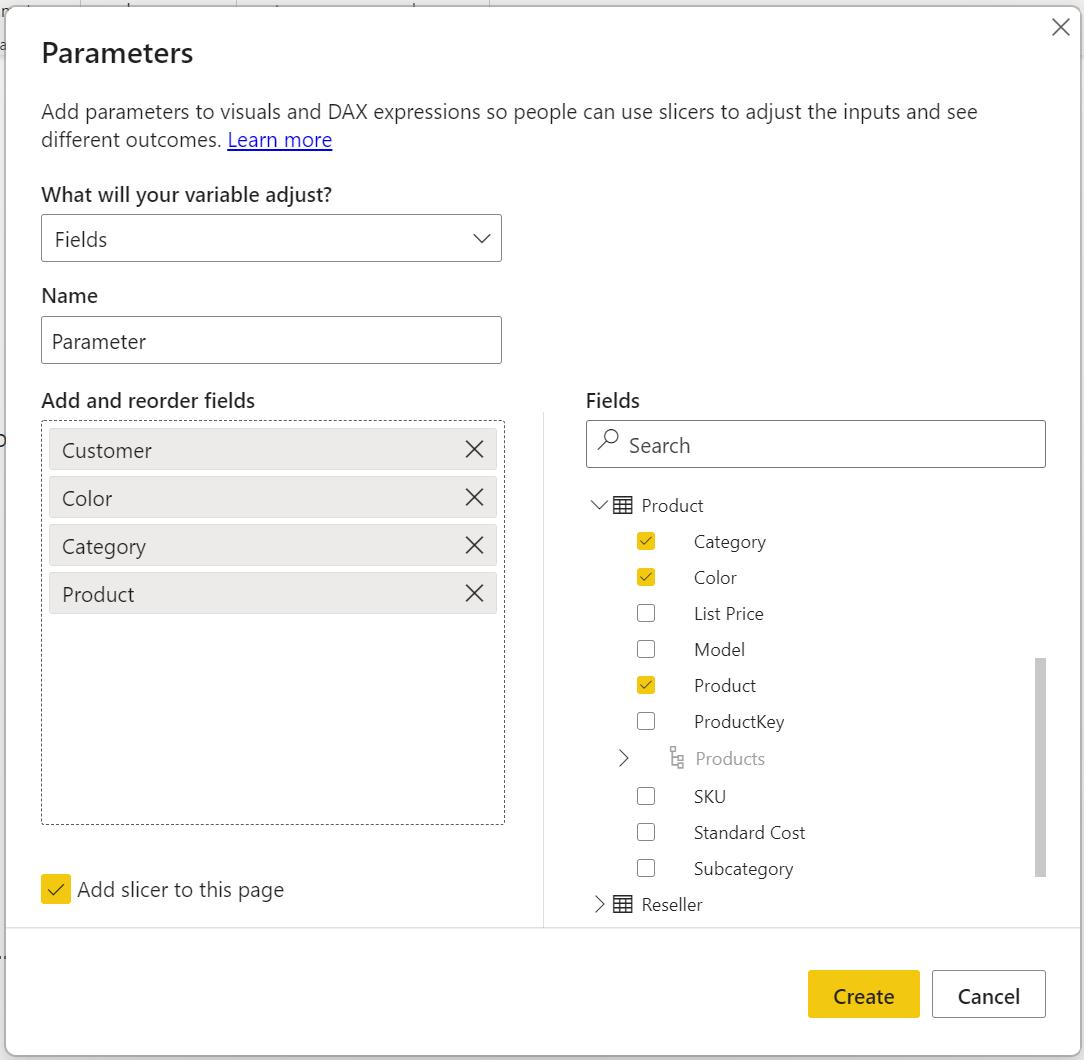
Power BI Blog: Field Parameters
9 June 2022