
Charts and Dashboards: Introducing the Camera Tool for Dashboards
9 April 2020
Welcome back to this week’s Charts and Dashboards blog series. This week, we will introduce a handy tool when creating dashboards – Excel’s Camera tool.
The Camera tool allows us to take a dynamic picture of a cell or range of cells e.g. data, table or graph. What we mean by ‘dynamic’ here is that the snapshot is pasted as a linked picture, so that when the source range of cells changes in value or formatting the copied image will also be updated automatically. These dynamic images may also be copied and pasted into Word and PowerPoint documents too.
To get the Camera tool, in the Quick Access Toolbar drop-down list, choose ‘More Commands…’.
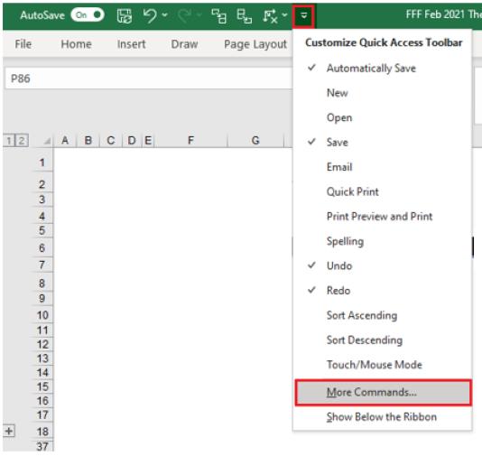
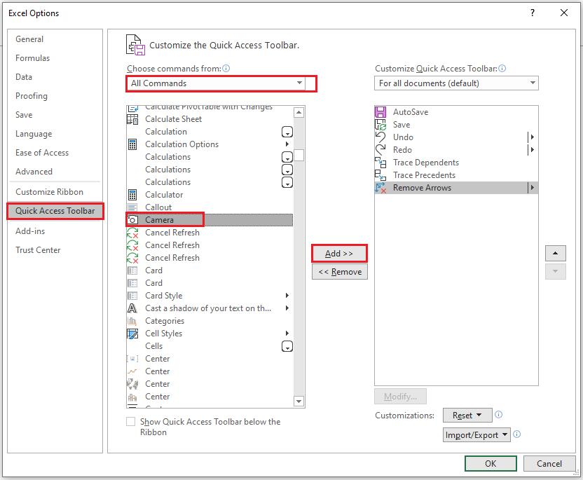
An ‘Excel Options’ dialog will appear. Under the ‘All Commands’ list, for easiest access, add Camera to the Quick Access Toolbar and click OK.
When we are creating a dashboard in Excel, sometimes we have the difficulty of fitting different charts and tables together. The Camera tool comes in handy here as we can easily get a snapshot of the chart or the data table and place it on the dashboard in the interim.
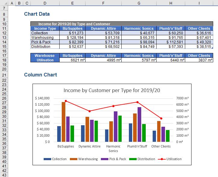
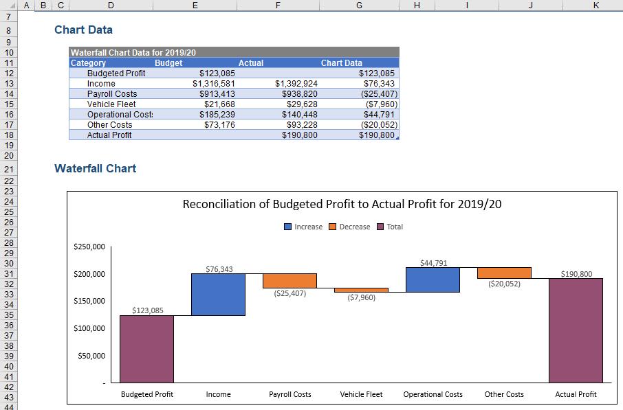
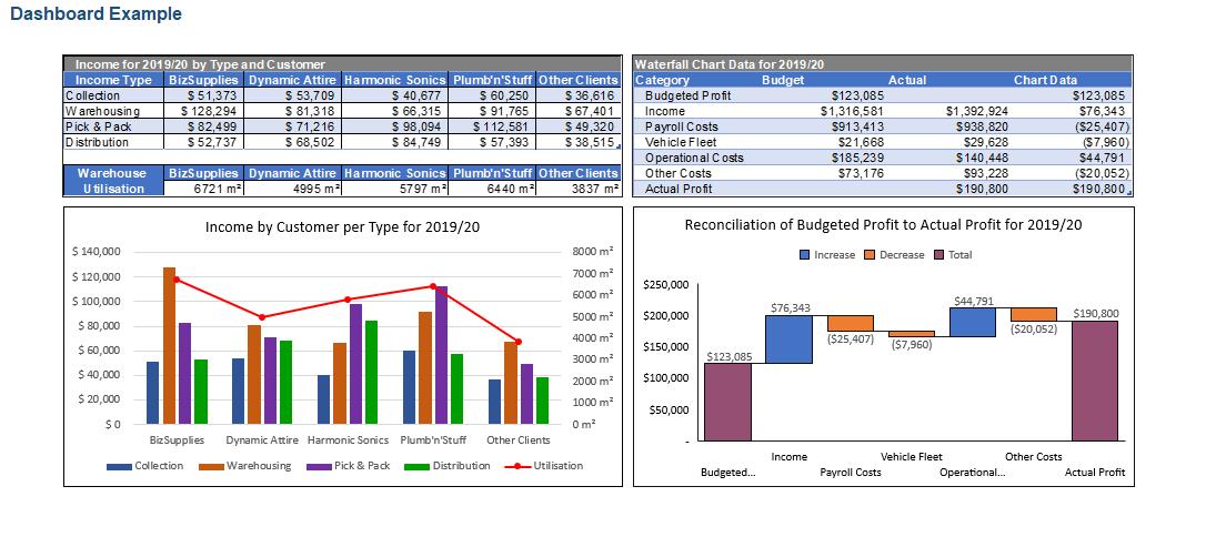
For example, here, there are two sets of data tables and charts on separate sheets that we want to bring together into one single dashboard:
There may be some reason not to recreate the tables on the dashboard (e.g. you may not want end users to change the data, but you still wish them to view it). Therefore, in this case, we can use the Camera tool to take the snapshots of the data tables and charts to paste and rearrange them on the dashboard. This way, when the data in the source tables change, the dashboard is automatically updated.
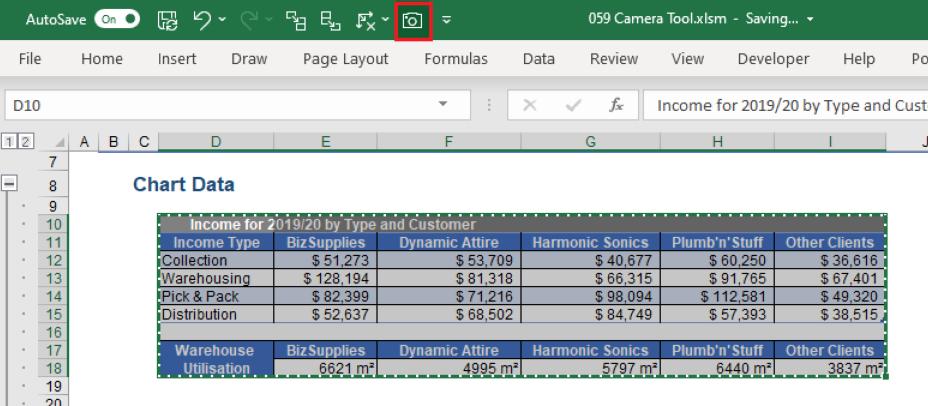
To take a snapshot of the data table using the Camera tool, select the range D10:I18 and click on the Camera icon on the Quick Access Toolbar:
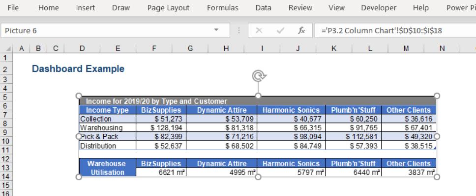
then go to the sheet where we are setting up the dashboard and click somewhere on the sheet to get the image. We may notice from the Formula bar that this is a linked image to a range of cells.
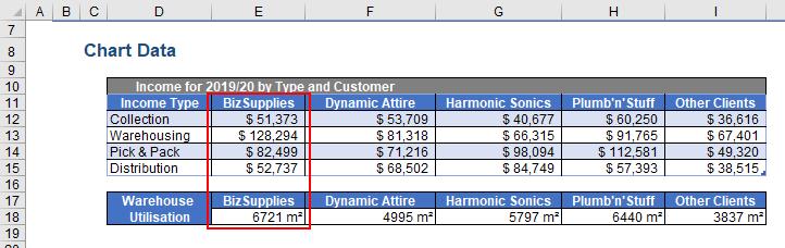
Notice that if the data in the source chart data changes,
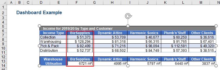
the details in the image also change because it is linked together:
Next, we will repeat the process to get the other three data table and chart items into the dashboard page. Alternatively, for the charts, we can just copy and paste them to the dashboard. We will have an initial dashboard like the one below.
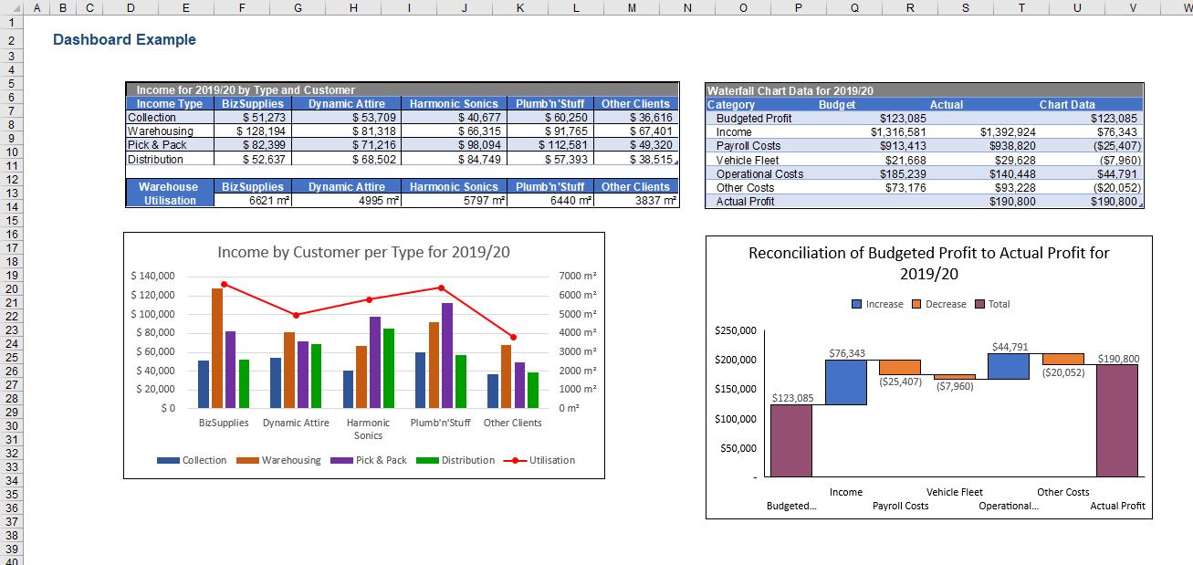
We will follow the best practices for the dashboard layout to get the complete dashboard by resizing and aligning the tables and charts. You can read more about designing a good-looking dashboard in our past blogs about Dashboard Workbook Layout – Part 1, Part 2 and Part 3.
That’s it for this week. Check back next week for more Charts and Dashboards tips.