
Charts and Dashboards: Dashboard Workbook Layout – Part 2
11 September 2020
Welcome back to this week’s Charts and Dashboards blog series. This week, we will talk about the dashboard design.
The key to a good dashboard / report is creating one that is tailored to the end users, so that it fulfils all their needs. For example, there is no point for a sales team to be bombarded with other information that they go not need to do their job, such as:
- depreciation analysis
- debt / equity ratios
- budget variances in costs
- segmental margins analysis,
if it isn’t relevant.
The same point goes for all other staff, so that they have more time to focus on doing their job, be it to order more stock or provide analytical reports. That’s not to say this data is not essential to management, but a key idea in developing your narrative is determining your audience.
- Granularity: how detailed the data has to be for them to do their job
- Level of information required: what sort of information do they need to accomplish their goal? (high level overview or more detailed?)
- Timescale: how much data do they need to achieve their task
- Leading and lagging metrics: are historical metrics sufficient or are projections required as well?
- Decision making required: which decisions they must make after looking at the data.
For instance, sales teams and lower management probably need to see day to day inventory stock and day to day customer traffic amounts, e.g.
- Granularity: high granularity of data
- Level of information: very low
- Timescale: short
- Leading and lagging metrics: historical data and short-term projections
- Decision making required: stock ordering, economic order quantities.
Meanwhile, manager level staff will probably need to see monthly, or even quarterly, sales and inventory stock amounts for their reports:
- Granularity: medium
- Level of information: overview of sales performance
- Timescale: medium
- Leading and lagging metrics: this is more likely to be summary (lagging) data, concentrating on historical results
- Decision making required: resource management and reporting issues to higher management.
Senior level management will want to see quarterly, or even yearly data:
- Granularity: low
- Level of information: overview of key metrics
- Timescale: long
- Leading and lagging metrics: historical summary with possibly a high-level projection
- Decision making required: supply chain solutions, staff performance management, reporting to top level management, restructure of branches, project approval, areas of improvement.
Top level management will want to see annual data and forecasts:
- Granularity: very low
- Level of information: high overview of key metrics
- Timescale: very long
- Leading and lagging metrics: historical summary, with possibly a high-level projection
- Decision making required: company direction, areas to grow the company, areas for company to pull out from, company investments.
Other dashboard design considerations include which types of charts and how to use colour to our advantage. You can also have a review at how to create memorable charts here.
Now, we will consider an example of a bad and a good dashboard.
For example, a manager is requesting to see metrics of their income. They also want to see some insights of the sales breakdown and performance in a financial year.
Bad Dashboard
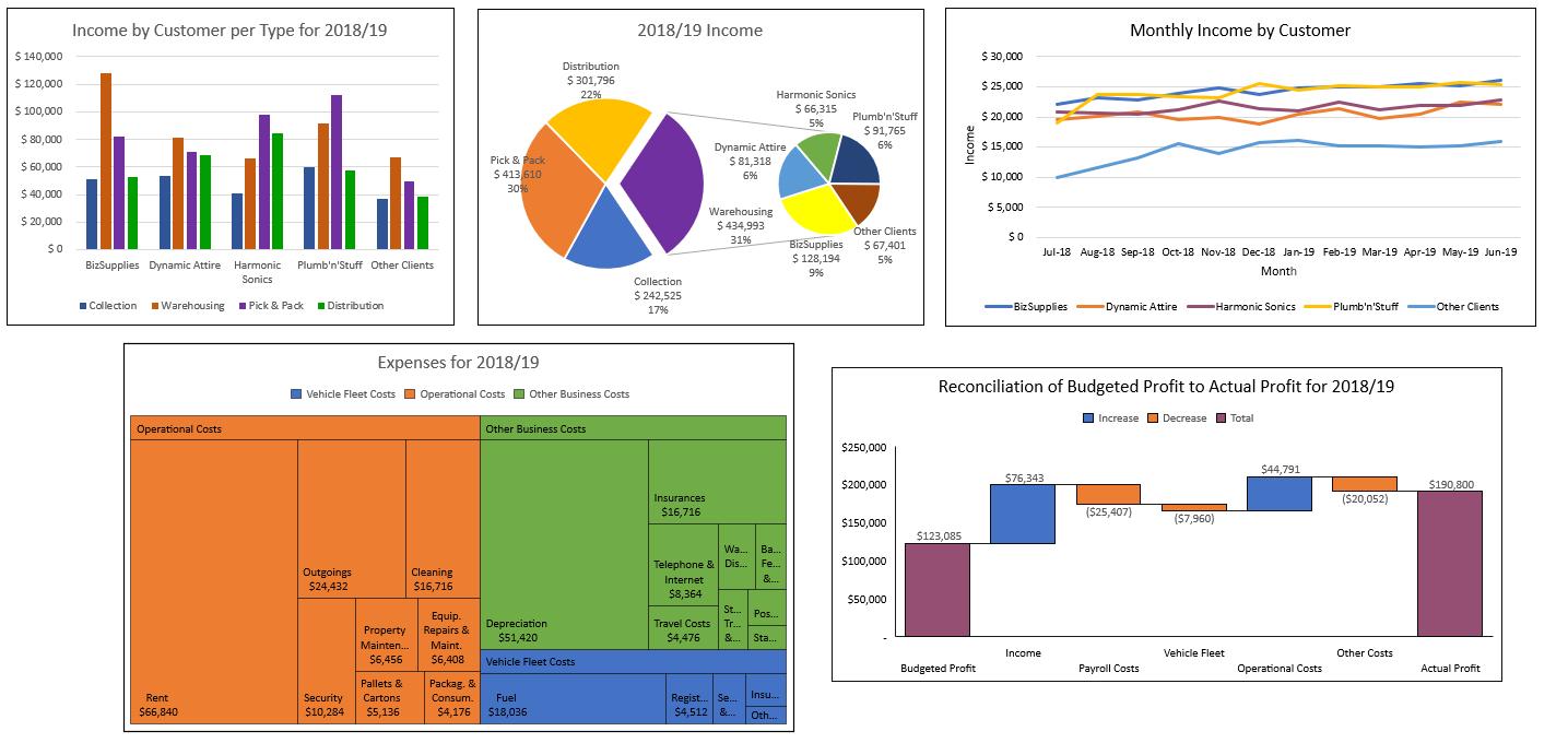
Look at the above dashboard. It has many colours, but it is not eye-catching:
- the charts are not organised
- the charts are not relevant to the end users
- the charts contain too much information, more than 7 + 2
- the information provided on the charts does not really help the end users
- the dashboard has arguably a terrible use of colour
- axes make results and comparisons difficult
- good point: the dashboard does actually depict seasonal trends.
Better Dashboard
Compared to the example bad dashboard, the below dashboard is enhanced:
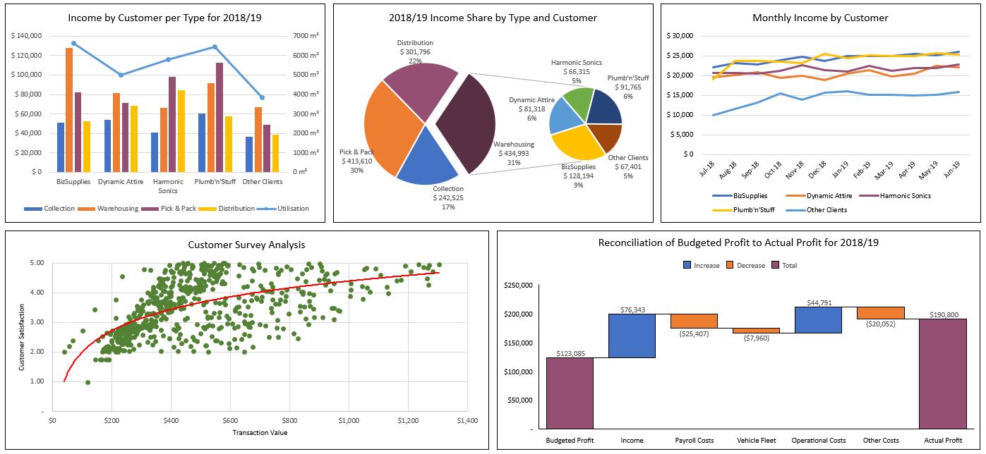
Key things to note from this dashboard:
- a harmonious colour scheme is used
- key metrics pop out to the user: All important information can be found in five seconds
- the charts are organised
- the appropriate charts have been selected to display the respective data
- the dashboard displays seasonal trends.
That’s it for this week, check back next week for more Charts and Dashboards tips.