
Charts and Dashboards: Chart Design Best Practice – Part 3: Memorable Charts
6 December 2019
Welcome back to Charts and Dashboards blog series. This week, we are going to look at some design concepts to adopt to create memorable charts.
The right chart type, chart compositions and colour effects help convey the message that we wish to the audience. Besides these considerations, to make the charts more impressive, here are some design concepts that you can utilise when creating charts.
Consistency: Charts that are consistent in design, easy to read, and eye-catching will be remembered.
Embellishments: Embellishments should be included to help communicate our point across. However, we should not add too many as it would begin to clutter the chart and make it counter intuitive. Here is where you should be creative!
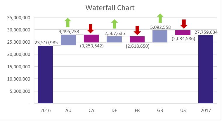
You could consider a chart like the one below:
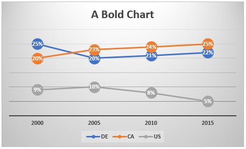
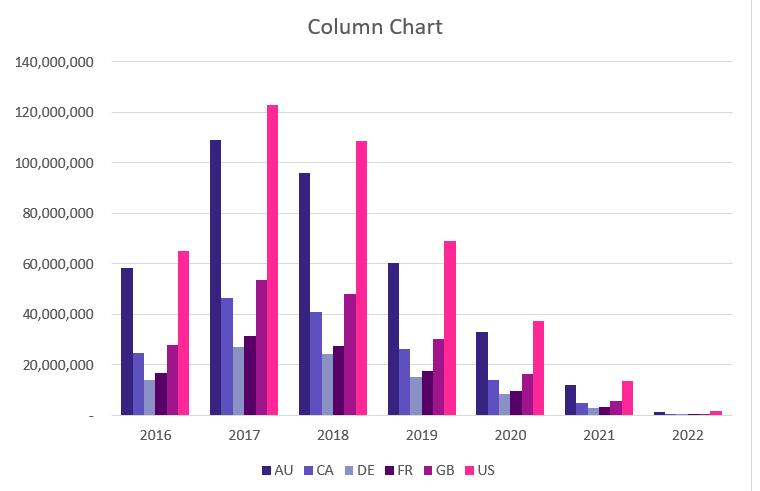
Making everything bold in a chart is bad practice and tends to be a bit of an eyesore, detracting from the message you are trying to communicate. That’s not my opinion – many psychologists concur on this point.
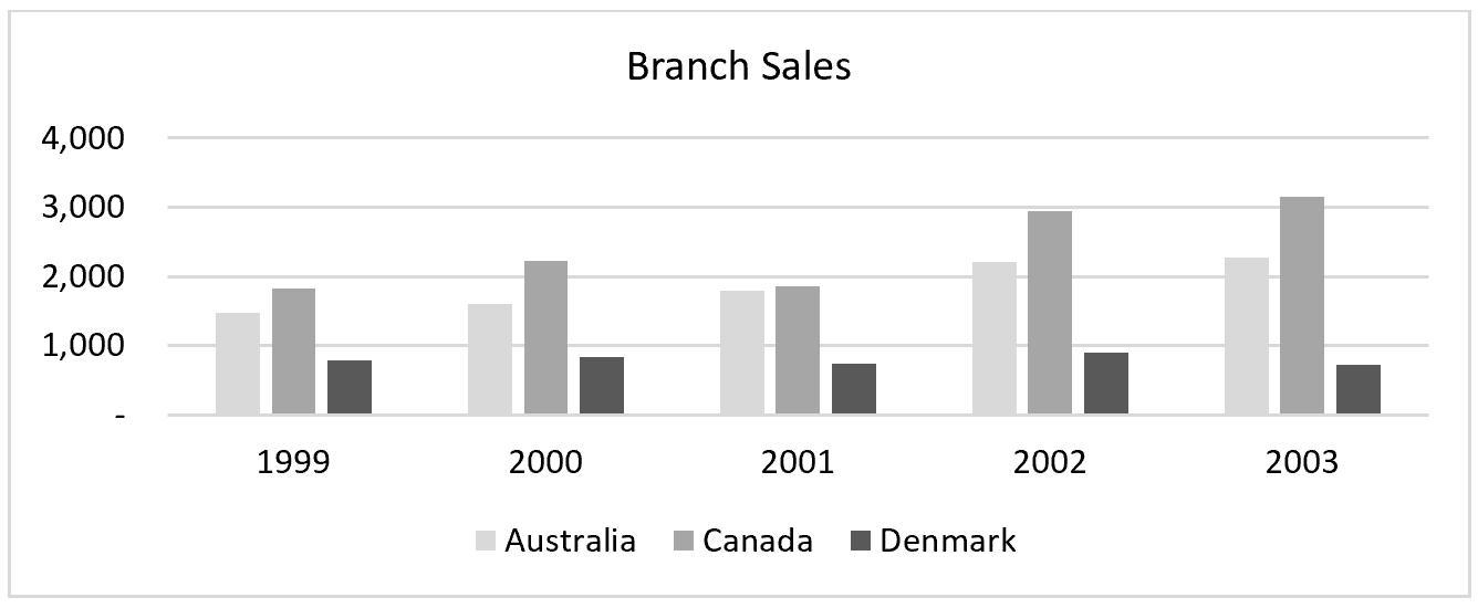
Colours for a reason: You can add more colour within reason. You can review the blog post about chart colour considerations here. Take this greyed out chart for instance, which is not very impressionable…
…and compare it with this one. Which one would you remember better?
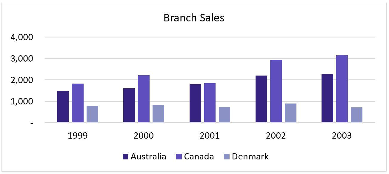
You should make good use of colour, but remember the RGB (red, green and blue) requirements section. You should not use just any combination of colour, but a good mix of colours to highlight the point across.
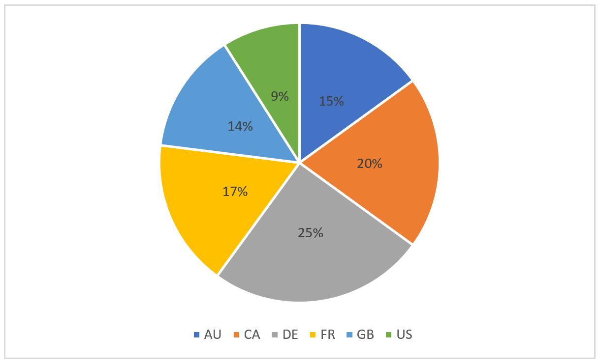
Legend or Labelling: It saves a lot of audience effort to grasp an idea from a chart when legend or label are used appropriately. Consider the chart like the one below, with various colour legend and no data labelling. It is time consuming to compare and check the relevant data points:

When I add data labelling, it is a bit easier, but it still needs improving:
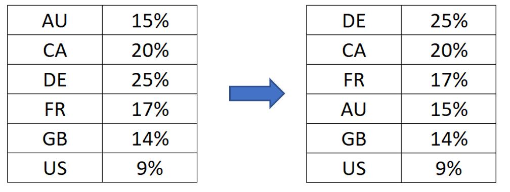
First, I do a little data cleaning by sorting data from largest to smallest, so that my data in the pie chart will be sorted clockwise accordingly:
Then I add the legend description to its relevant pie, leaving my chart is now much easier to be comprehended in just a glance!
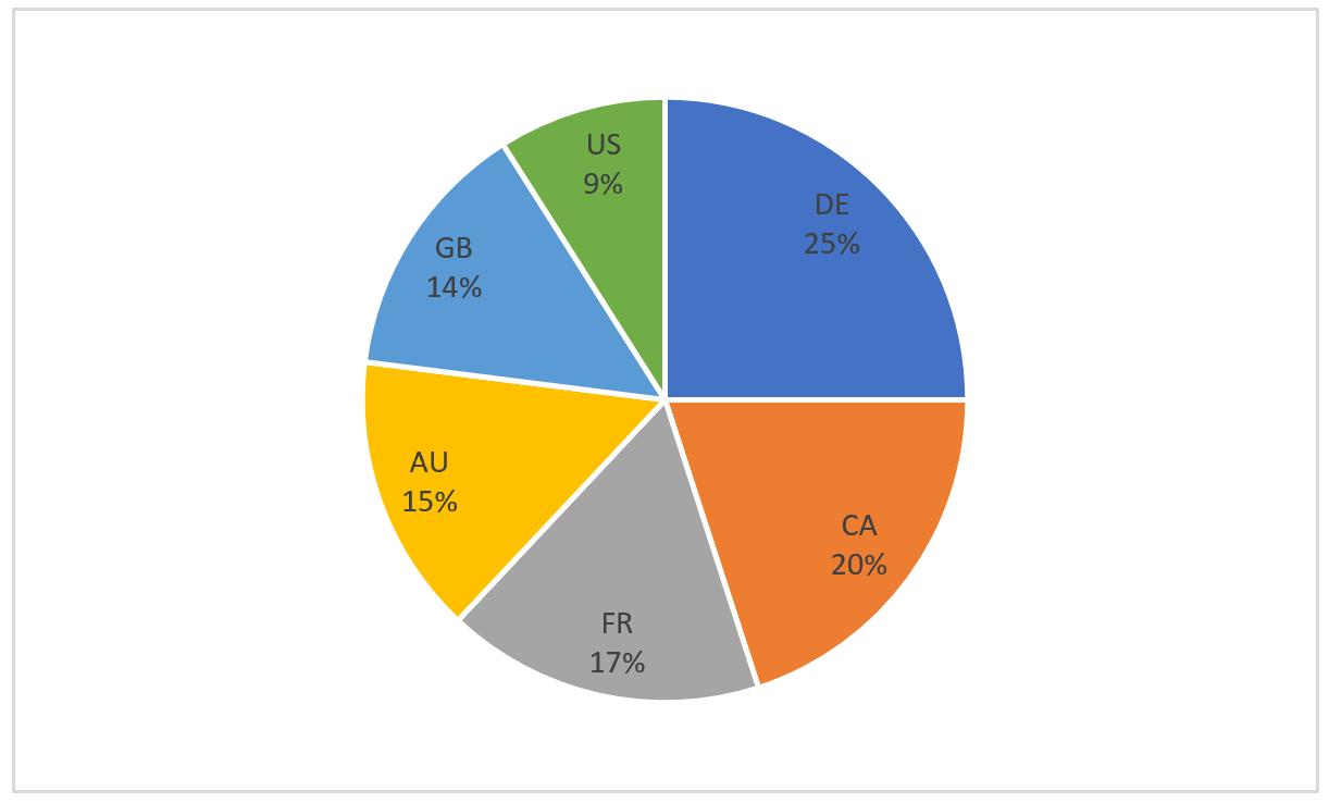
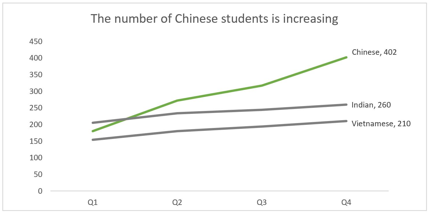
Chart Title: You often see chart titles such as “Sales in 2010 – 2015”, “Domestic / International Students” which describe what is the data being plotted. To go a further step, you can include a summary of the data right in the chart title to brings the first impression that lasts.
In short, your chart should be unique. Following the previous tips will allow us to generate a unique, communicable and informative charts, that will be very memorable. Check out here how to create this last chart.
That’s it for this week, check back next week for more Charts and Dashboards tips.