
Spreadsheet Skills: Dynamic Chart Labels
You might be a Legend with your charts, but can you move the label in mysterious ways? By Liam Bastick, Managing Director (and Excel MVP) with SumProduct Pty Ltd.
Query
I have created a straightforward line chart in Excel. I want to show both the data values and label the chart so that the label attaches itself to the position of the final data point rather than in a legend somewhere. It doesn’t seem possible. Can you help?
Advice
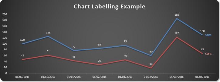
In this example, the aim is to attach the label for the chart series to the series itself, e.g.
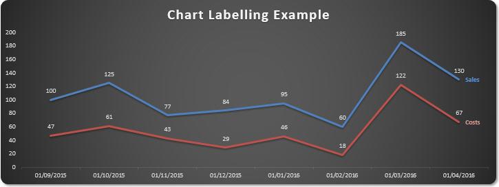
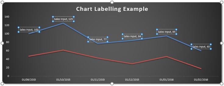
As you can see from the above figure (and replicated in the attached Excel file), the line chart’s label appears on the right hand side next to the final data point in the series. If the values were to change, the label would move too:
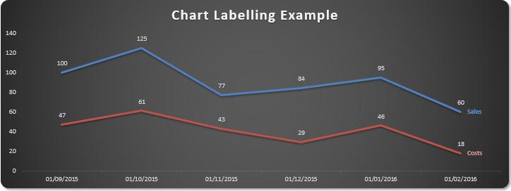
You may note that the final period is earlier and that the values for the final point differ – yet the labels hang on steadfastly.
So how do we do this?
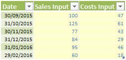
First of all, make sure your chart data is collated in a Table.
Tables have been discussed previously (see Tables for more details); the benefit is that if charts are linked to a Table range and the range is contracted or extended, the dependent chart will update automatically without having to use the ‘Select Data…’ functionality.
Creating a line chart from this Table with Excel 2013, for example, has become trivial. Simply highlight the Table and click on the Quick Analysis tool in the bottom right hand corner (CTRL + Q):
Following the resultant prompts leads to a line chart in all of about two seconds. Right-clicking on one of the data series then allows you to add data labels:
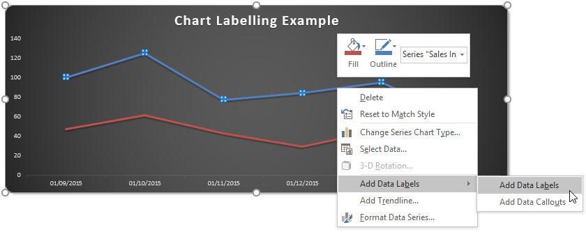
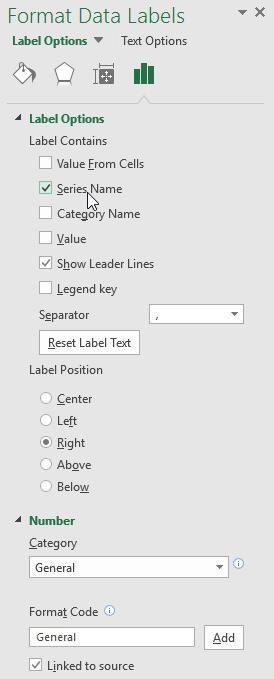
By default, Excel adds the values. Right-clicking on these values and selecting ‘Format Data Labels…’ from the pop-up context menu triggers the ‘Format Data Labels’ task pane and allows you to choose what should be displayed (e.g. value, series name, category name), where it should be displayed (e.g. left of the data point, above it, below it) and how it should be displayed (format to use):
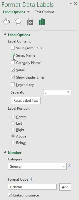
Selecting ‘Series Name’ in ‘Label Options’ almost provides what is required:
The problem here is that we only require the series name against the final data point. If we need this to be flexible, manual adjustment is insufficient: we need to cheat.
‘Cheating’ requires us to add two more columns to the underlying data Table:
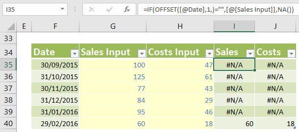
Assuming the first three columns have been labelled Date, Sales Input and Costs Input as in the example illustration above, we add two more columns Sales and Costs (N.B. in a Table, the same column heading may not be used more than once). The formulae in the two columns would be as follows:
=IF(OFFSET([@Date],1,)="",[@[Sales Input]],NA())
and
=IF(OFFSET([@Date],1,)="",[@[Costs Input]],NA())
The @ symbol for Tables in Excel 2010 onwards signifies that the formula is referring to the data point for that field in that row, e.g. the formula highlighted in cell I35 in the image is essentially
=IF(OFFSET(F35,1,)="",G35,NA())
which is effectively
=IF(F36="",G35,NA())
For more information on the OFFSET function, please see Onset of Offset. This is necessary as TABLE formulae do not like calculations linking to other rows.
Tables replaced Lists back in Excel 2007. The original syntax was different and more cumbersome. Therefore, for those still using Excel 2007, the formulae should be:
=IF(OFFSET(Example_Chart_Data[[#This Row],[Date]],1,)="",Example_Chart_Data[[#This Row],[Sales Input]]],NA())
and
=IF(OFFSET(Example_Chart_Data[[#This Row],[Date]],1,)="",Example_Chart_Data[[#This Row],[Costs Input]]],NA())
respectively.
These formulae cause the corresponding Sales and Costs values only to appear in the final row of the table, with #N/A elsewhere. Normally, I would strongly recommend against having prima facie errors in an Excel file, but here they are useful – this is the syntax required for these data points to be ignored by the chart engine.
You are almost done. All that is left is to highlight the revised Table and recreate the line chart from earlier. After selecting the Data Labels for the Sales Input and Costs Input series (just as previously), you simply add Data Labels for the two new “series” Sales and Costs even though they are singleton points:
Et voila! You have created the chart required:
Word to the Wise
Sometimes with charts you just have to think outside of the box. Too often people add macros to charts when they are just not necessary and they can slow calculations down. Using a second ‘shadow’ sequence is a common technique in chart manipulation and it is well worth exploring.
Finally, to reiterate, an example using the above method may be found in this month’s attached Excel file.
If you have a query for the Spreadsheet Skills section, please feel free to drop Liam a line at liam.bastick@sumproduct.com