
Charts and Dashboards: Chart Design Best Practice – Part 2: Colours and Compositions
22 November 2019
Welcome back to Charts and Dashboards blog series. This week, we are going to look at colour and the variable aspects of a chart.
First, let’s talk about colours. According to the ‘Theory of Colour’ (Thomas Sanocki, Noah Sulman, Color Relations Increase the Capacity of Visual Short-Term Memory), when considering colours, contrasting and complementary colours should be taken into account.
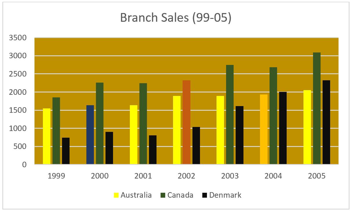
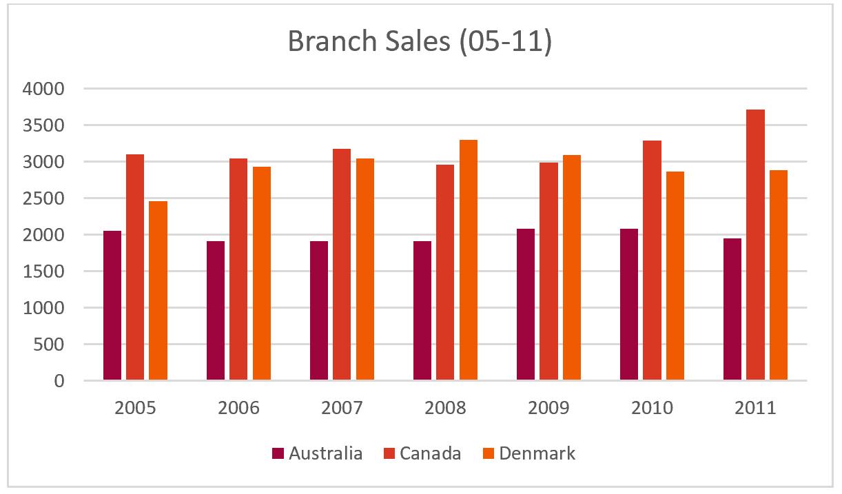
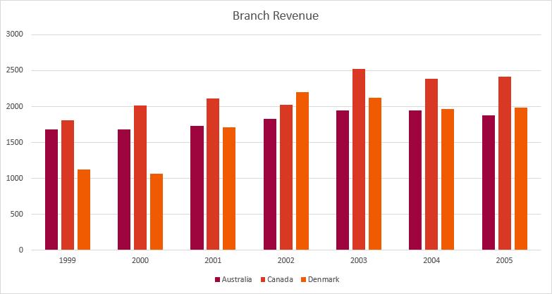
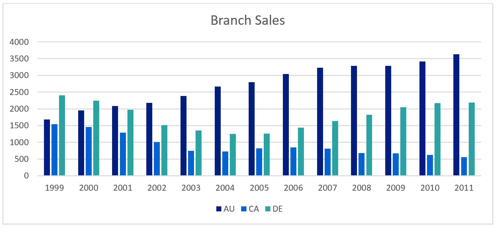
Contrasting of surrounding colours impacts how well we are able to focus our attention to the content. Take this chart for instance: does anything immediately stand out to you?
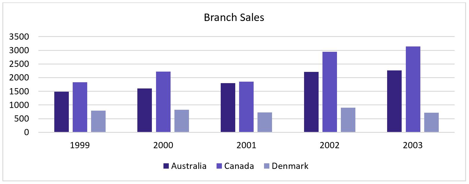
Nothing really stands out to you, because all of the colours come from the same colour palette.
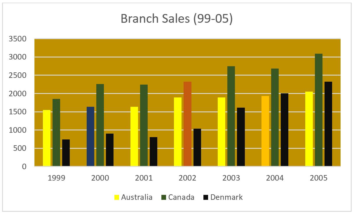
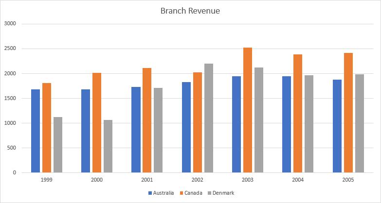
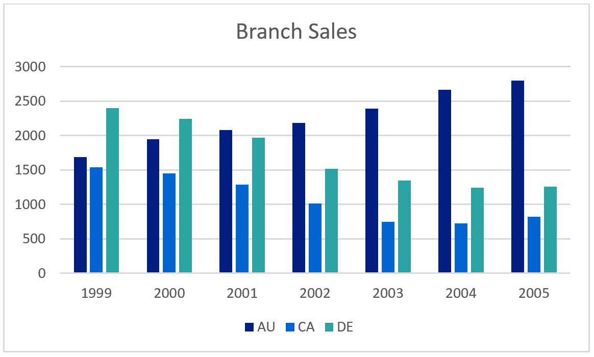
Here is the same chart, but with one column series adjusted to have high contrast:
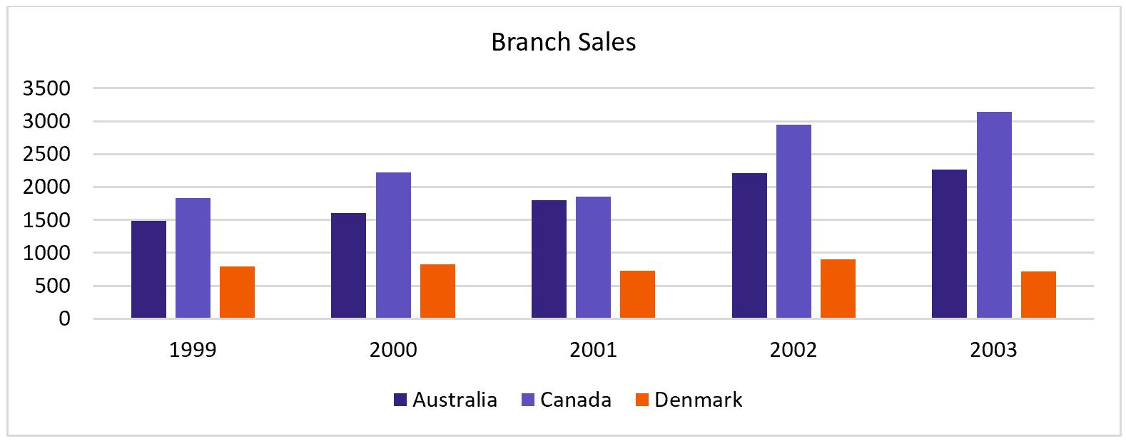
See how you are immediately drawn to the columns that represent the sales in the Denmark branch? You can use this trick to emphasise points in your charts that are important: e.g. losses or large changes.
Studies have shown that colours that are similar are ‘harmonious’ and ‘pleasant’ while contrasting colours are more associated with chaos or ‘boldness’. Memory performance is higher overall for similar colour palettes (two-colour palettes) than for dissimilar-colour palettes (four or more colour palettes).
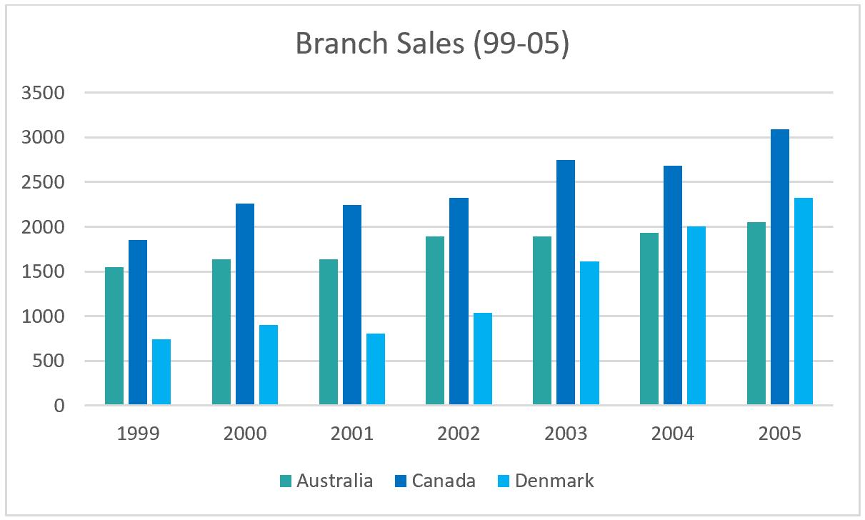
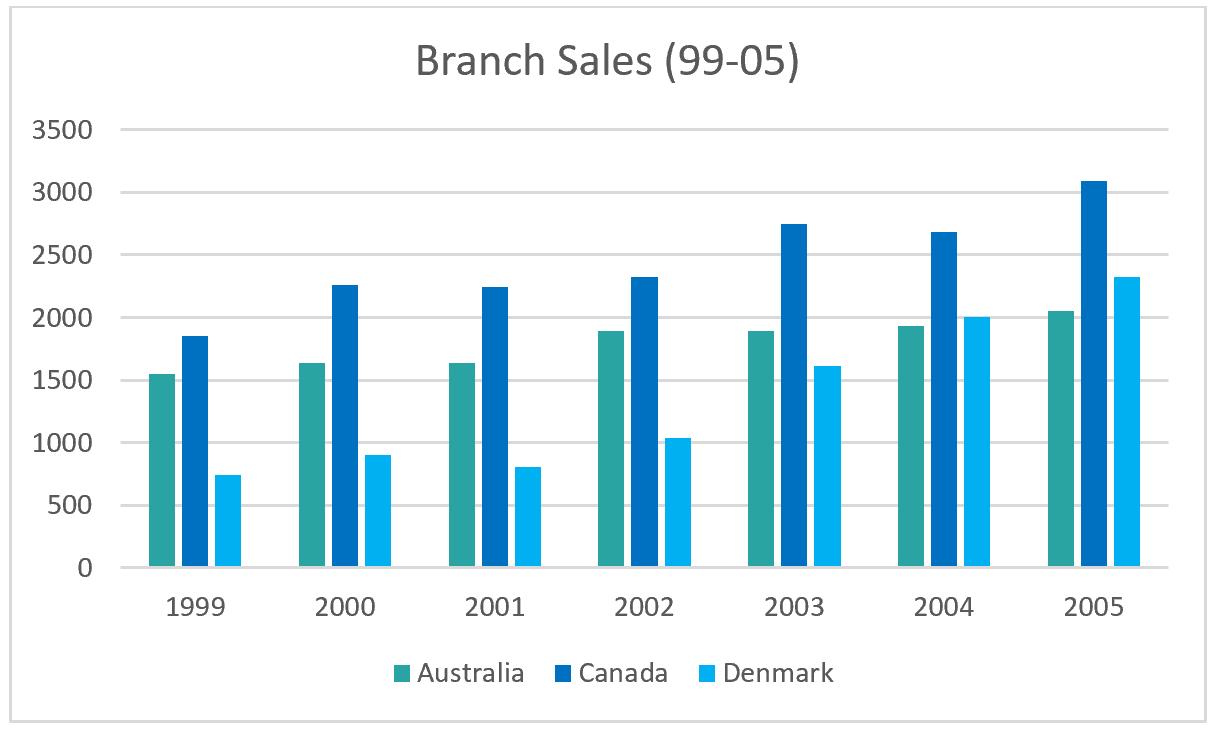
Here are two examples of harmonious charts:
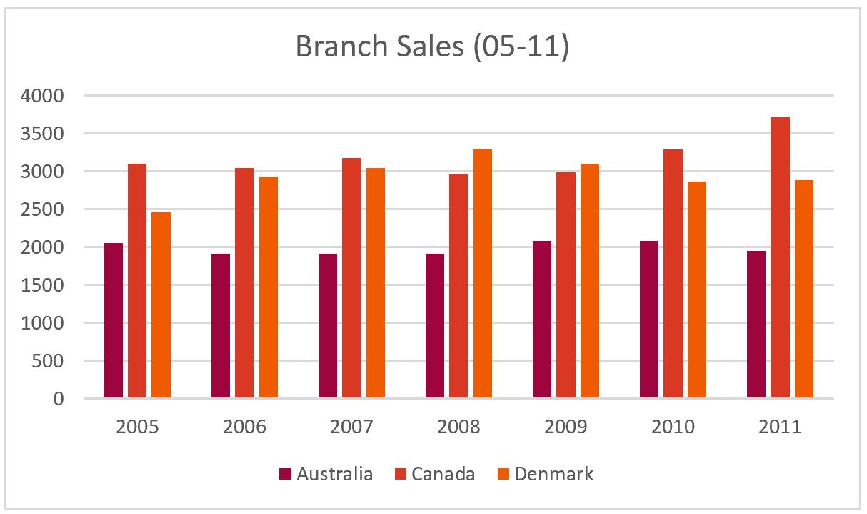
Similarly, here are two disharmonious charts:
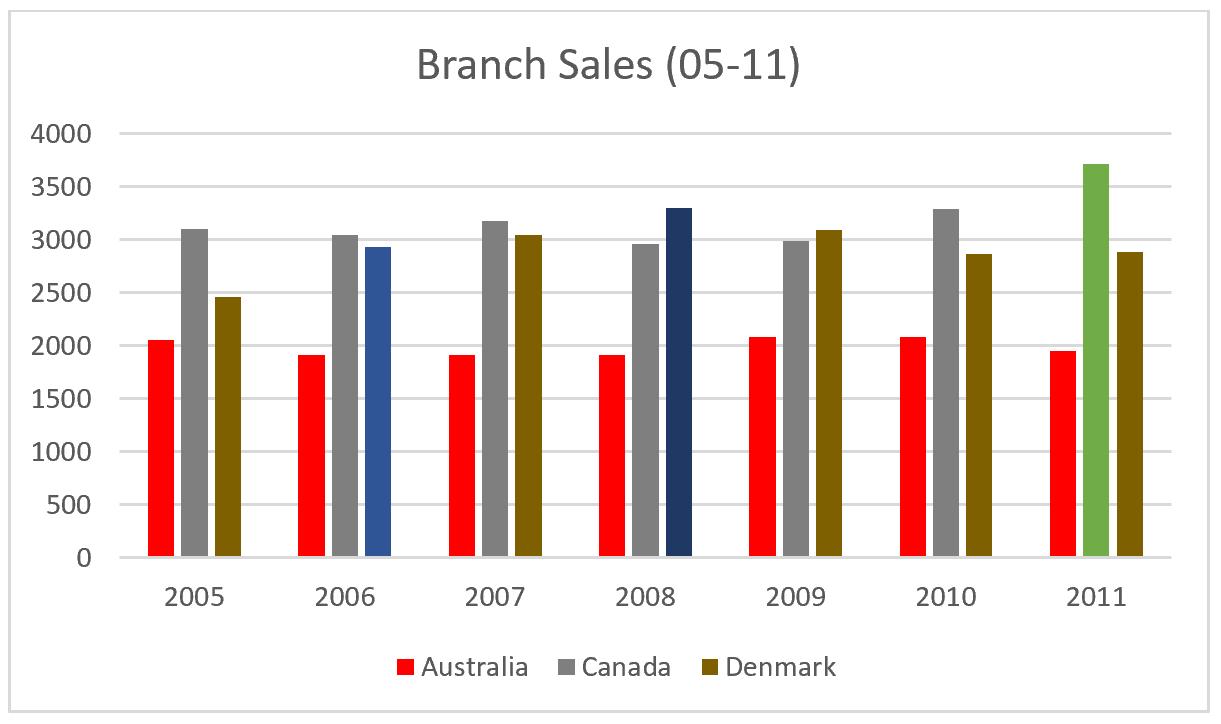
Which ones are more impressionable?
Having stated the above, do remember to reduce colours on complex content. In other words, you shouldn’t do this:
Instead, you should do this:
Note the high contrast between visual focus points and background.

It’s recommended that you use harmonious colour palettes.
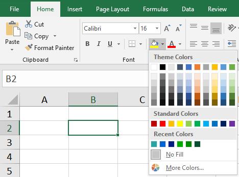
To be practical, here is how you can use it to your advantage. To set up a cell colour in Excel:
- Select a cell
- Navigate to the ‘Home’ tab and select the ‘Fill Color’ option
- Then select the ‘More Colors…’ option from the drop-down menu
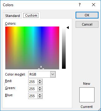
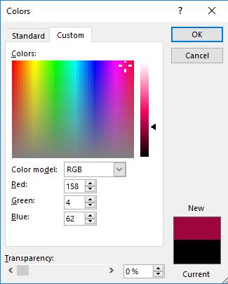
- Then select the ‘Custom’ tab in the ‘Colors’ dialog box. Here we can enter the RGB numbers for the desired colour that you wish
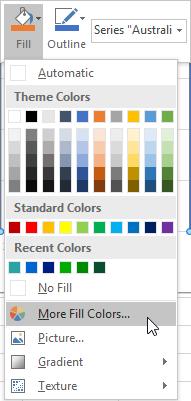
The process is similar for charts:
- Right click on the chart element you want to change
- Select the ‘Fill’ option
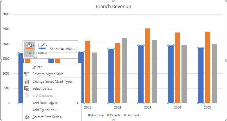
- Select ‘More Fill Colors…’
- Click on the ‘Custom’ tab then enter the RGB values
Next, we should consider the number of variables in a chart. Humans can only store around five to nine items of information in our short-term memory (from The Magical Number Seven, Plus or Minus Two: Some Limits on Our Capacity for Processing Information by George A. Miller). In short, this is known as Miller’s Law.
In order for us to process information we should take full advantage of this statistic and try to limit the maximum number of variables in charts to around 7 +/- 2.
Consider reviewing this chart for five seconds:
Then, view this one for the same duration:
Which one were you able to process better?
In short, charts make it easier and straightforward to present and understand data, as long as they are kept effectively. An appropriate number of data aspects, e.g. how many series or how many variables should be displayed in the charts, should be continuously considered when creating ones.
That’s it for this week, check back next week for more Charts and Dashboards tips.