
Charts and Dashboards: Chart Design Best Practice – Part 1: Which Chart When?
15 November 2019
Welcome back to our Charts and Dashboards blog series. Before moving on to working with charts, over the next three weeks, we will look at the best practice to create an effective chart. This week, we are going to have an overview of multiple chart types and which one to use when.
Charts help present data in an effective way so that people can understand complicated data, identify patterns and the stories behind the numbers. However, we need to select the right chart type that is appropriate to the nature of data and the message we wish to convey. The following are questions that you should consider when determining which chart to use:
- Are we comparing values?
- Are we illustrating the composition of something?
- Do we want to understand the distribution of data?
- Does the end user wish to analyse trends in the data set?
- Do we want to better understand the relationship between value sets?
Let’s have an overview of different chart types and when to use them.
Column Charts are used to compare one or several data series over time:

Bar Graphs are essentially a horizontal column chart. They should be used to avoid clutter when there are numerous series to compare, or when data labels are too long:

Line Charts reveal progress or trends over time. They may be used to illustrate several different categories of data series. These charts should be used when we have data series with a continuous data set with no gaps, or when we have many data points (typically, users struggle to make sense of more than seven elements).

Combined Charts allow us to plot data using two y-axes, with a shared x-axis. These charts should be used to illustrate a correlation, or the lack thereof, between data sets. Depending upon the scale, the combined chart allows easy comparison between two series of data.

The ability to assign one series of data to another secondary axis is beneficial, especially if both series shared the same axis, the chart will be skewed. It’s recommended that two different data types are used for the y-axes (e.g. absolute values and percentages), as makes it easier for end users to understand the chart.

Area Charts are useful for showing part-to-whole relationships. They highlight individual and overall performance of data series. Care should be taken that amounts are not double-counted.

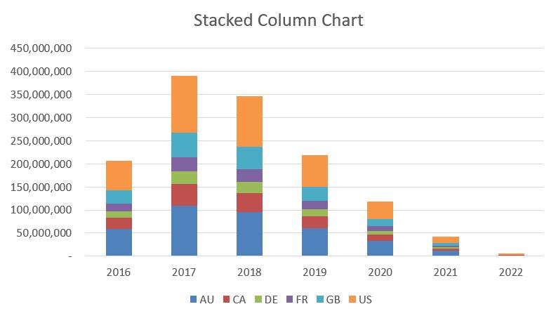
Stacked Bar / Column Charts should be used when needing to compare several different data series and the composition of each series being compared. They are a more precise version of area charts.

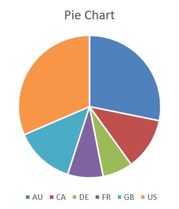
Pie Charts show the proportion of data that make up the whole. They are limited to a single timeframe and therefore, impossible to determine growth and / or trends. With this chart, you need to make sure that all elements add up to 100%.
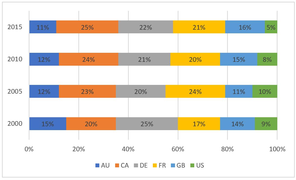
Note that Pie Charts are not the only solution for proportional data, whose total is 100%. You can also consider 100% Stacked Bar / Column Charts, a variation of Stacked Bar / Column Chart. It is especially useful to compare how the percentage that each value contributes changes over time, and when the category text is too long.
Scatter Plot Charts show the relationship between two or more different data series. They can reveal trends within the data or between data series. Scatter plots are also valuable in identifying outliers and the distribution of data and can be used as a proxy to grid charts in Excel where no such chart exists. Care is needed as dates are treated as text.

Interestingly, these types of charts are probably not best to use when one or both scales represents dates. Scatter Plots will make each data point equidistant, regardless of whether the time periods are of equal length.
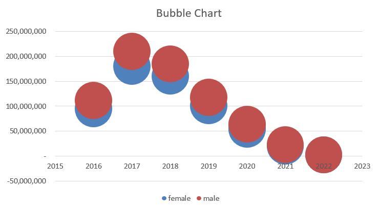
Bubble Charts show the distribution or relationship between two or more data series. The size of the bubble indicates the value or volume in that data point.
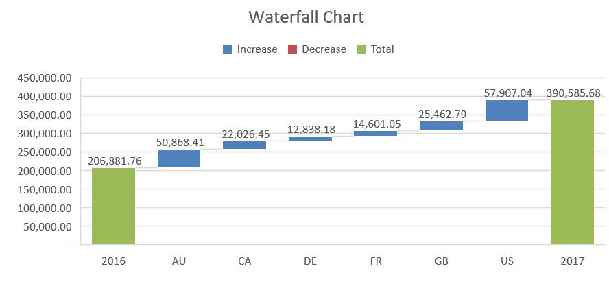
Waterfall Charts show how an initial value is positively or negatively affected by intermediate values. They can be used to illustrate the composition of a number. For instance, the waterfall chart below shows how each country contributes to the total value:
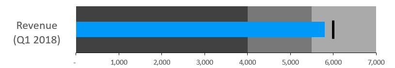
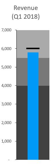
Bullet Charts are a great way to illustrate the progress toward a target.
Doughnut Charts are like pie charts, but they allow for trends if embedded.

There are a lot to choose from, aren’t there? In short, when deciding which chart to use when, you should consider the following questions:
- Are we comparing values? - These chart types are perfect for comparing multiple value sets, as they can easily show the high and low values within the data sets:
- Column
- Bar
- Line
- Scatter Plot
- Bullet
- Are we illustrating the composition of something? - These types of charts excel at illustrating how individual parts make up part of the whole figure. This list of charts should be considered when we want to illustrate the composition of something:
- Pie / doughnut
- Stacked bar
- Stacked column
- Area
- Waterfall
- Map
- Do we want to understand the distribution of data? - Charts that show distribution well are charts that allow you to easily spot outliers, the distribution of your data, and the range of information in the data series. These charts illustrate distributions relatively well:
- Scatter plot
- Line
- Column
- Bar
- Does the end user wish to analyse trends in the data set? - These charts make it very easy to analyse data series within a specific time period.
- Line
- Combined charts (e.g. clustered column + line chart)
- Column
- Do we want to better understand the relationship between value sets? - Relationships are best illustrated with these charts, as they are good at showing if there is a positive, negative or no relationship between two or more data series:
- Scatter plots
- Bubble
- Line.
That’s it for this week, check back next week for more Charts and Dashboards tips.