
Charts and Dashboards: Dashboard Workbook Layout – Part 1
4 September 2020
Welcome back to this week’s Charts and Dashboards blog series. Over the next few weeks, we will talk about how to layout a dashboard. This week, we will consider the workbook layout in general.
Let's start with a couple of definitions:
- a Dashboard is a collection of all the relevant charts from the source data, that is up-to-date and well maintained throughout all reporting periods
- a Reporting Dashboard is a collection of charts that highlight potential issues, or issues that may occur in the future, that have to be highlighted to senior management. Therefore, this is highlighted to allow senior management to address these issues, rather than being bogged down with all of the charts contained in the Dashboard.
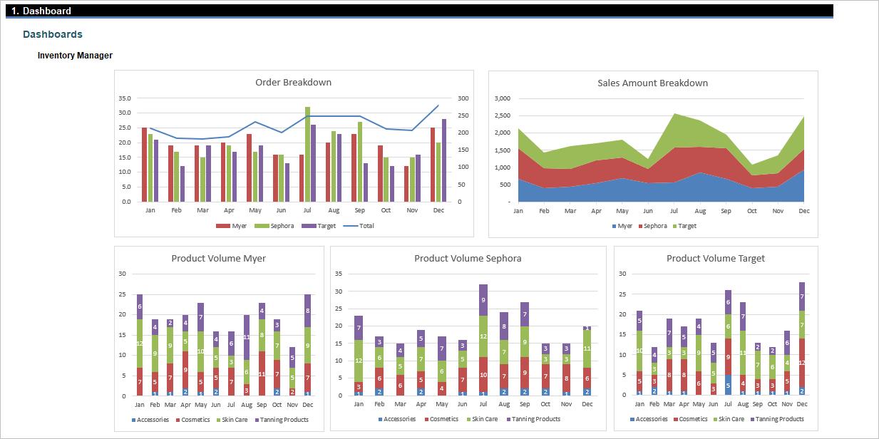
The first thing to consider when designing a dashboard is how many charts or tables should you bring in and how to organise them. Each dashboard should contain no more than five to nine visualisations to avoid visual clutter. Cognitive psychology tells us that the human brain can only comprehend around 7 +/- 2 images at one time (i.e. between five and nine images), and this should be the number of items you wish to show / highlight in your dashboard.
When designing a dashboard, it’s important to follow some kind of organising principles:
- display the most significant insights on the top part of the dashboard
- trends in the middle
- granular details in the bottom.
You can also avoid visual clutter by using filters and hierarchies, or simply by separating the dashboard into two or more clearer dashboards.
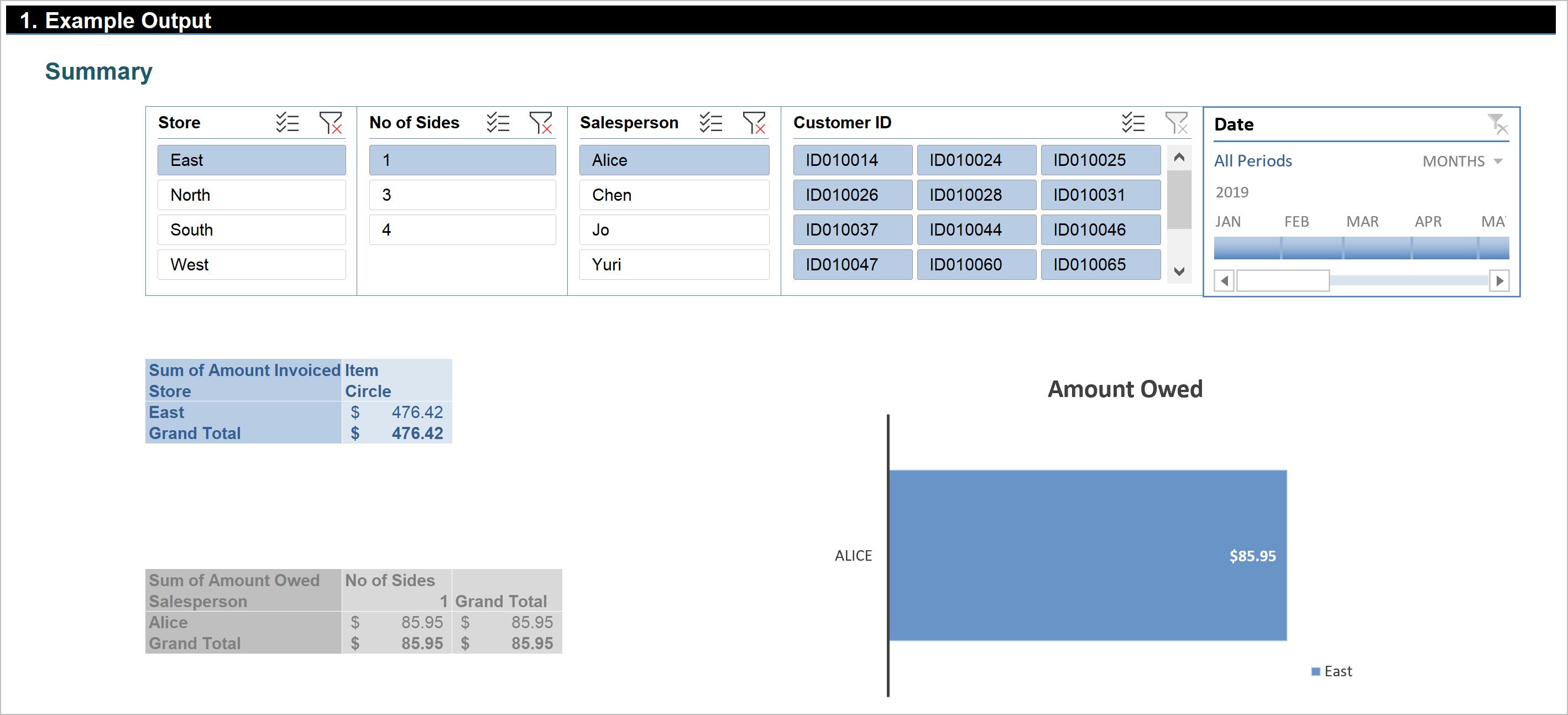
If PivotTables and Slicers are used in a dashboard, it is “>Best Practice” to have the dashboard laid out as below, where all the slicers should be arranged at the top and their linked charts or tables underneath:
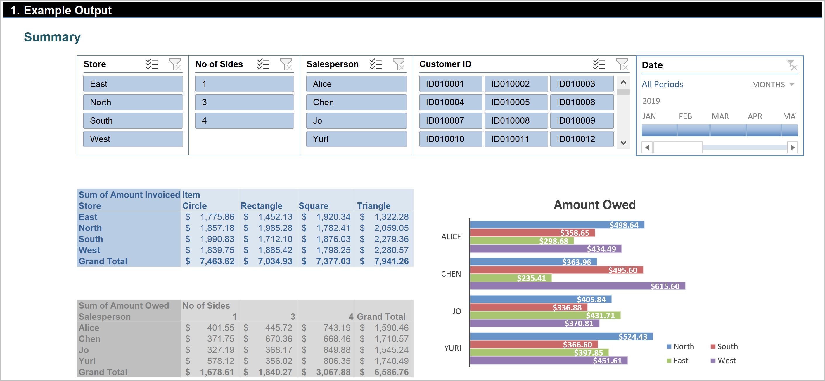
The reason why Slicers should be on the top is that the size and presentation of their linked charts change accordingly with the filters applied, hence the dashboard may look messy or have too much white space if the rescaled charts are placed at the top:
Although we might be tempted to display complex charts in this manner, it is recommended that we start simply and use only as much filtering, grouping and other summarising options as we need. The more options we add, the more unpredictable the results can be, and sometimes, we’ll end up with a result we didn’t anticipate. If we need more, we can consider more charts. Each chart, table or slicer should have a specific purpose, not several. That’s the essence of a clear dashboard.
That’s it for this week, check back next week for more Charts and Dashboards tips.