
Charts and Dashboards: Dynamic Legend
16 April 2021
Welcome back to this week’s Charts and Dashboards blog series. This week, we will talk about how to create a dynamic legend.
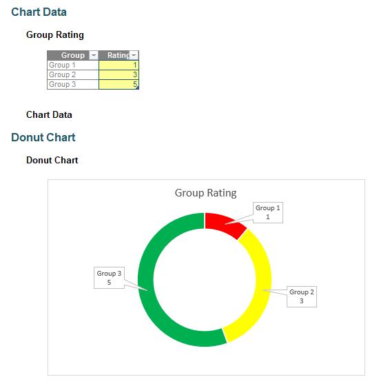
Three weeks ago, we started a small series about building a conditional donut chart where the colour of chart series representing the group’s rating changes depending on their rating. You can read this series from Part 1, where we prepared the data to build the initial chart, Part 2, where we got the colour coding working, and Part 3, where we created a “conditional donut chart”. Here, we complete the chart with the data labels.
The data labels do not look nice at all times. For example, when we change the group rating, they look as follows:
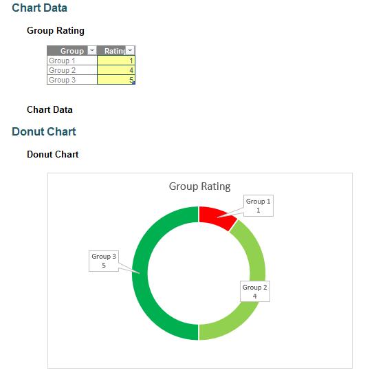
Here, the colour has changed, without explanation. Therefore, we want to create a legend to fix this issue. In this case, the legend should be dynamic so that the colour on the legend should change following the changes in the data.
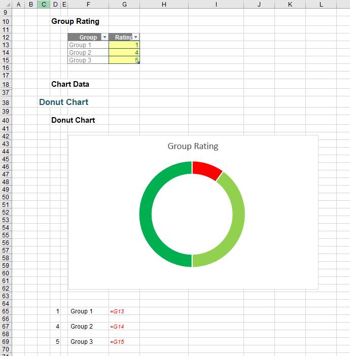
First, we will remove the data labels from the chart and create a range of cells for the legend. In our example, this wil be in cells D65:F69.
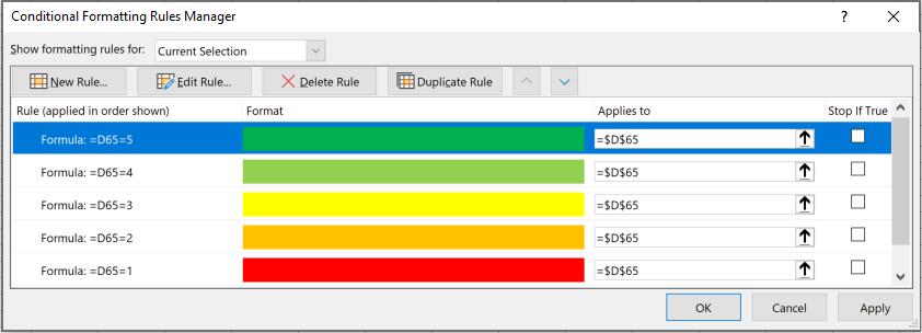
Next, we will apply the colour conditional formatting to cell D65 so that it will display the colour based on the rating by navigating to the Home tab on the Ribbon and choosing Conditional Formatting -> New Rules… as shown below:
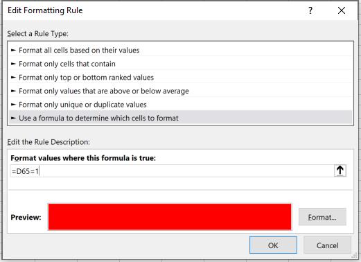
We will need to repeat this process five times, with the value being increased to two [2], then three [3], then four [4], and finally five [5], viz.
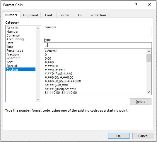
Then, we want the number in cell D65 to be invisible so that only the colour is displayed. To do this, right-click on the cell D65 and select ‘Format Cell…’ or use the CTRL + 1 keys to open the ‘Format Cells’ dialog. Under the Number -> Custom, enter ‘;;;’ in the Type box to make the number invisible. You can read more about custom number formatting here.
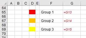
We just need to copy the formatting of cell D65 to cell D67 and cell D69. We are now having a range of cells which looks like a legend which colour depends on the group rating.
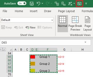
To get the legend ‘image’ to the chart, we will use the Camera tool. Please check our blog on the Camera tool on how to get the tool and how to use it when creating charts and dashboards. We will take a snapshot of the legend by selecting the range of cells and click on the Camera icon on the Quick Access Toolbar.
Then, click somewhere on the sheet to paste the image.
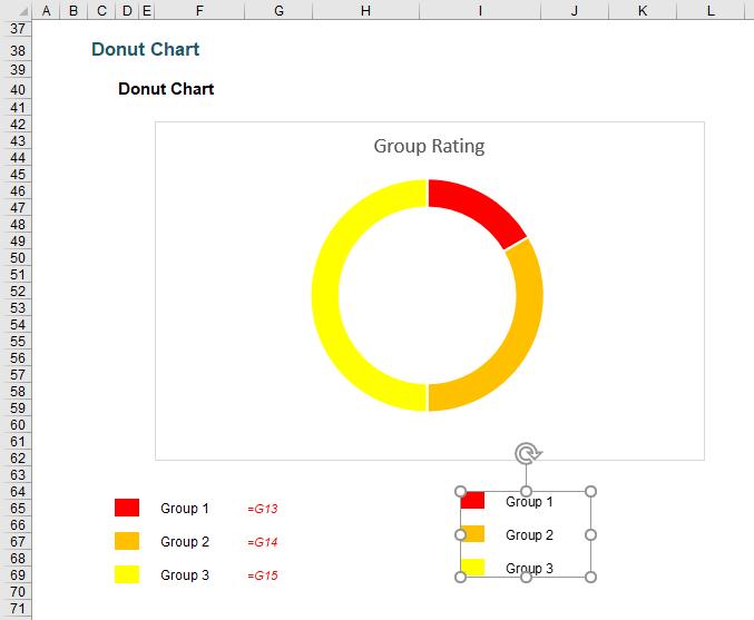
To remove the image border, right-click on the image and choose ‘Format Picture…’. In the ‘Format Picture’ panel, let Fill be ‘No fill’ and Line be ‘No line’. Then, we just need to drag the legend image onto the donut chart.
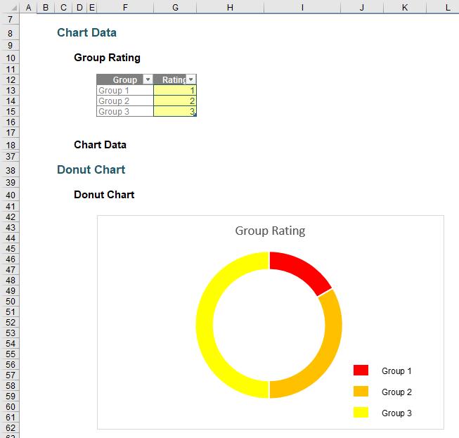
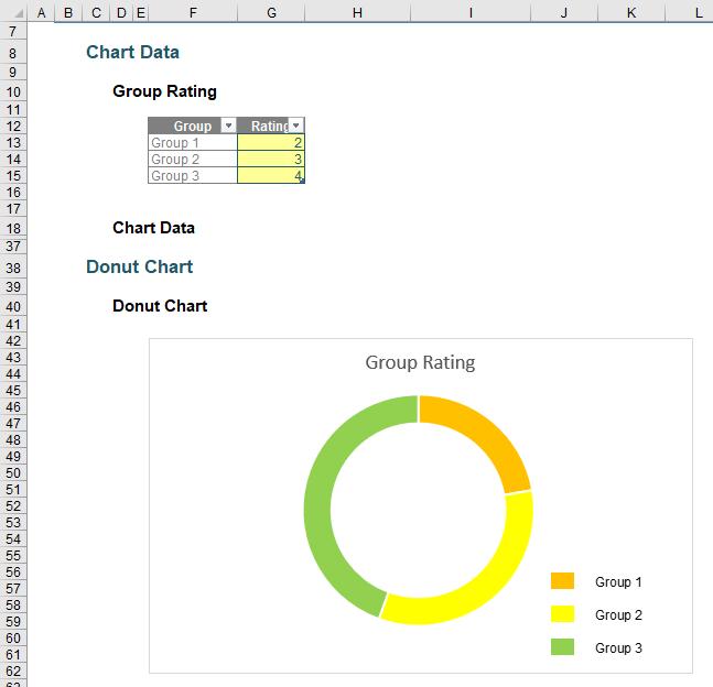
Now that the group ratings are changed, the colours of the chart series and the legend are also updated accordingly.
That’s it for this week. Come back next week for more Charts and Dashboards tips.