
Charts and Dashboards: Conditional Donut Chart – Part 3
2 April 2021
Welcome back to this week’s Charts and Dashboards blog series. This week, we will get the data label in the “conditional donut chart”.
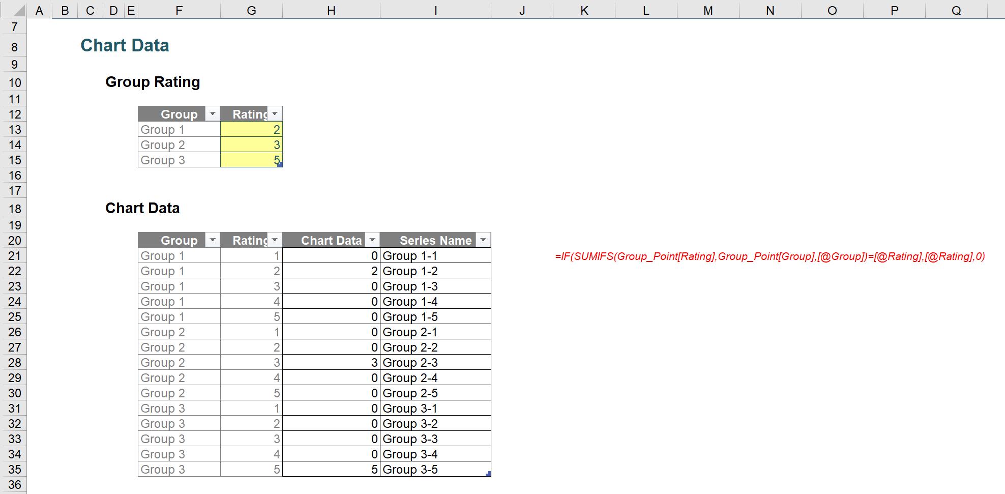
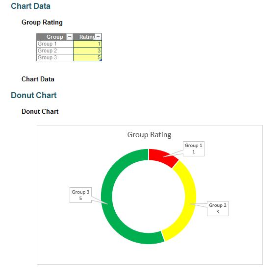
To recap, in Part 1 of this series, from the group rating data and the transformed chart data table (as shown below),
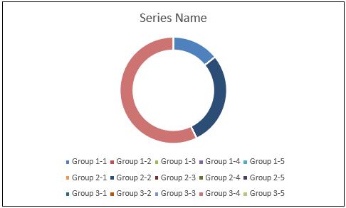
we created an initial donut chart:
Then, in Part 2, we constructed some conditional formatting in the colour of the series so that each of the series indicating the same rating will be displayed with the same colour, e.g. the three series Group 1-1, Group 2-1 and Group 3-1 have a rating 1 and should therefore share the same colour scheme.
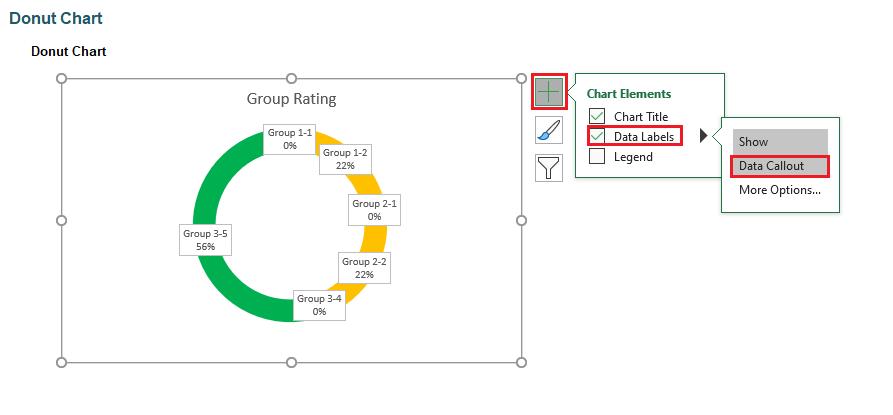
There is not much information that can be drawn from the chart, as we could not distinguish between the groups and their ratings. Hence, it’s a good idea to add data labels to the chart by getting the ‘Data Labels’ from the ‘Chart Elements’ list, viz.
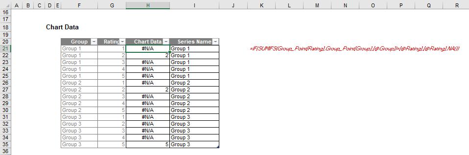
We only have three groups and their ratings, but we get more than three data labels; furthermore, the names of the group do not seem right. To fix this, we need to go back to the Chart Data table. First, we need to change the formula in the Chart Data column i.e. H21:H35, from
=IF(SUMIFS(Group_Point[Rating],Group_Point[Group],[@Group])=[@Rating],[@Rating],0)
to
=IF(SUMIFS(Group_Point[Rating],Group_Point[Group],[@Group])=[@Rating],[@Rating],NA())
Originally, the series with the zero [0] value will still be plotted in the chart (we just cannot see it because it is zero), hence, our chart has fifteen series in it. Meanwhile, the series with #N/A will not be plotted. Thus, our chart will only show three series. You can read more here and here for tips on how to hide data on chart.
Next, we change the Series Name column to be equal to the Group column. We can also use the Group column to draw a chart. However, the current chart is using the Series Name column (and I am lazy).
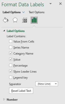
Then, right-click on the data labels and choose ‘Format Data Labels’. In the ‘Format Data Labels’ panel, under ‘Label Options’, tick ‘Value’ and choose ‘(New Line)’ as a Separator from the drop-down list.
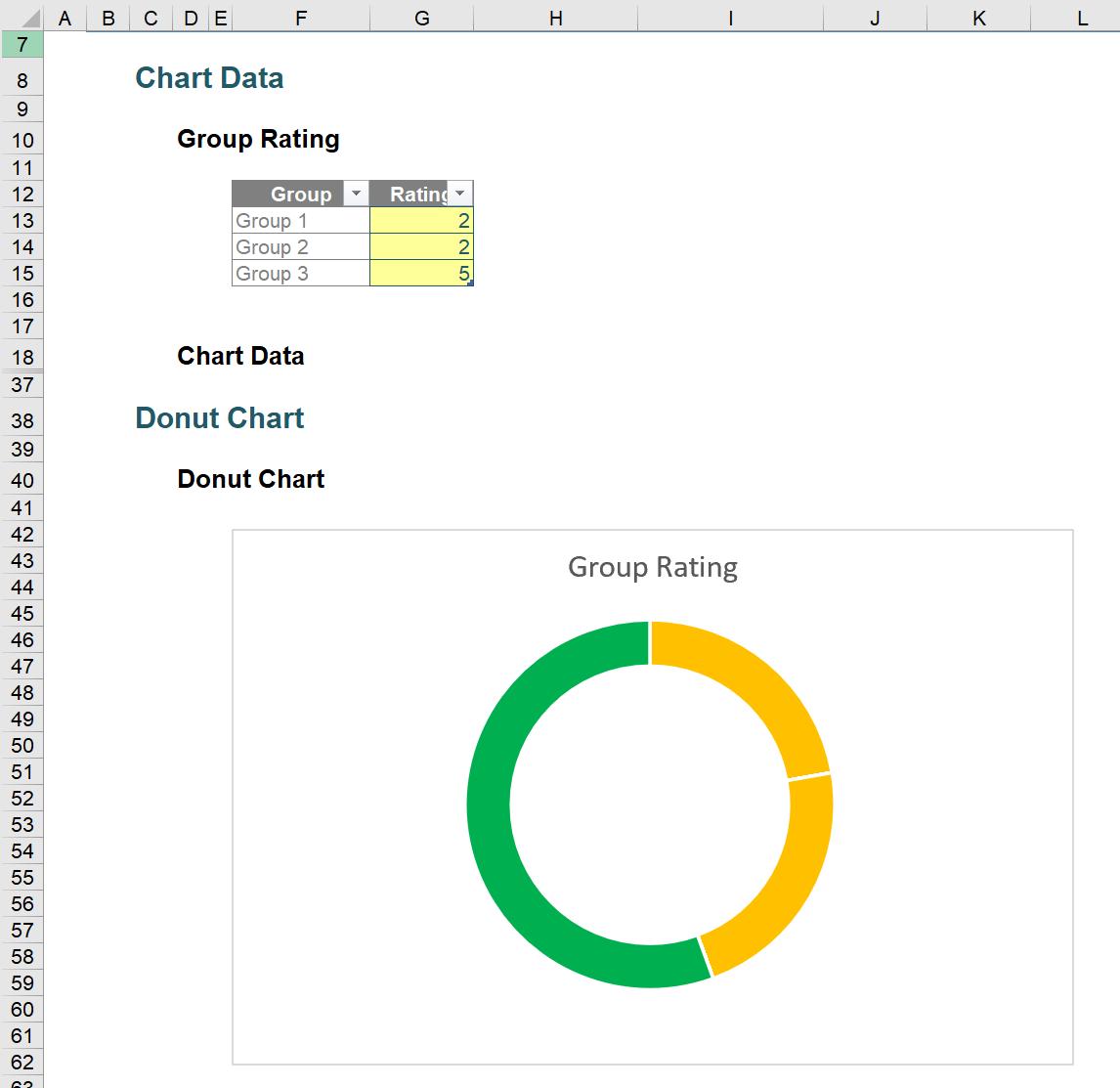
We now have a donut chart which looks like the one below.
That’s it for this week. Come back next week for more Charts and Dashboards tips.