
Charts and Dashboards: Conditional Donut Chart – Part 2
19 March 2021
Welcome back to this week’s Charts and Dashboards blog series. This week, we will continue to build the “conditional donut chart”.
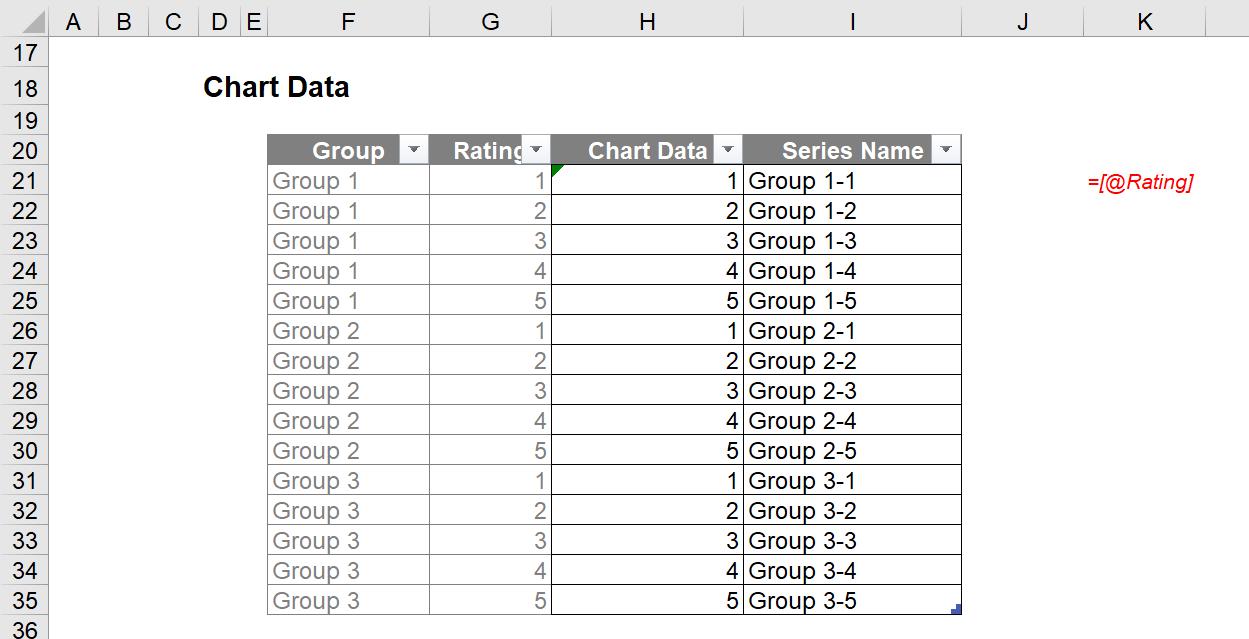
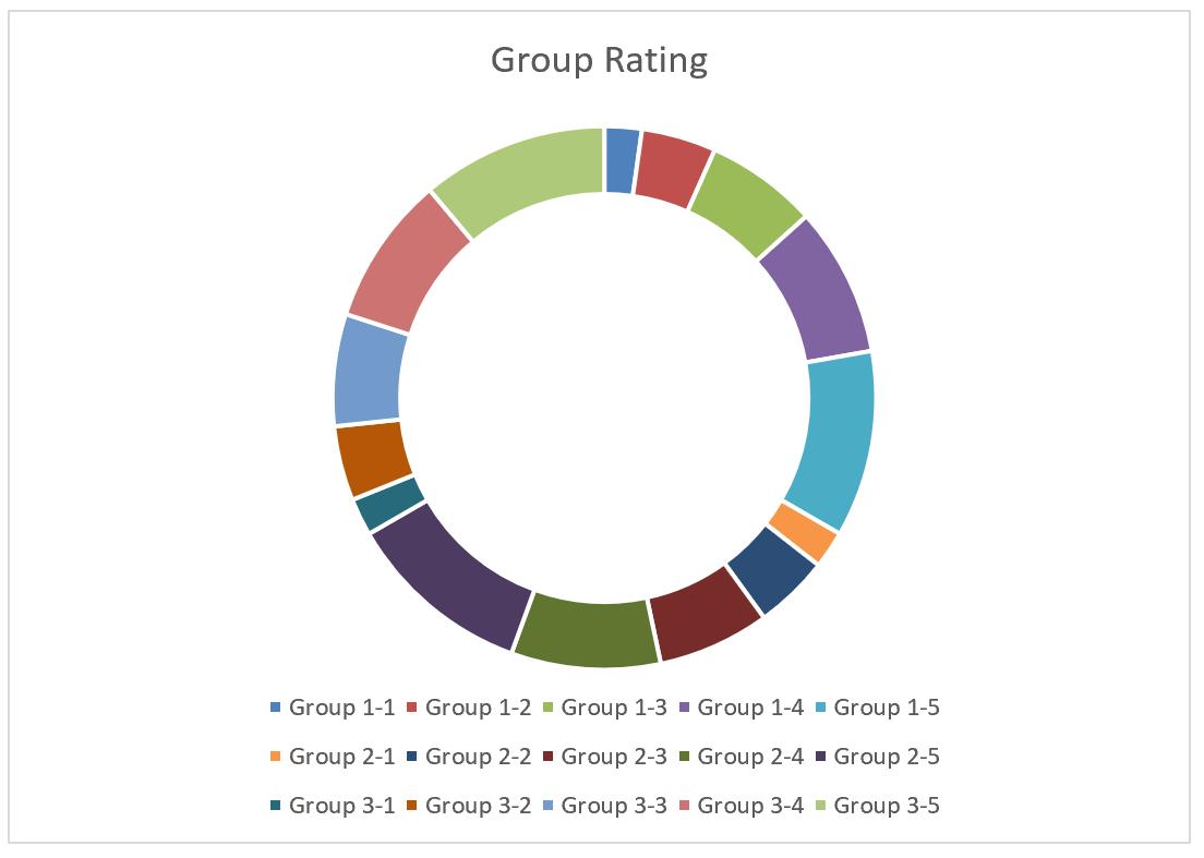
Last week, from the group rating data and the transformed chart data table (as shown below),
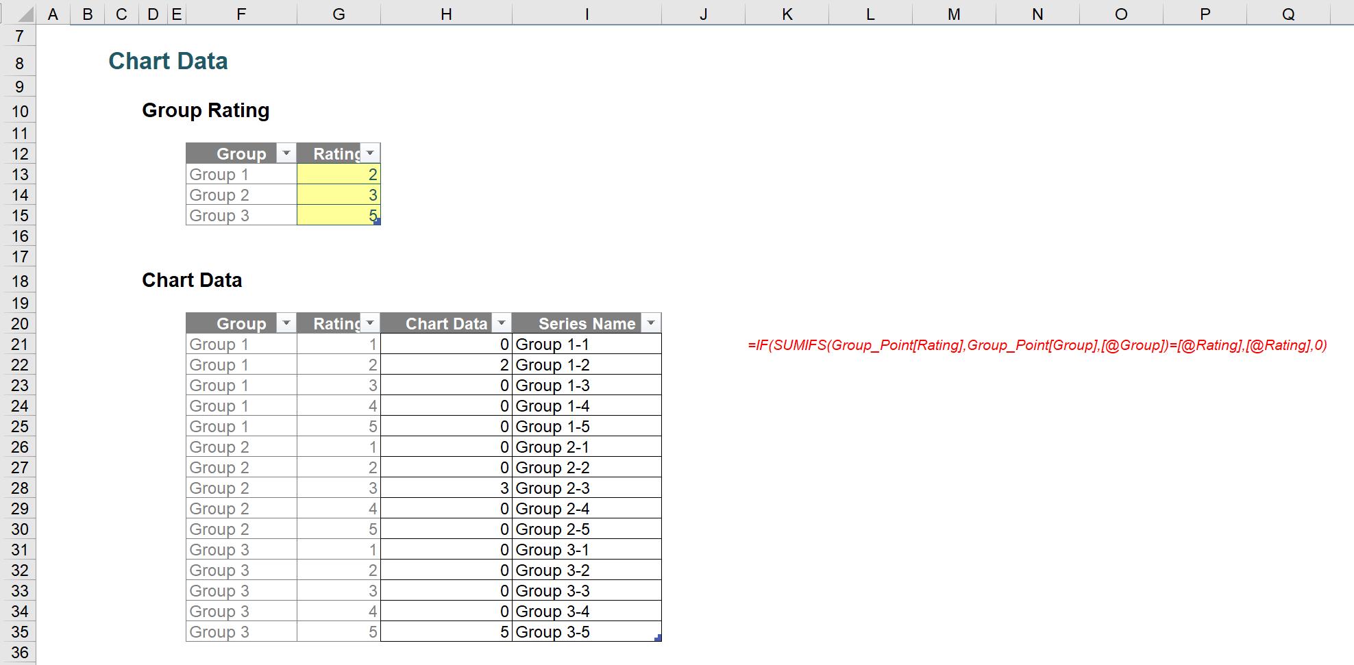
we created an initial donut chart:
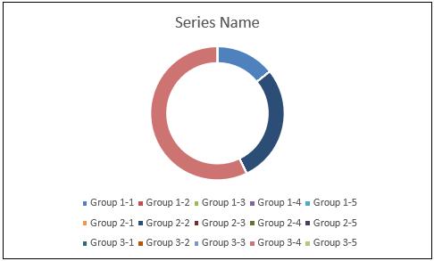
We deliberately included 15 series in the chart, although there will be only three [3] series that are visible. We will need to format the series so that each of the series indicating the same rating will be displayed with the same colour, e.g. the three series Group 1-1, Group 2-1 and Group 3-1 have a rating 1 and should share the same colour scheme.
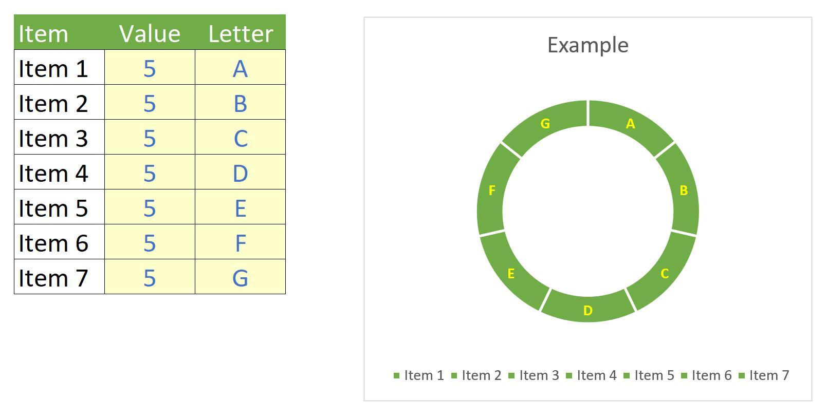
To make it clear, we have an example chart like the one below, where we have different items with different values plotted with different colours on the chart.
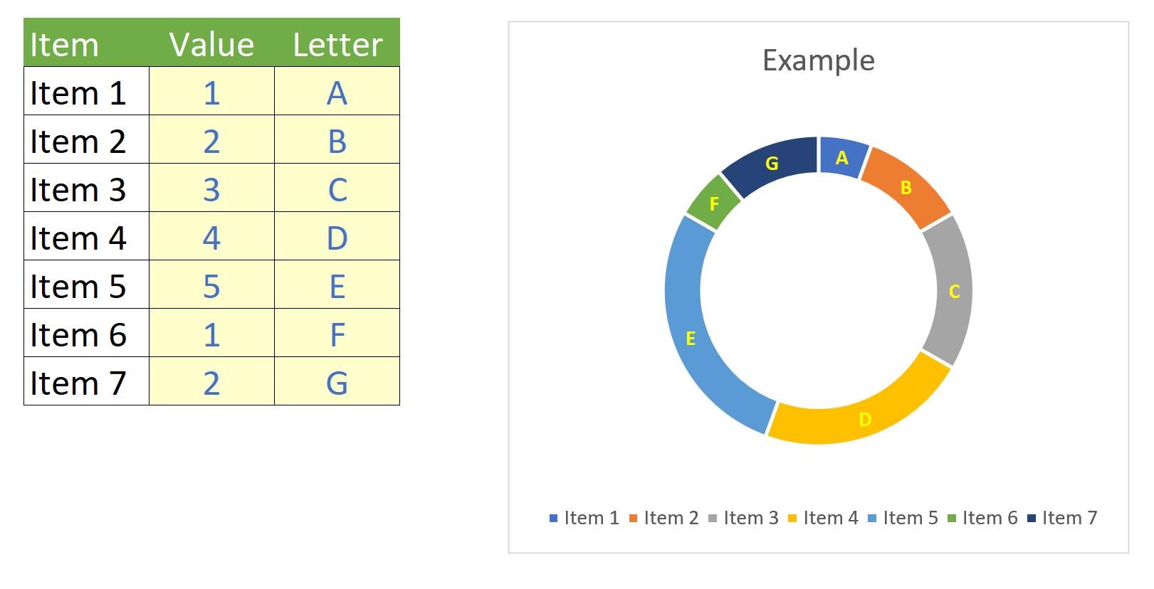
If we get all items with the same value, only the size of their portions on the donut chart changes, not the colour.
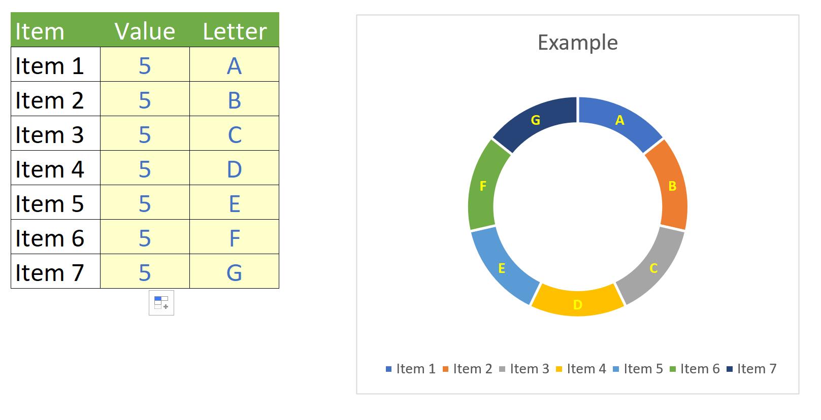
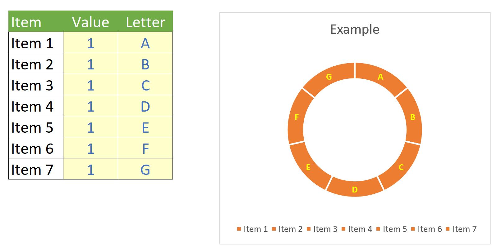
However, what we are aiming to do here is that if all items share the same value, they will be plotted with the same colour on the chart and the colour depends on their value, e.g. green for value of five [5]
and orange for value of one [1]
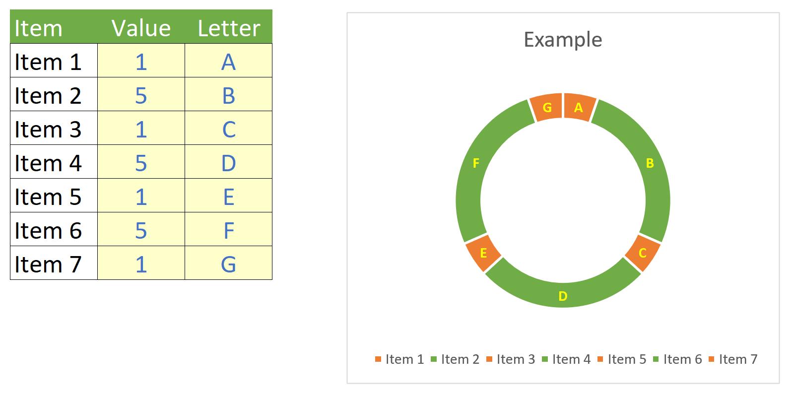
or a mixture of values as shown below.
The process of getting the colours for the above chart is manual. Let’s make things automatic.
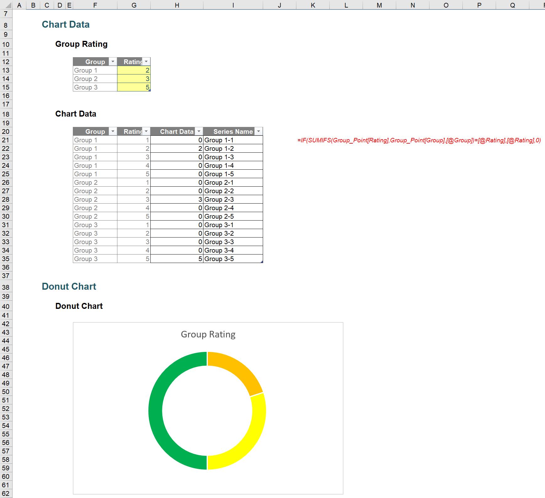
To do this, first, we replace the Chart Data series with the Rating number:
The donut chart will now look like the one below, which makes it easier to tell between the series.
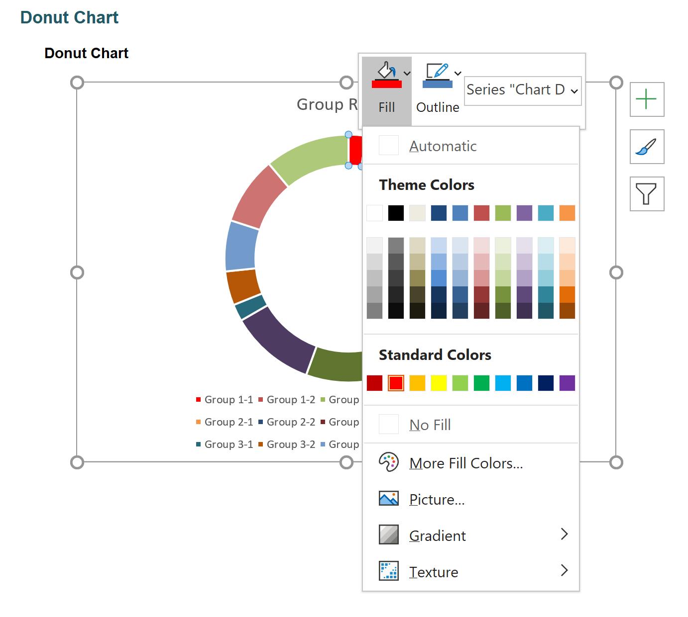
Now, click twice on the series (not double-click) to select the series we need to format, then right-click and choose the colour to our liking from the Fill drop-down. Otherwise, we can select ‘Format Data Point…’ for detailed formatting options. Here, we defined the lowest rating as red shade and highest rating as green shade.
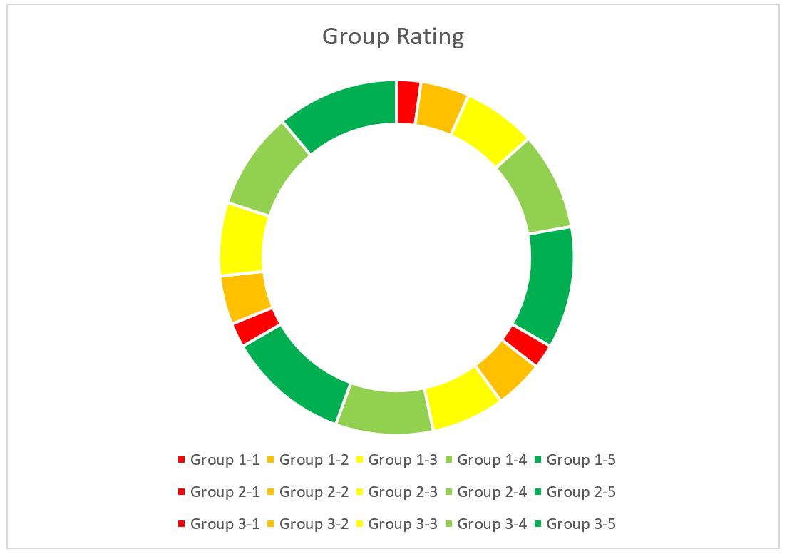
When we are finished with the colour formatting, the chart should resemble something similar to the one below:
By reverting the Chart Data series to the initial formula
=IF(SUMIFS(Group_Point[Rating],Group_Point[Group],[@Group])=[@Rating],[@Rating],0)
we will get the donut chart with the conditional colouring.
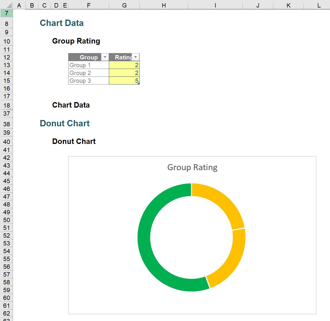
If we change the group rating as two, two and five for Group 1, 2 and 3 respectively, our donut chart will show the same colour for the rating as two points for Group 1 and 2.
As we already removed the legend (we do not need fifteen!), we will need another legend or data label for our chart, which we will save for the next part.
That’s it for this week. Come back next week for more charts and dashboards tips.