
Charts and Dashboards: Hiding Data - Part 1
12 June 2020
Welcome back to this week’s Charts and Dashboards blog series. This week, let’s talk about how we can hide one or more data points in a chart.
When creating charts with time series, do not skip periods – if data only exists for seven months of the year, your graph should still show all 12 months, so as to remove any chance of the information being misinterpreted. If the reader sees seven columns on a graph, they may not notice that five months of zero results are missing. When creating charts measuring values, typically these would go on the vertical axis and you should always show zero.
For example, I have to chart some data, but my data series is somewhat incomplete:

When a Line Chart is created, has this ever happened?
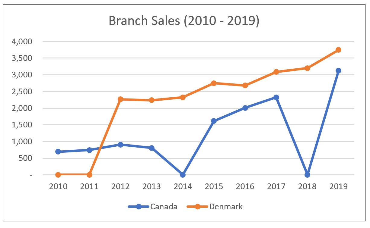
Excel assumes the missing values are zero (0).
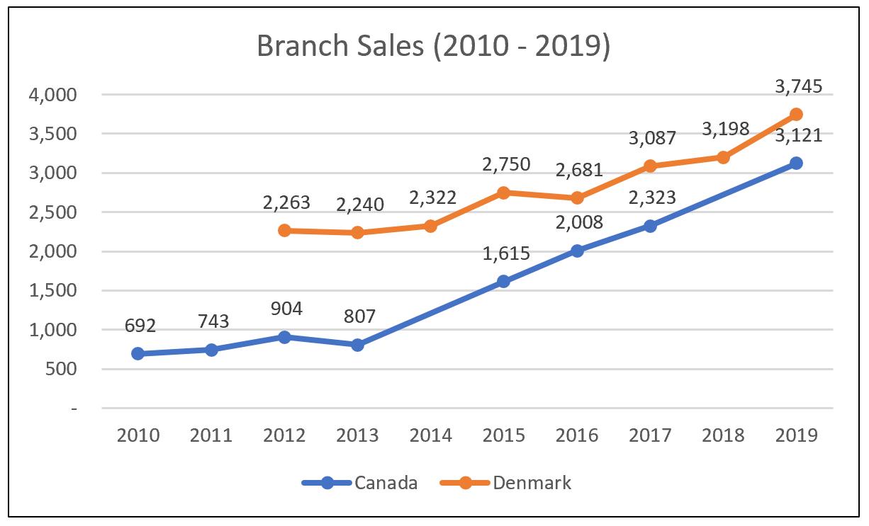
Or this?
Excel draws a line in place of the missing data points.
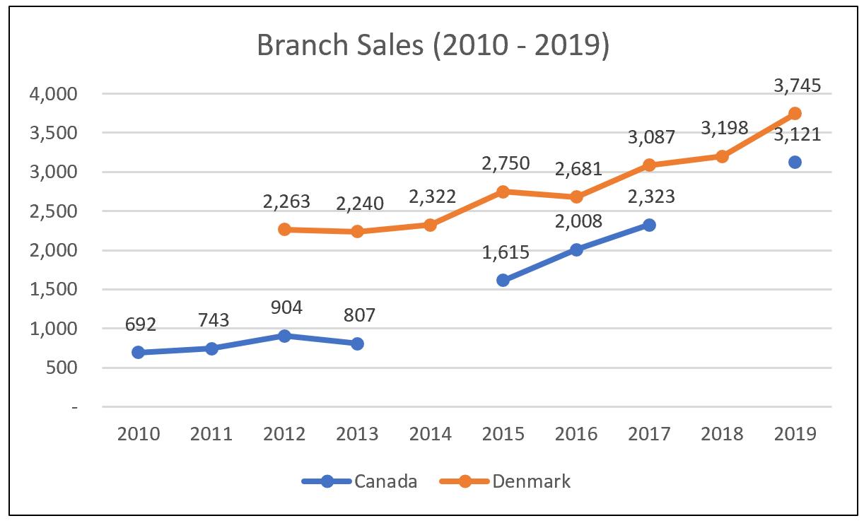
However, I want the chart to display like this:
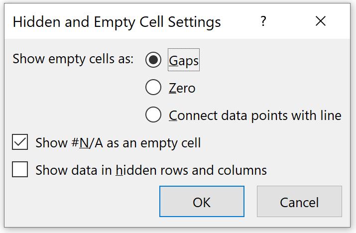
The trick is to review the settings regarding how Excel displays hidden and empty cells. To get there, right-click on any part of the chart, then select ‘Select Data’, and then select the ‘Hidden and Empty Cells’ option, viz.
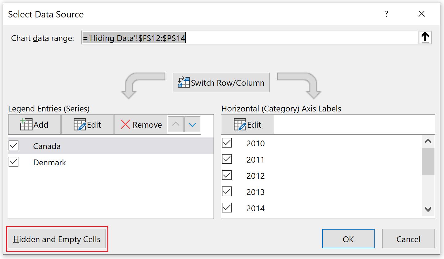
The ‘Hidden and Empty Cell Settings’ dialog will appear:
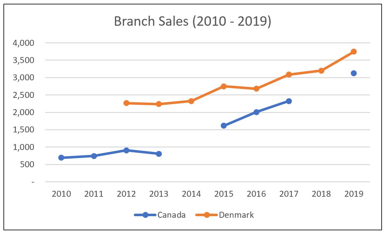
This chart is the result of setting ‘Show empty cells as: Gaps’:
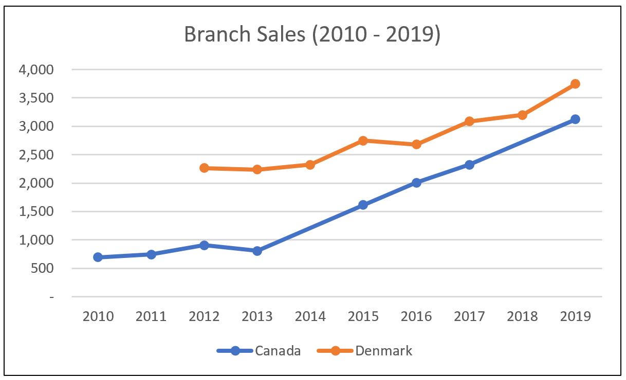
This chart is the result of setting ‘Show empty cells as: Zero’:
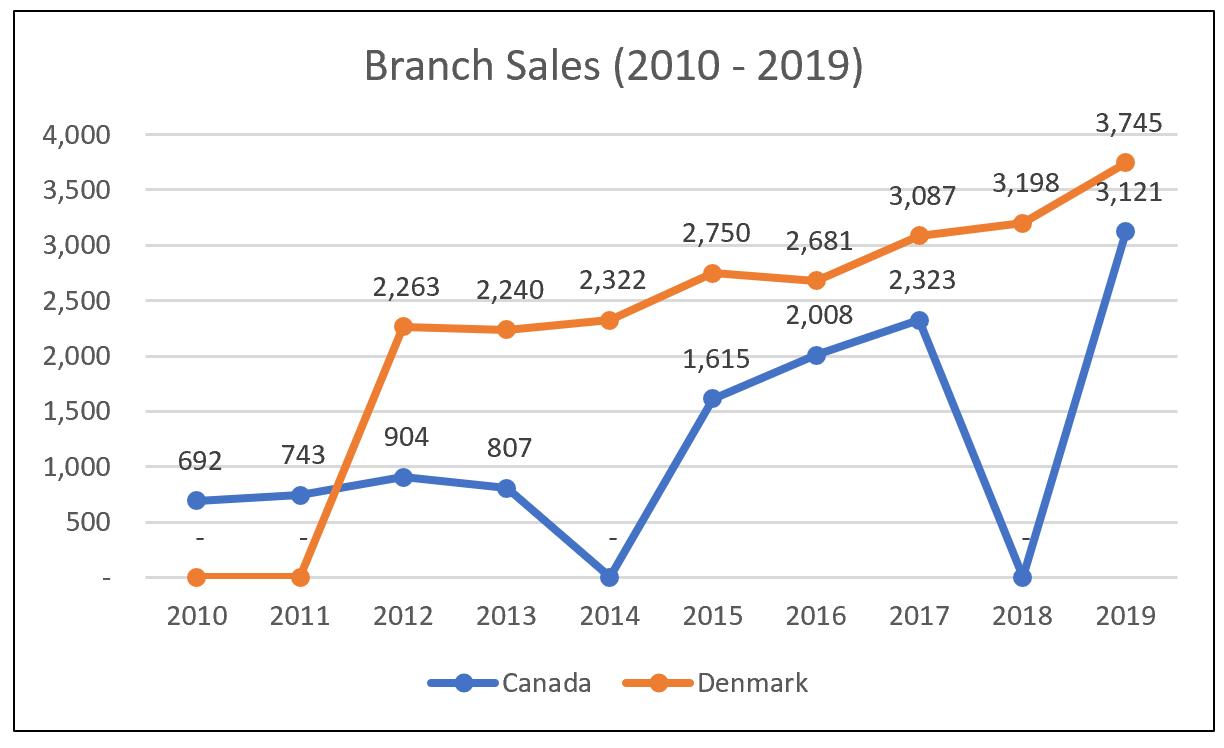
This chart is the result of setting ‘Show empty cells as: Connect data points with line’:
That’s it for this week, check back next week for more Charts and Dashboards tips.