
Charts and Dashboards: Histogram Hiccoughs – Part 3
19 May 2023
Welcome back to our Charts and Dashboards blog series. This week, we enhance our custom Histogram chart so that it resizes dynamically.
In Part 1, we looked at the standard Excel Histogram chart, which is available in Excel 2016 onwards. We used some ‘Age’ data:
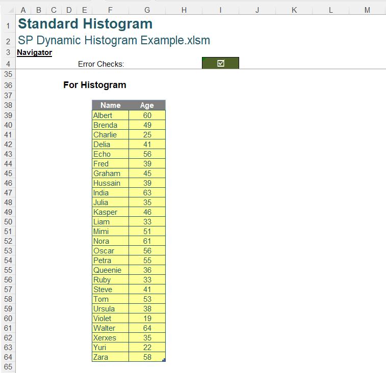
We selected our data, and created a standard Histogram chart, but we encountered some issues, and we found that it could not work dynamically.
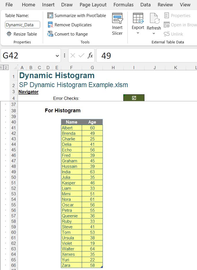
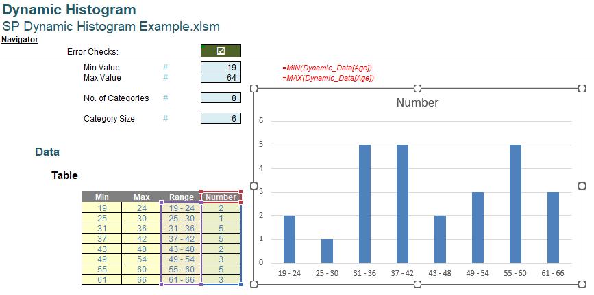
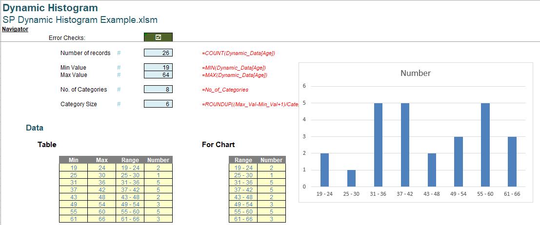
Last time, we created a custom Histogram chart from a Clustered Column chart. Having assigned a ‘Table Name’ to our data:
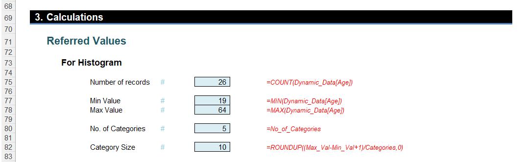
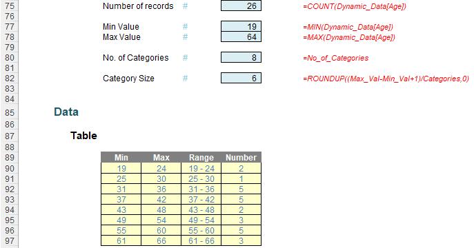
We created some intermediate calculations, or ‘Referred Values’:
We used Dynamic Arrays to create the chart data:
We then selected the Range and Number columns and created our chart:
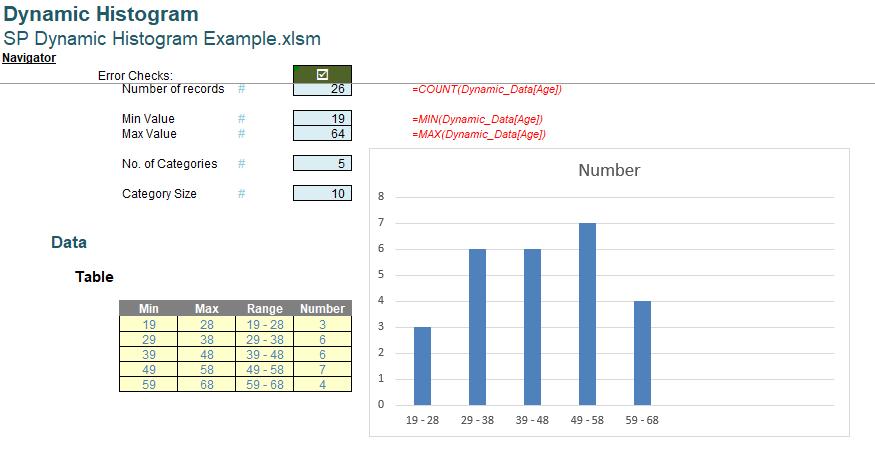
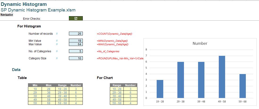
However, when we changed the No_of_Categories to five [5]:
We want to our chart to resize automatically. The question is, why when the ‘Table’ is clearly dynamic, is the Histogram chart not reflecting the changes?
The answer is that we are using two [2] different dynamic ranges to create Range and Number. For the chart to be dynamic, the source data needs to be one [1] dynamic array.
We need another step. We delete the chart and create another set of data to create the chart from:
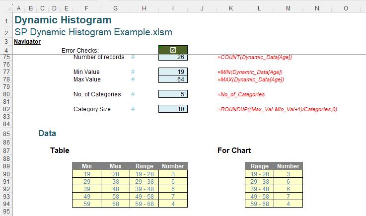
The ‘For Chart’ data has been created from the ‘Table’ using the OFFSET() function.
=OFFSET(H90,,,Categories,2)
To understand this formula, we should first understand how OFFSET() works.
The syntax for OFFSET() is as follows:
OFFSET(reference, rows, columns, [height], [width])
The arguments in square brackets (height and width) may be omitted from the function. The default values are the same dimensions as the original reference.
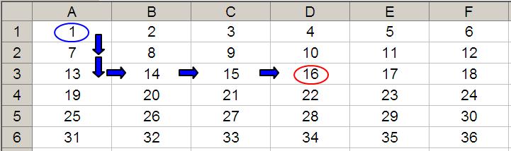
In its most basic form, OFFSET(ref, x, y) will select a reference x rows down (-x would be x rows up) and y columns to the right (-y would be y columns to the left) of the reference ref. For example, consider the following grid:
OFFSET(A1,2,3) would take us two rows down and three columns across to cell D3. Therefore, OFFSET(A1,2,3) = 16, viz.
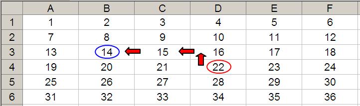
OFFSET(D4,-1,-2) would take us one row up and two rows to the left to cell B3. Therefore, OFFSET(D4,-1,-2) = 14, viz.
Furthermore, we can use the height and width arguments. Consider the OFFSET example from earlier. If we extend the formula to OFFSET(D4,-1,-2,-2,3), it would again take us to cell B3 but then we would select a range based on the height and width parameters. The height would be two rows going up the sheet (-2), with row 14 as the base (i.e. rows 13 and 14), and the width would be three columns going from left to right (3), with column B as the base (i.e. columns B, C and D).
Hence OFFSET(D4,-1,-2,-2,3)would select the range B2:D3, viz.
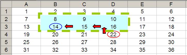
Note that OFFSET(D4,-1,-2,-2,3) would result in a spilled array (or a #SPILL! error since Excel cannot display a matrix in one cell, but it does recognise it).
In the formula we are using for the chart:
=OFFSET(H90,,,Categories,2)
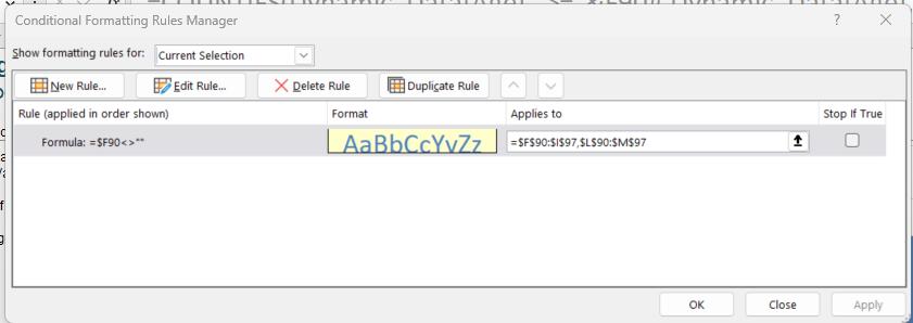
H90 is the reference, and we are not inputting any rows or columns, but we are using the optional height and width arguments. The height is Categories (giving us a row for each category), and the width is two [2], since we want to copy the Range and Number columns. We have extended the conditional formatting rule that we created for the ‘Table’ to cells $L$90:$M$97:
We select the ‘For Chart’ data, and create the Clustered Column chart again:
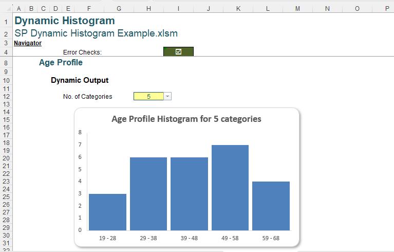
This time, when we change the categories from five [5] to eight [8], the horizontal axis adjusts accordingly:
We can now add the formatting to get our dynamic Histogram chart, which is actually a Clustered Column chart.
We have added shading as we did for the static Histogram chart. We have been able to add rounded corners this time:
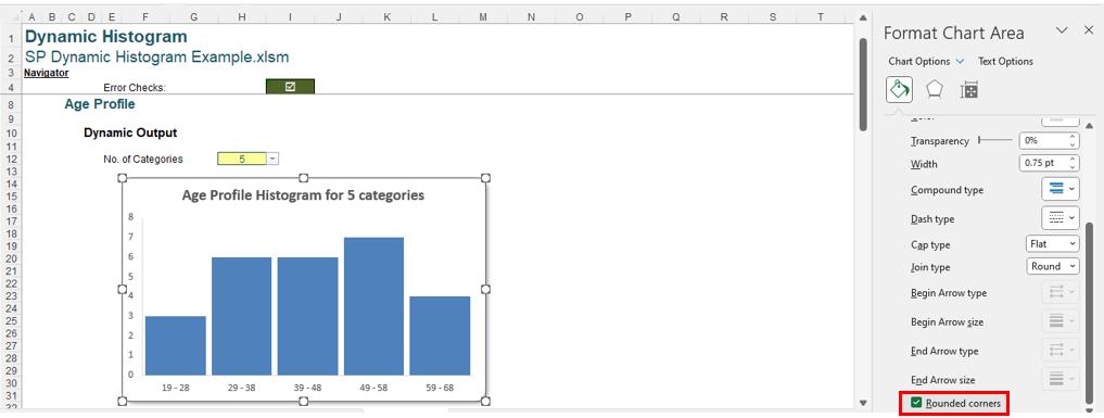
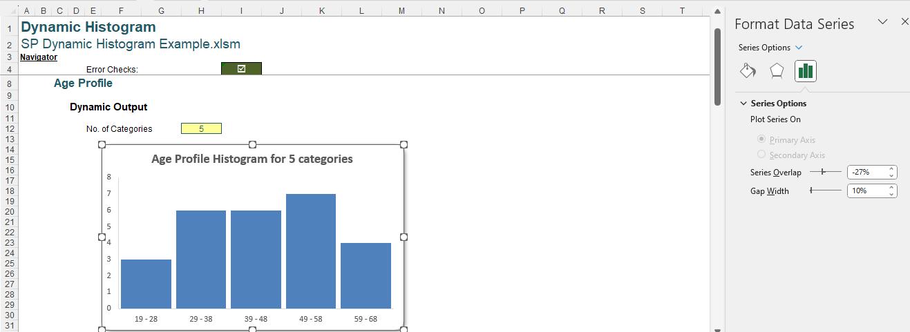
We have also adjusted the widths of the bars by using ‘Series Options’ on the ‘Format Data Series’ pane:
Finally, we have created a dynamic title:
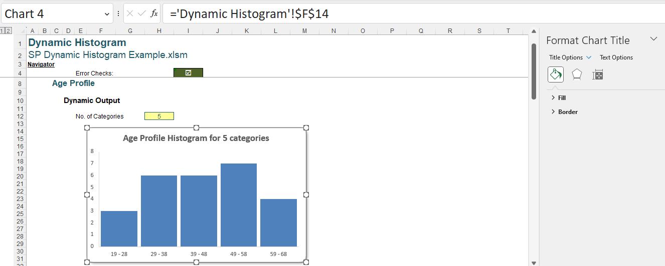
Note that cell $F$14 is hidden behind the chart.

The formula in this cell is:
=C8&"Histogram for "&No_of_Categories&" categor"&IF(No_of_Categories=1,"y","ies")
Cell C8 is the title of the solution, ‘Age Profile’. This is concatenated with the text “ Histogram for “ and then the input number of categories (given by No_of_Categories). In case the user selects only one [1] category, we trap for this when we specify the ending of “categor”. If it is true that No_of_Categories is 1 we use “y”, otherwise we use “ies”.
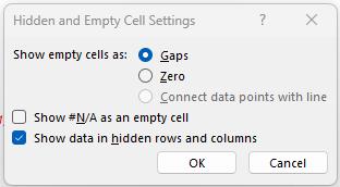
We are now able to stop our chart from disappearing if the data is hidden as we can access the ‘Hidden and Empty Cell Settings’ dialog:
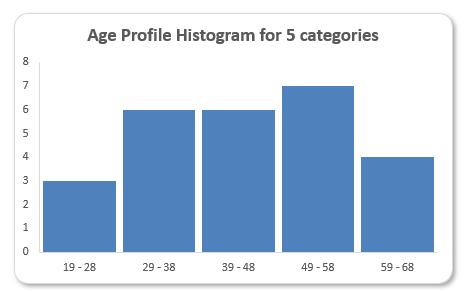
Our dynamic (customised) Histogram chart is complete:
No polar bears in snowstorms!
That’s it for this week, come back next week for more Charts and Dashboards tips.