
Charts and Dashboards: Histogram Hiccoughs – Part 1
5 May 2023
Welcome back to our Charts and Dashboards blog series. This week, we look at a standard Excel Histogram and some issues it presents.
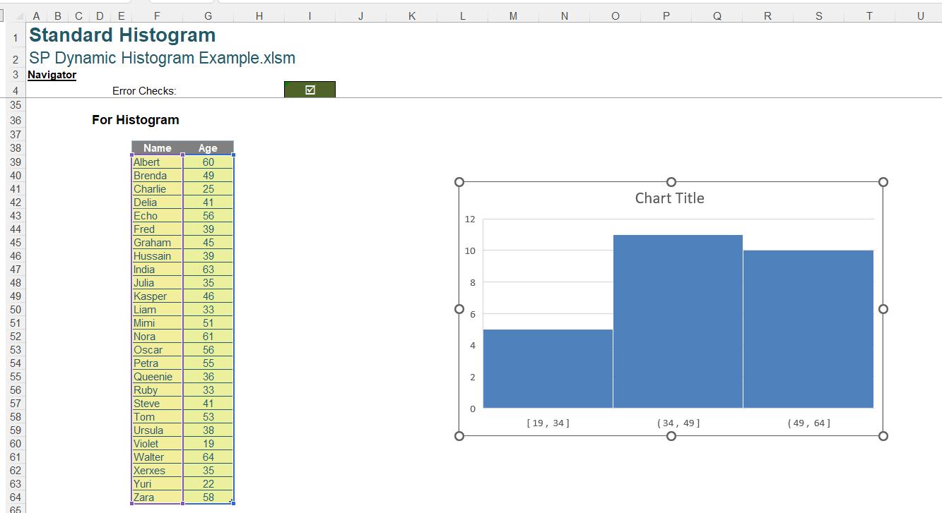
We have some ‘Age’ data for this week’s chart:
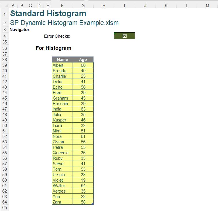
We would like to show this information in a Histogram chart. This helps us to analyse the distribution of the data, helping us to visualise how many people are in different age categories, sometimes referred to as “buckets”. This week, we look at the standard Excel Histogram chart, which is available in Excel 2016 onwards.
We select our data, and go to the Insert tab, where we select the ‘Recommended Charts’ option:
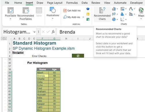
Even though it is a logical chart for our data, the Histogram is not suggested:
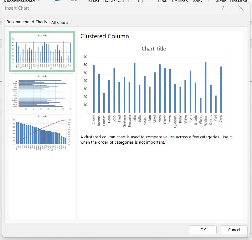
To find the chart we want, we need to select the ‘All Charts’ tab:
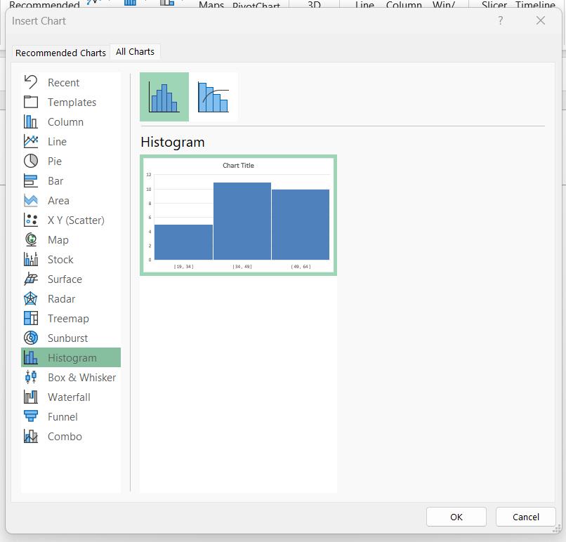
Having located the Histogram chart, we click ‘OK’ to select it:
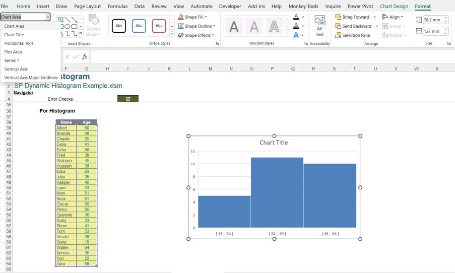
This gives us a basic chart, but there are some things we would like to do to improve it. We can select the chart and use the Format tab to format the chart elements:
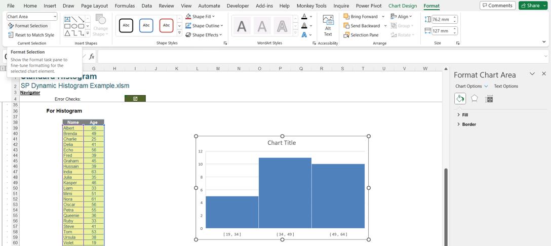
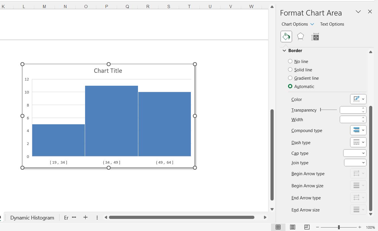
We would like to add shadow and rounded corners to the chart area, so we select the Chart Area in the dropdown, and choose ‘Format Selection’ to access the ‘Format Chart Area’ pane:
In the Effects options, we can choose shading:
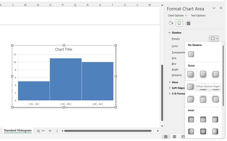
However, in the Border options, there is no ‘Rounded Corners’ option at the bottom of the pane:
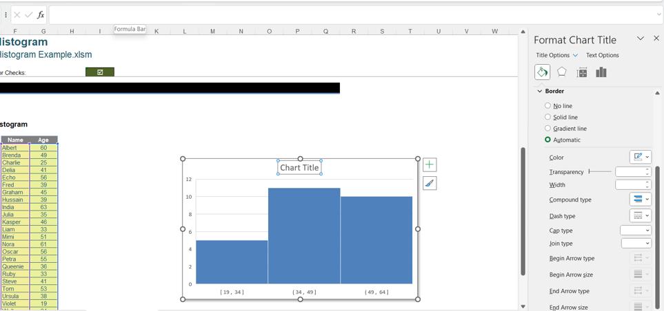
There is another feature which is not available to us on this chart. When we create chart titles, we often use an excel formula to determine the title so that it is dynamic, as we covered in Dynamic Chart Titles.
When we try and access the formula bar for this title, we are not permitted to type anything:
Whilst we are able to create a standard Excel Histogram chart, we are unable to access many of the features that we have come to expect when creating charts.
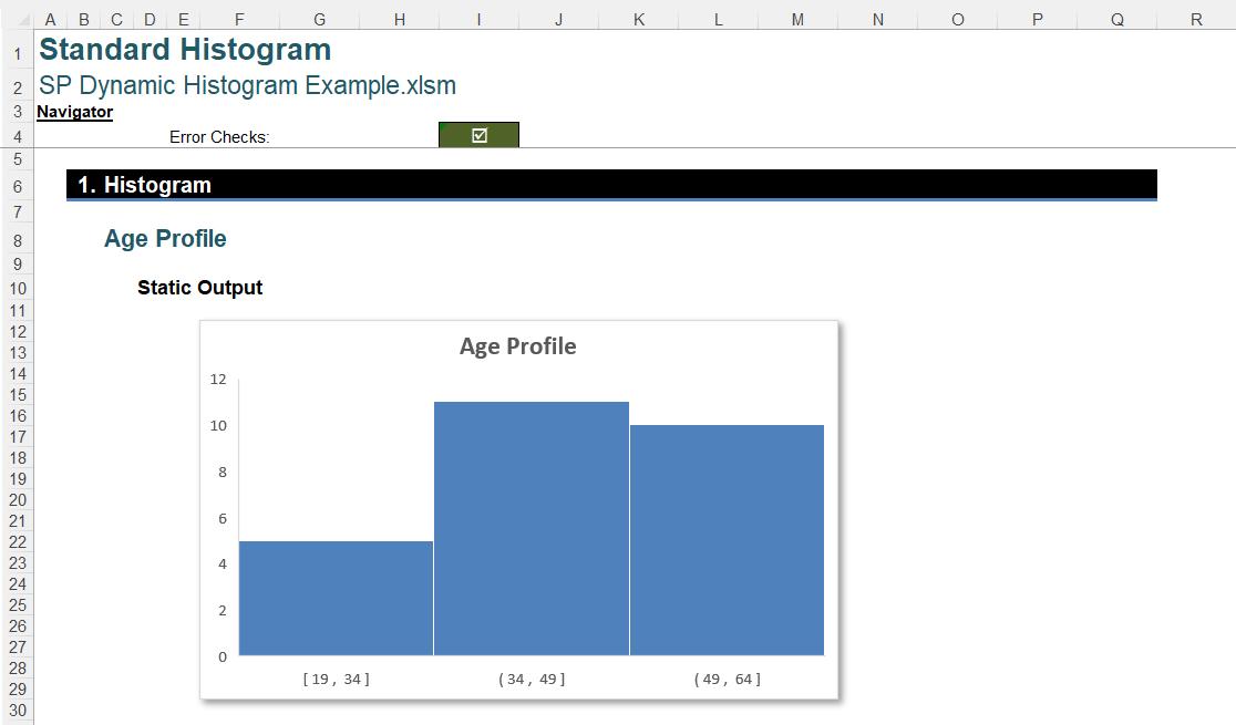
There is also a practical problem. The chart above is using the data in cells F38:G64. However, if I hide the data:
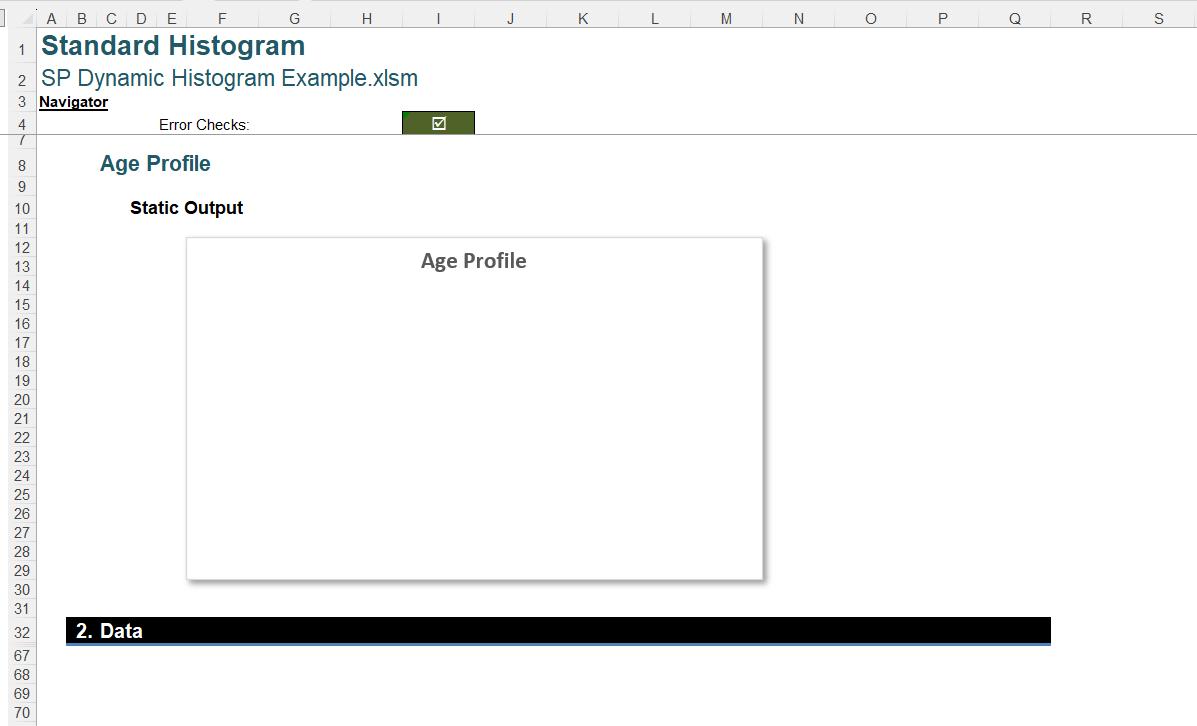
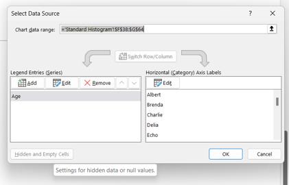
We have a polar bear in a snowstorm. We have covered this issue in Hiding Data – Part 2, where we solved it using the ‘Hidden and Empty Cells’ settings on the ‘Select Data’ dialog. We can access this by selecting the chart and right-clicking:
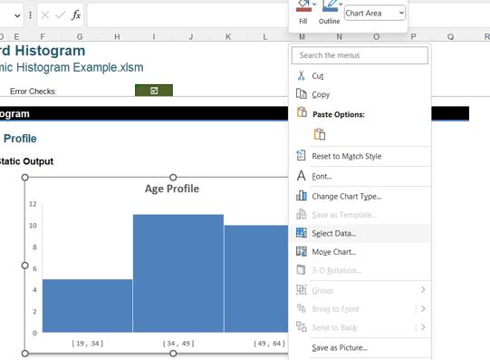
However, for the standard Histogram, the ‘Hidden and Empty Cells’ option is greyed out:
Next time, we will look at an alternative method of creating a Histogram chart which will not only allow us to round the corners and stop the chart from disappearing, but also provide a truly dynamic solution.
That’s it for this week, come back next week for more Charts and Dashboards tips.