
Charts and Dashboards: Histogram Hiccoughs – Part 2
12 May 2023
Welcome back to our Charts and Dashboards blog series. This week, we construct a custom Histogram chart.
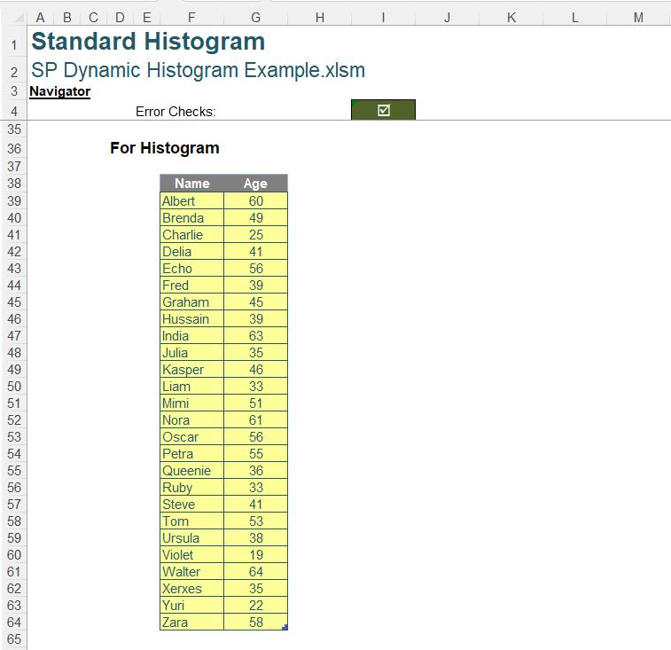
Last week, we looked at the standard Excel Histogram chart, which is available in Excel 2016 onwards. We used some ‘Age’ data:
We selected our data, and created a standard Histogram chart, but we encountered some issues.
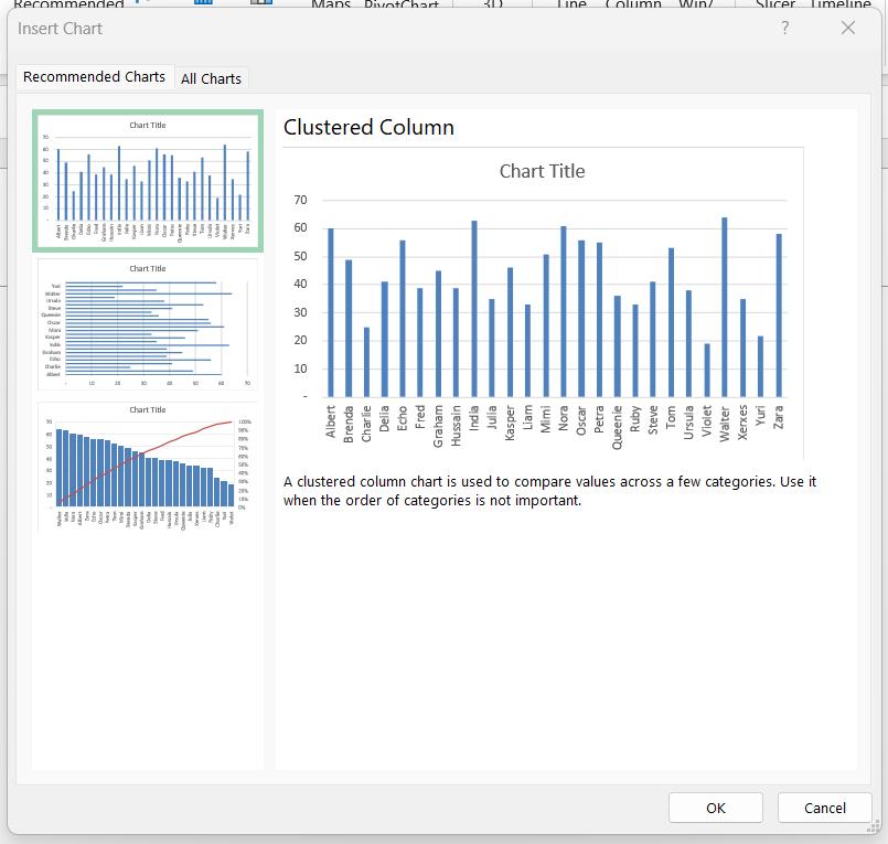
Even though it is a logical chart for our data, the Histogram was not suggested from the ‘Recommended Charts’ option:
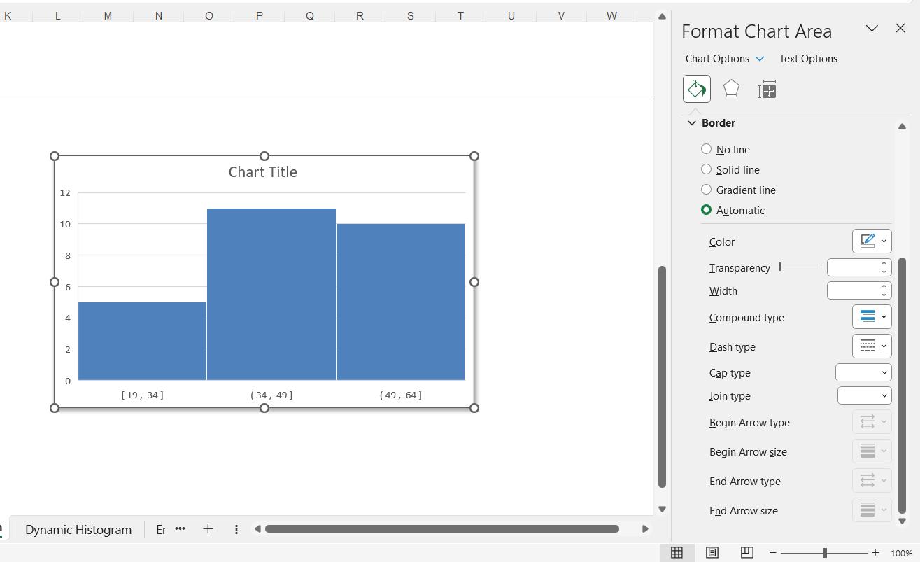
When we wanted to format the chart, we found that there was no ‘Rounded Corners’ option at the bottom of the pane:
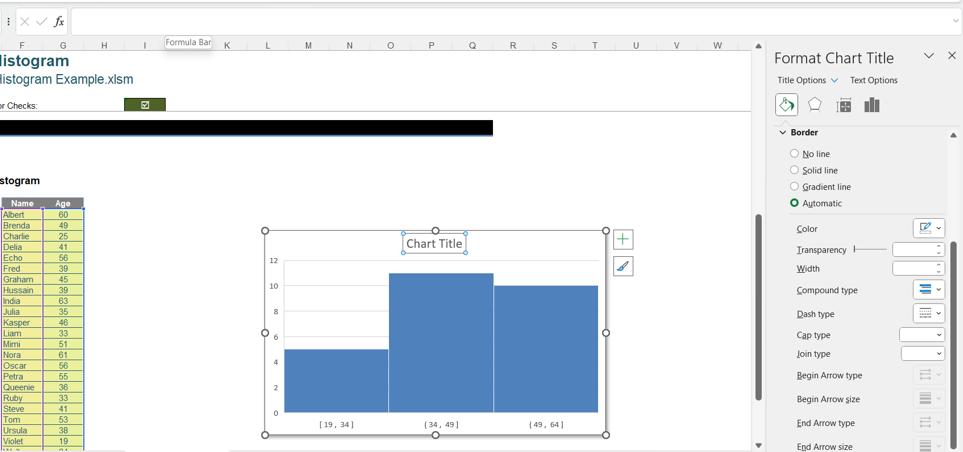
We were unable to create a dynamic chart title, because when we tried to access the formula bar for the title, we were not permitted to type anything:
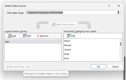
We also had another practical issue, as we couldn’t access the ‘Hidden and Empty Cells’ option to stop our chart from appearing blank if the chart data was hidden:
In addition to the issues we found last time, the final drawback is that we cannot make the standard Histogram chart dynamic. We can change the number of bins by selecting the horizontal axis and right-clicking to access the ‘Format Axis’ pane:
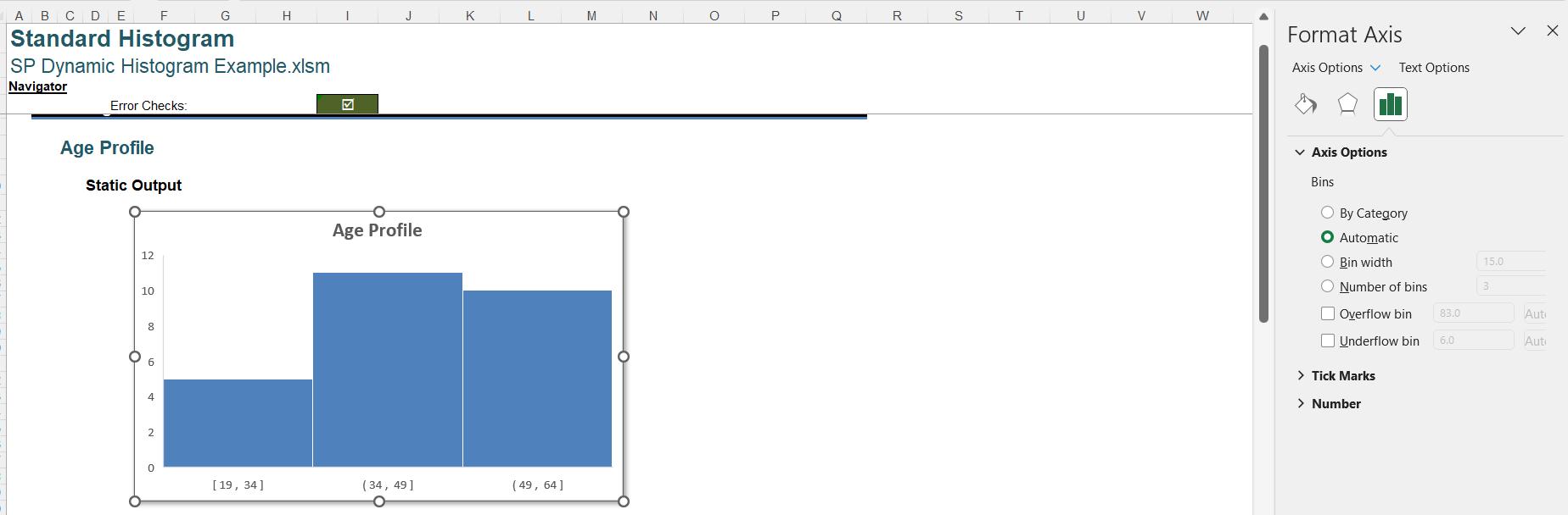
In the ‘Axis Options section on the ‘Axis Options’ tab, we can change the ‘Bin’ from Automatic to ‘Number of Bins’. Here, we have changed the ‘Number of Bins’ to six [6]:
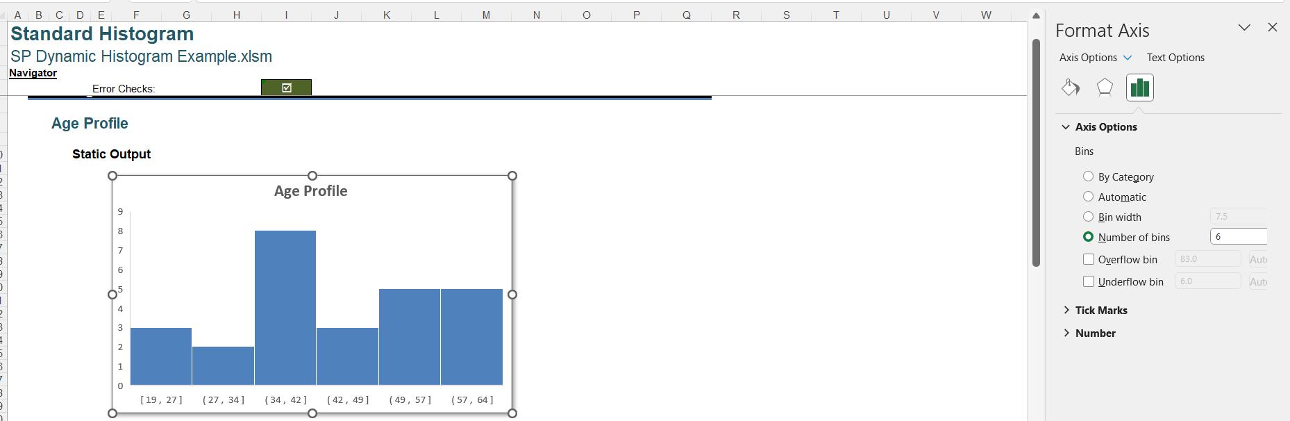
However, we cannot put a cell reference in the ‘Number of Bins’, so it can only be changed manually.
We may take a different approach. Instead of using the standard Histogram chart provided by Excel, we can use a Clustered Column chart. We start with the data as before:
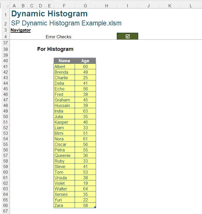
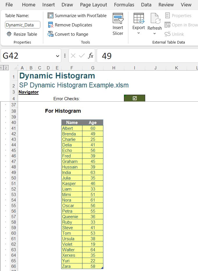
Since we want our dynamic Histogram to reflect any changes to the data, we have converted the data to a Table, which we have called Dynamic_Data:
We have also created some intermediate calculations, or ‘Referred Values’:
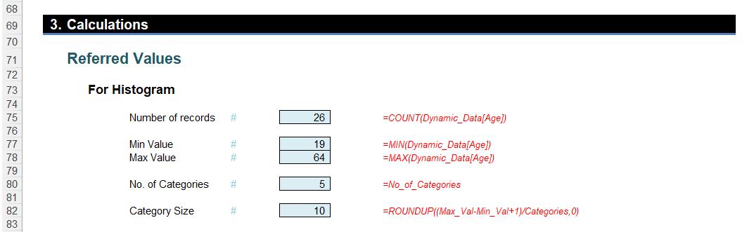
Number of records is a count of all the ages in the Age column of Dynamic_Data, which is given by:
=COUNT(Dynamic_Data[Age])
Note that we use COUNT() rather than COUNTA() or ROWS(). ROWS() would return the number of rows, regardless of whether they are blank or not numerical. COUNTA() would return the number of values that are not blank, but would include non-numerical data. We want to count the numerical values only.
We have assigned a named range No_of_Records to this value:
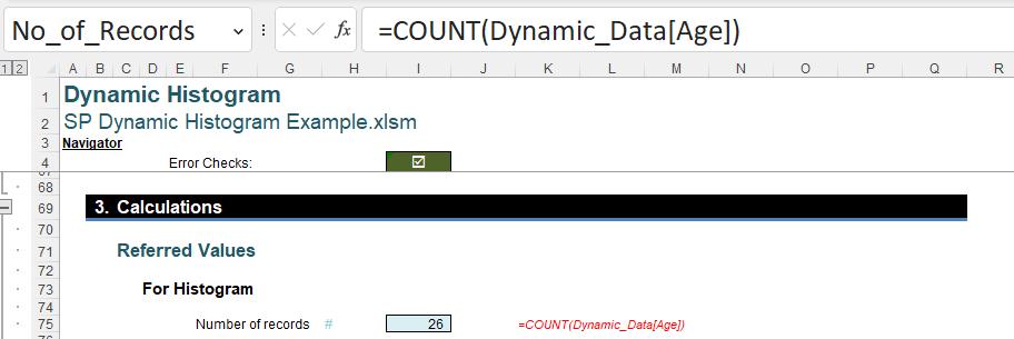
Assigning named ranges to the results of the intermediate calculations will make the calculations in the chart data table easier to follow.
Min Value is simply the minimum age in the Age column of Dynamic_Data, which is given by:
=MIN(Dynamic_Data[Age])
Similarly, Max Value is the maximum age in the Age column of Dynamic_Data, which is given by:
=MAX(Dynamic_Data[Age])
These have also been assigned names Min_Val and Max_Val respectively.
No. of Categories is the number of bars or buckets we want to see in our chart. Since we are creating a dynamic solution, this points to our input cell.
=No_of_Categories
No_of_Categories is the defined name for our input field:
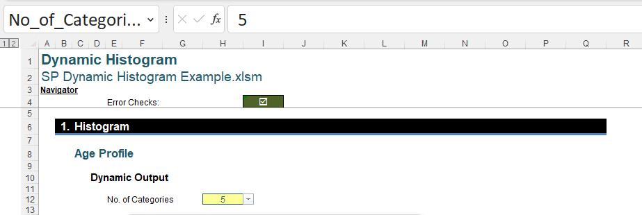
Note that the input field has dropdown values:
This list has been created using ‘Data Validation’:
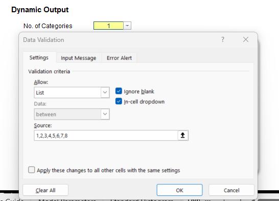
We have set this up so that the user must use a whole number between one [1] and eight [8]. We select eight [8] and continue.
Returning to the ‘Referred Values’:
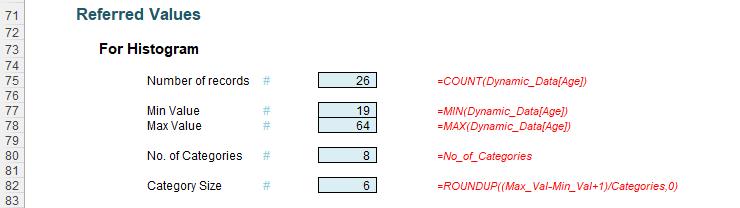
The final intermediate calculation is Category Size, which is the width of each category or bucket. This is defined as:
=ROUNDUP((Max_Val-Min_Val+1)/Categories,0)
This takes the difference between the oldest age (Max_Val) and the youngest age (Min_Val), and adds one [1] as we cannot have a width of zero [0]. We then divide by the number of categories. Since we need the next whole number, we apply the ROUNDUP() function to the result. The result of this calculation is given the defined name Category_Size.
Now we have the intermediate calculations, we can move on to the chart data:
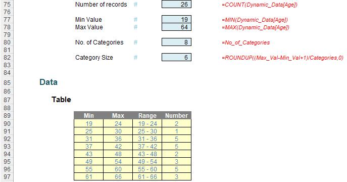
Although this looks like a Table, it has been created using Dynamic Arrays. The number of rows corresponds to the number of categories selected.
The Min column is created by a single formula which calculates the minimum age for each category as an array:
= Min_Val+(SEQUENCE(Categories)-1)*Category_Size
This starts with youngest age and adds the product of the numbers in sequence from zero [0] to one [1] less than the value in Categories, and the width of each column (Category_Size). In this example, Categories is eight [8], so we will have eight [8] rows. SEQUENCE() begins with 1, so by subtracting one [1], this means that the first value in the column is Min_Val.
The formula to create the Max column is similar:
=Min_Val+(SEQUENCE(Categories))*Category_Size-1
This time, we are not subtracting one [1] from the SEQUENCE(Categories) result, so the first row returns the same value as the second value in the Min column. We then subtract one [1] to get the Max. The final value in the Max column is greater than Max_Val so that all values are contained in a bucket.
The Range simply concatenates the values in the Min and Max column so that we have the column labels:
=IF(F90#,F90#&" - "&G90#)
To prevent what Microsoft refers to as coercion (formulae not spilling as intended), it is good practice to check that there is a value in the Min column (identified using F90#). If there is a value, then we concatenate the Min and the Max column values, using a hyphen and a space either side of the hyphen ( - ) as the separator. If there is no value in the Min column, Range would be blank too.
The final column, Number is the number of values in each bucket, and therefore the height of the bar.
=COUNTIFS(Dynamic_Data[Age],">="&F90#,Dynamic_Data[Age],"<="&G90#)
We are counting how many values in the Age column of the data Table Dynamic_Data are in the range between Min and Max. If we look at the ‘Function Arguments’ dialog, we see:
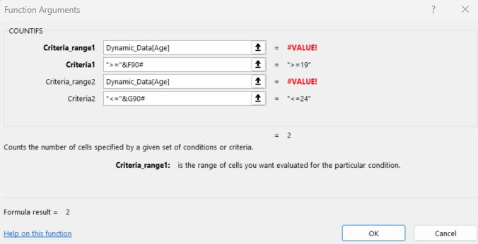
We are counting the number of cells where Dynamic_Data[Age] is :
">="&F90# which evaluates to >=19 (greater than or equal to 19) for the first row in our example
and "<="&G90# which evaluates to <=24 (less than or equal to 24) for the first row in our example.
For the first row, Number will be two [2]. Note that the #VALUE! errors in the ‘Function Arguments’ dialog appear because a full column cannot be shown.
When we apply the formatting for our ‘Table’, this needs to be dynamic too. We have used conditional formatting:
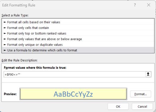
This formatting is only applied if $F90 is populated. Note that the number of the cell is not anchored, so this will apply to any values below $F90 in the range that this applies to. To apply this to the ‘Table’, we apply it to the range $F$90:$I$97, which is the area the table could occupy. Also, do consider the trick where the border is not included for the top of the cell when using it on a list going down a column.
Having explained the chart data, we can select the Range and Number columns and go to ‘Recommended Charts’ on the Insert tab:
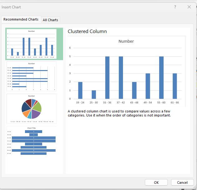
This time, a ‘Clustered Column’ is suggested, and it looks good, so we click OK:
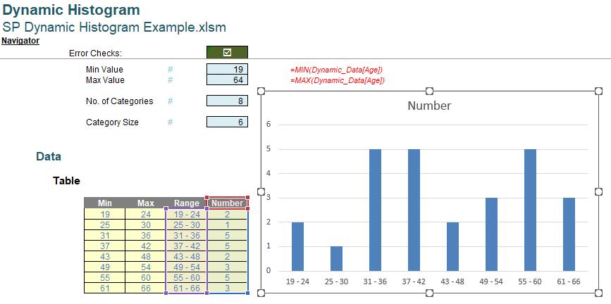
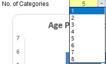
We need to do some tidying up, but first, we should check that this chart is dynamic. We change the No_of_Categories to five [5]:
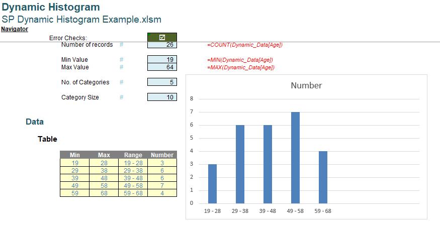
Clearly, we are not quite there yet. When the number of categories changes, we want to our chart to resize automatically. The question is, why when the ‘Table’ is clearly dynamic, is the Chart not reflecting the changes? We have already proved that we can create a dynamic chart from dynamic arrays in Dynamic Arrays in Charts.
Next time, we will look at why our chart is not resizing dynamically.
That’s it for this week, come back next week for more Charts and Dashboards tips.