
Power BI Blog: Presenting Several Measures on a Single Visualisation
26 December 2019
Welcome back to this week’s Power BI blog series. This week, we are going to look at how to toggle between several sets of data more efficiently in a single visualisation.
When putting together dashboards, it is important to present information effectively. For example, let’s say we have the following dataset:
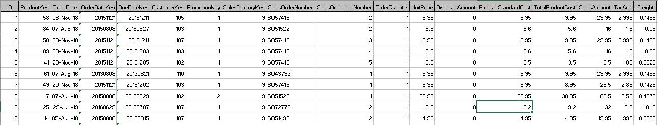
We have the total product cost and sales amount. From this table, we can load it to Power BI and create a simple measure to calculate the profit. After loading the data to Power BI, let’s create several measures:
Total Costs = SUM(Sales[TotalProductCost])
Total Sales = SUM(Sales[SalesAmount])
Profit = [Total Sales]-[Total Costs]
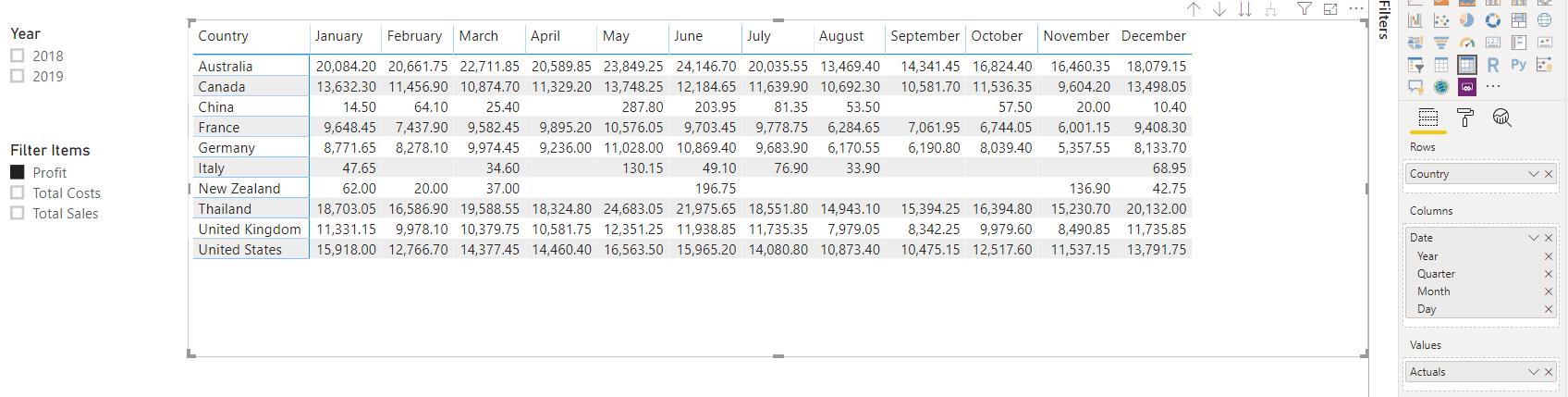
Now, if we create a table to see the breakdown of all three measures over the years by country, we will get something like this:
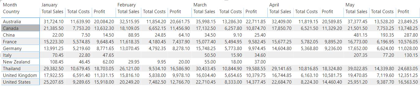
It’s a little clustered and arguably, a little difficult to follow. But what if we could have a single measure display one of the three outputs at a time and have the user pick which one they wish to see using a slicer?
To achieve this, we are going to have to use disconnected tables and the SWITCH function. You can read more about disconnected tables here, and the SWITCH function here.
The first step is to create a table with our slicer values: these are the values that we want our users to be able to pick from.
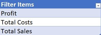
Load that table into Power BI, and create a slicer for Filter Items:
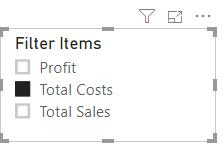
This will not work at the moment, since we have not created our measure that will take the inputs from this slicer and display it on our table.
The next step now is to create the following measure:
Actuals = SWITCH(TRUE(),
SELECTEDVALUE('Filters'[Filter Items])="Profit",[Profit],
SELECTEDVALUE('Filters'[Filter Items])="Total Costs",[Total Costs],
SELECTEDVALUE('Filters'[Filter Items])="Total Sales",[Total Sales],
[Total Sales]
)
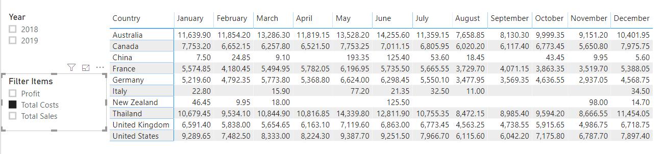
Now, insert the Actuals measure into the Values area of the table:
Toggling between the three options will have our table update accordingly:
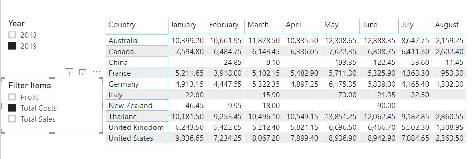
For good measure (!), we may include the Year slicer as well:
There we have it: how to use SWITCH and disconnected tables to toggle between several measures in a single visualisation. This method may be adopted with other visualisations. Of course, we have done something similar with Variables (read more about that here). That method may look ‘cleaner’, however, we thought that we would like to let you know that we did not have to use variables to achieve this effect.
That’s it for this week, come back next week for more Power BI!
In the meantime, please remember we offer training in Power BI which you can find out more about here. If you wish to catch up on past articles, you can find all of our past Power BI blogs here.