
Power BI Blog: Gauge Charts
7 May 2020
Welcome back to this week’s Power BI blog series. This week, we are going to look at a custom visualisation: Gauge Charts.
Over recent blogs, we have been looking at some custom visualisations. This week, we are going to look at the LinearGauge visualisation by xViz. With this visualisation, we were able to illustrate the cumulative total against a ‘goal’ value.
The gauge looks something like this:
Some may view this as similar to a horizontal ‘bullet’ chart.
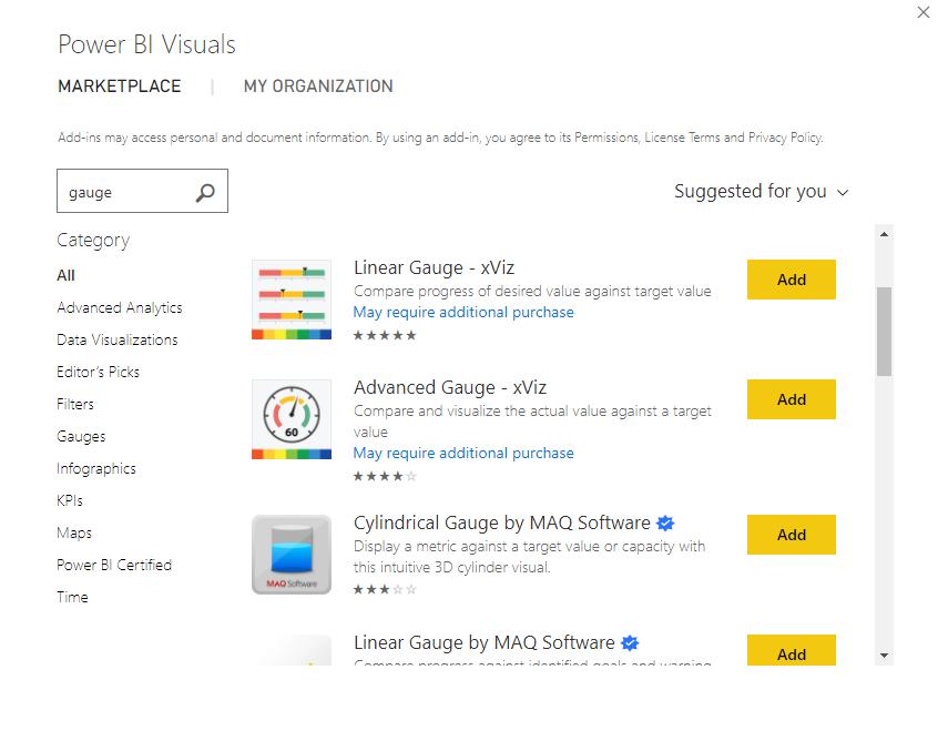
Let’s get into it. The first step is to download the visualisation:
Given the nature of this visualisation, it is often best used to show a cumulative metric such as the cumulative sales, which is what we’ll do here.
Note that we will be building on the same dataset we have used in our previous blogs (e.g. Presenting Several Measures on a Single Visualisation).
To calculate the cumulative total sales, we create the following measure:
Cumulative Total =
CALCULATE(
[Actuals],
FILTER(
ALLSELECTED('Calendar Table'[Date]),
'Calendar Table'[Date] <= MAX('Calendar Table'[Date])
)
)
We can then drag the Cumulative Total measure into the ‘Actual Value’ area of the visualisation:
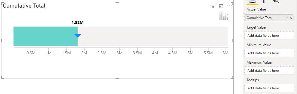
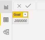
The visualisation has additional areas for the ‘Target Value’, ‘Minimum Value’ and the ‘Maximum Value’. Let’s populate these areas. The next step is to import the target value for the total cumulative sales for this data set. In this case, we used the ‘Enter Data’ option in Power BI to create our ‘Goal’:
We can add this field into to the visualisation as the ‘Target Value’:
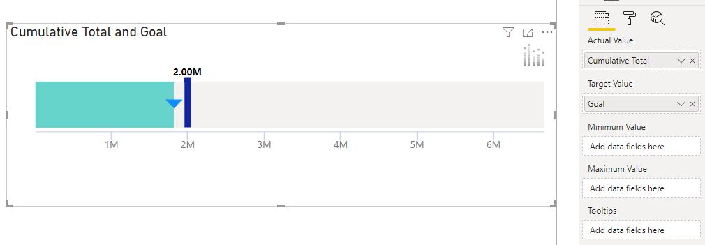
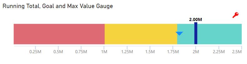
Now we can see a distinct target value. However, any progress seems to be belittled by the scale of the visualisation being set to 7M (million).
We can create a simple measure to set our maximum value based on our goal:
Max Value Gauge = SUM(Goal_Table[Goal])+500000
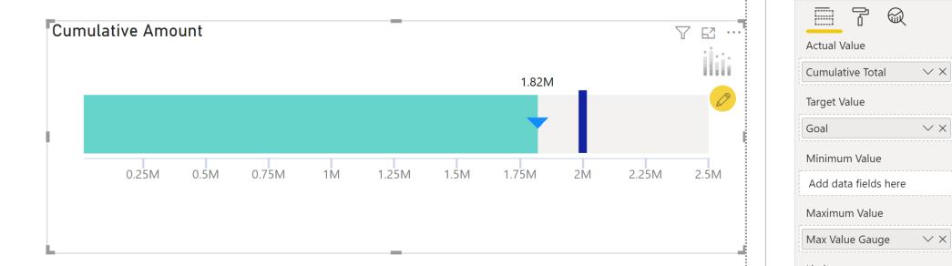
Now we have our maximum value set so our gauge is easier to read. The LinearGauge is a very simple – yet effective – visualisation that you can use to communicate cumulative sums.
That’s it for this week, come back next week for more Power BI!
In the meantime, please remember we offer training in Power BI which you can find out more about here. If you wish to catch up on past articles, you can find all of our past Power BI blogs here.