
Power BI Blog: Displaying Multiple Slicer Selections on Cards
17 September 2020
Welcome back to this week’s edition of the Power BI blog series. This week, we look at how to create a card that displays slicer selections in Power BI.
This week, we are going to continue with last week's report. Just as a quick recap, we created a measure that can sum the top number of cities in our dataset:
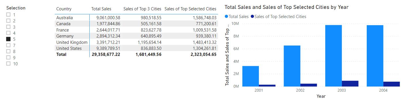
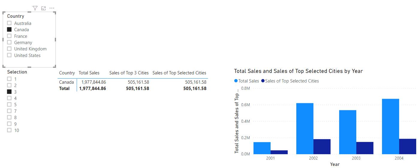
Now that we have that working, we also want to add a slicer for the Country field.
Looking at the report, it is quite difficult to determine which country is selected. Currently the only way to determine which country is filtered is by looking at the slicer visualisation, or the country listed on the table. To make it absolutely clear which country / countries have been selected, we can create a card visualisation that will prominently display the country selection(s) on the top of the report.
For this scenario, we can use the solution in a previous blog, Dynamic Headings Based on Slicer Selection.
Country Selection =
IF(ISFILTERED(Geography[Country]),FIRSTNONBLANK(Geography[Country],1),"All Countries")
Country Selection Concat =
CONCATENATE("Country Selected: ", [Country Selection])
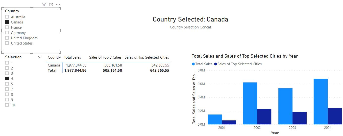
If we place the ‘Country Selection Concat’ measure into a card we get the following result:
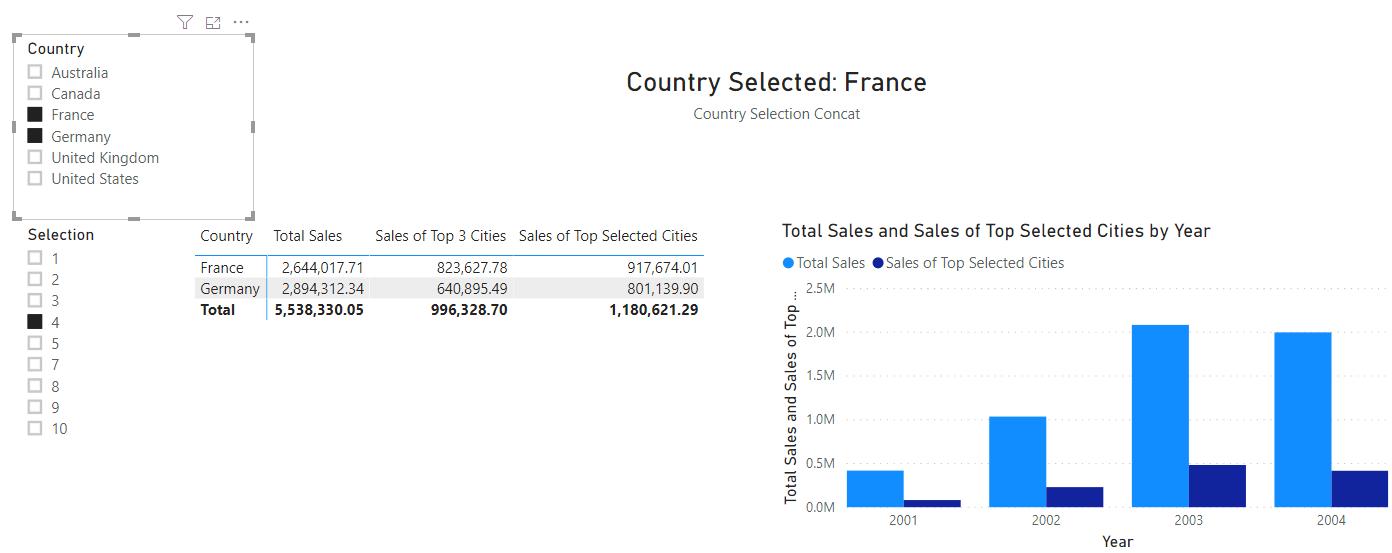
What if we want to select multiple countries? As it stands, the current DAX code does not support this.
To display multiple slicer selections in a single card, we are going to have to use the CONCATENATEX function. The CONCATENATEX function uses the following syntax:
CONCATENATEX(table, expression, [delimiter])
- the table parameter requires a table where the expression will be evaluated
- the expression will be evaluated on each row of the table
- the delimiter parameter is an optional parameter that delineates a separator during concatenation.
We can write the following measure:
List of Countries =
CONCATENATEX(
VALUES(Geography[Country]),
Geography[Country],
", "
)
Feeding that into a card visualisation we get the following result:
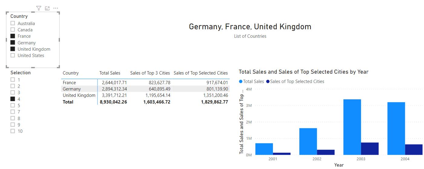
We can now prominently display which countries have been selected from the slicer at the very top of the report.
That’s it for this week! Come back next week for more on Power BI!
In the meantime, please remember we offer training in Power BI which you can find out more about here. If you wish to catch up on past articles, you can find all of our past Power BI blogs here.