
Power BI Blog: Custom Visuals – the Hierarchy Tree Continued
20 February 2020
Welcome back to this week’s Power BI blog series. This week, we take a deeper look at the Hierarchical Variance Tree visualisation.
Last week, we looked at how to create a Hierarchy Tree with a custom visual. This week, we shall look at how to further customise the visual presentation and present more than one field in the value field.
As a quick recap, this is the resulting visual we produced by the end of last week’s blog:
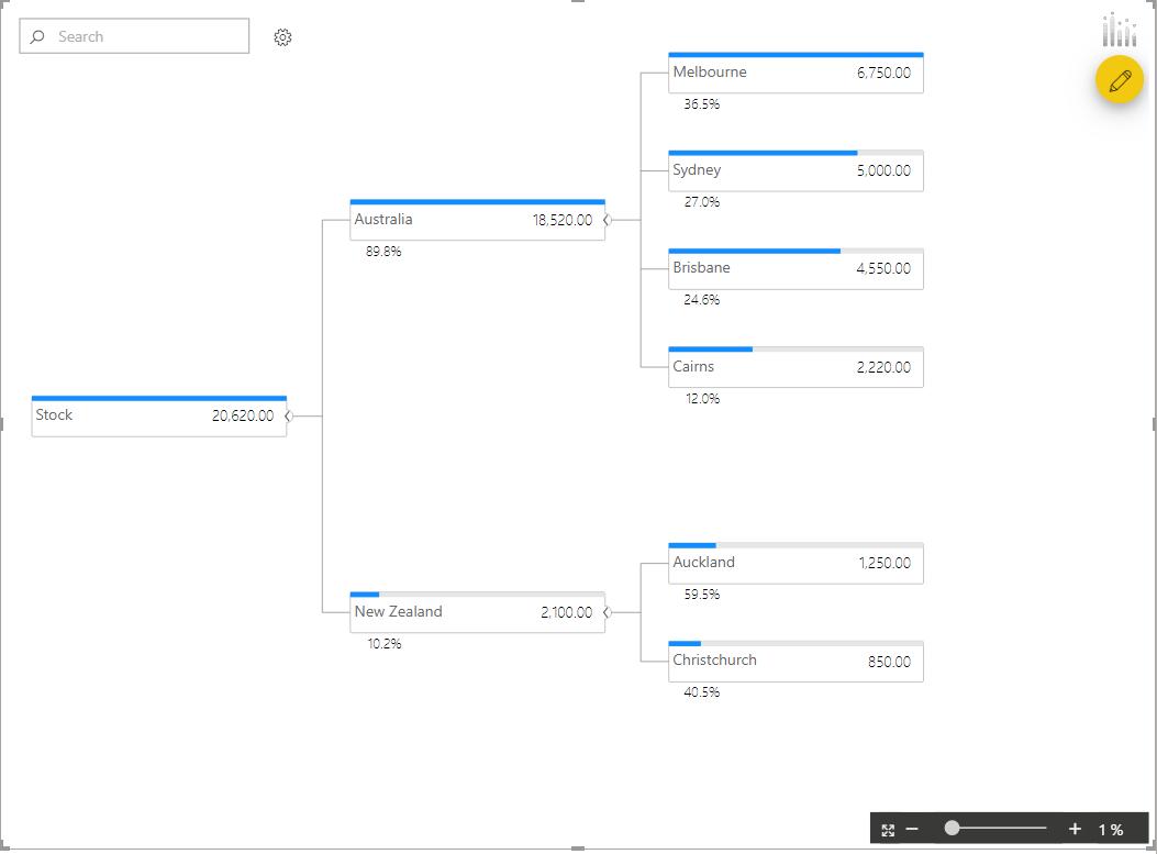
We had the total stock amounts separated into Australia and New Zealand nodes, then had the stock amounts broken down further into city nodes. This visualisation also allows us to compare two fields. Let’s update our original dataset to include budget amounts for our stock values so we may analyse items further:
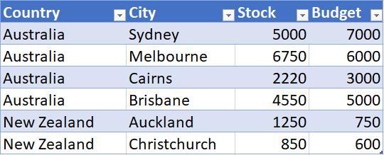
Refreshing the query in the Power BI file will bring in our Budget numbers into our dataset. We can then add the Budget numbers into the Value area of the visualisation.
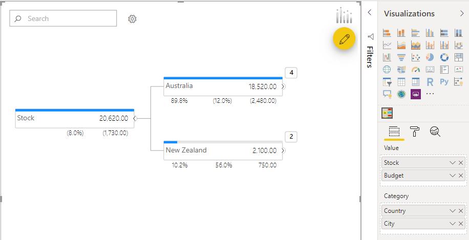
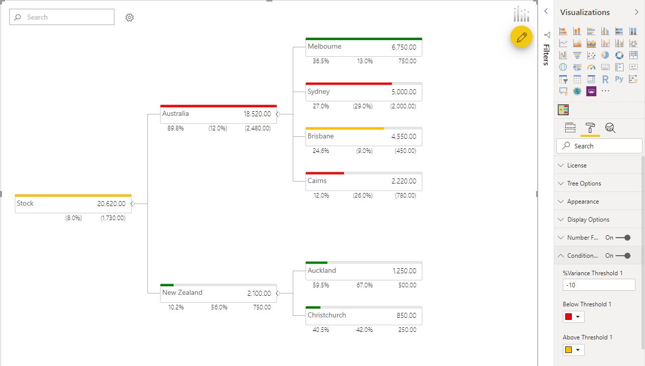
We will see that there are two new numbers below the Australia and New Zealand nodes. The percentage figure represents the percentage difference between the actuals and budget amounts. The second number is the raw number value difference between the stock and budgeted amounts. Both numbers will be displayed in brackets when negative.
We can expand the tree to view the breakdown per city by country:
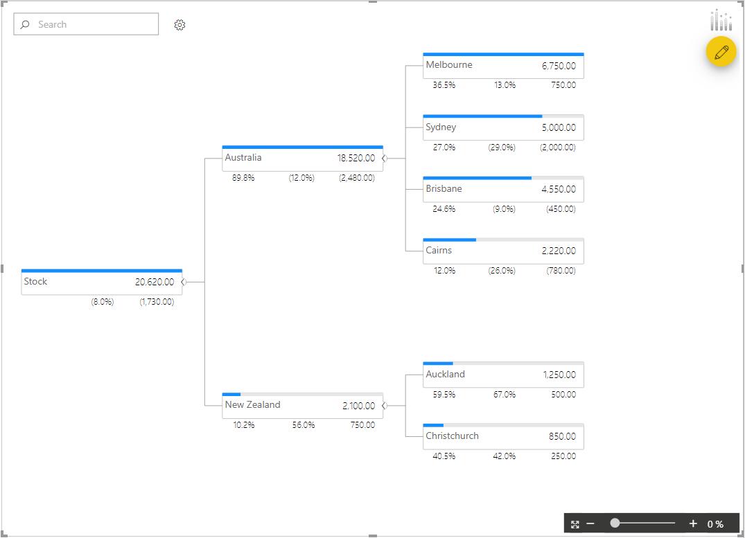
Each of the city nodes now has the percentage and raw number difference between the budget and total stock in each city.
The blue bars ‘Progress Bars’ do not serve much purpose at the moment; we may change them so that the bar will reflect the difference between the stock amounts and the budgeted amounts. To do this, click on the visualisation and navigate to the Format tab, to scroll down to the ‘Conditional Formatting’ option and toggle it to On in the Visualization pane:
Currently, it is colour coded based on how far actual stock values are compared to the budget. We can further customise the ‘Progress Bar’ under the ‘Tree Options’ option. For this example, we have picked the ‘% Variance’ option:
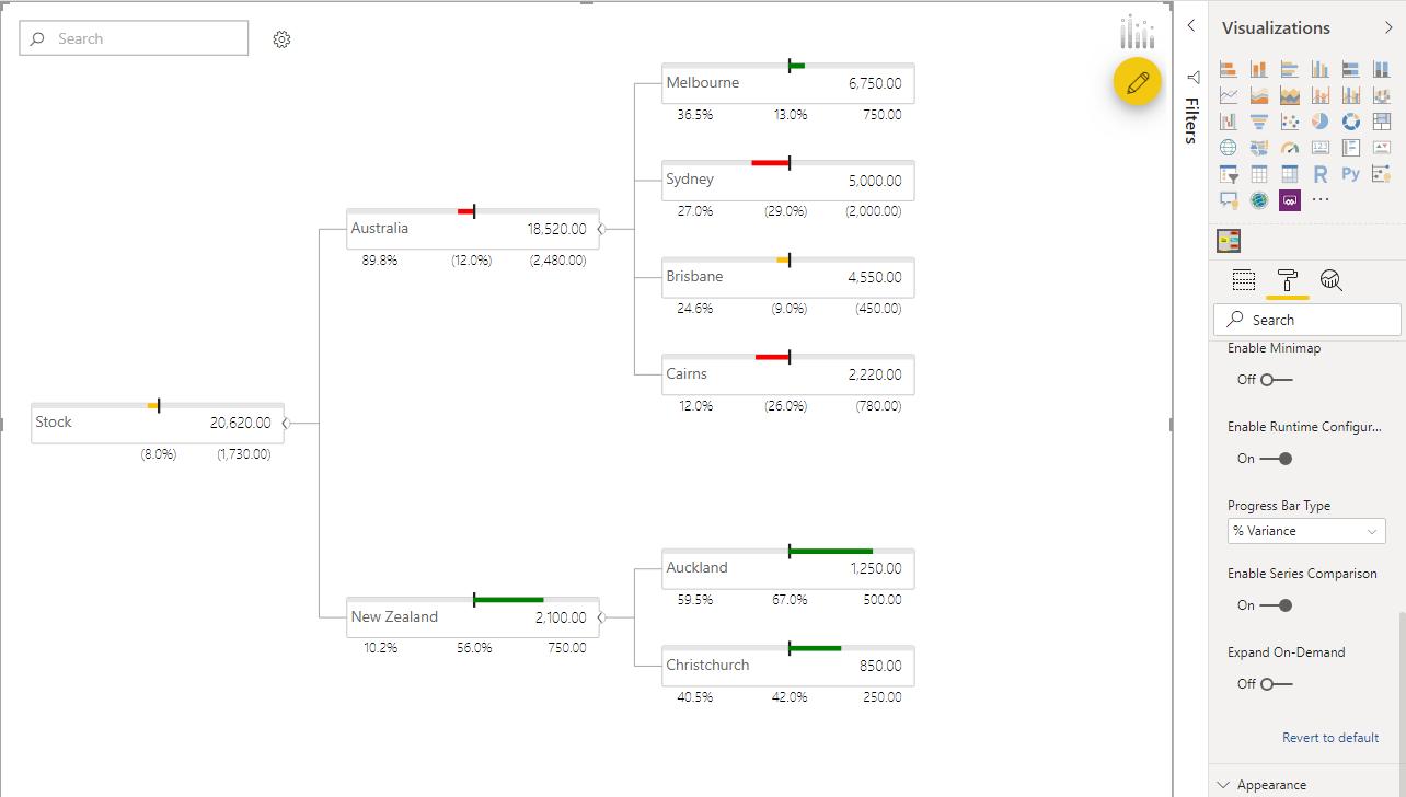
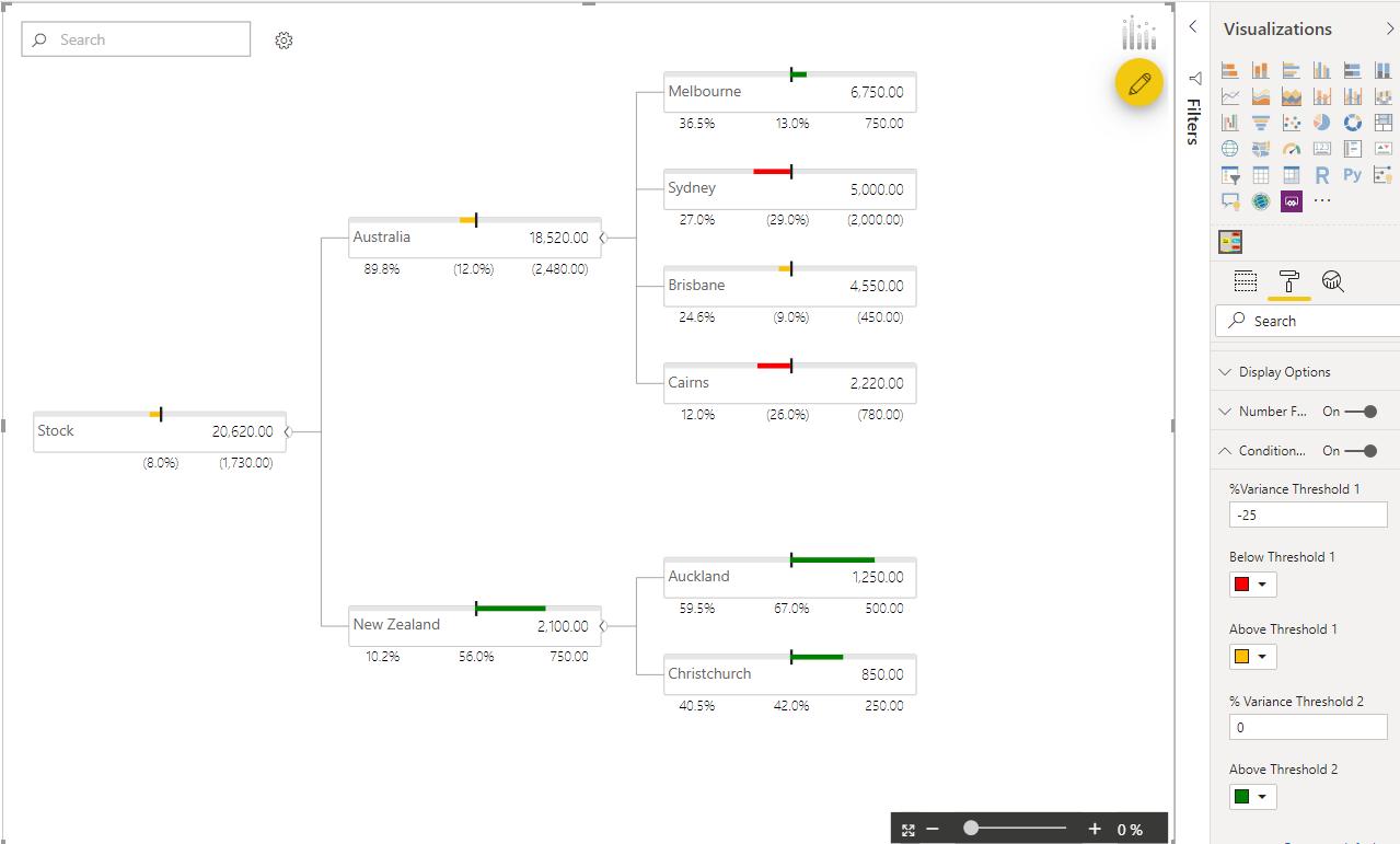
The progress bar area has changed to show the budgeted amount represented by the black bar. The progress bars are displayed directionally in relation to the budget amount to give a visual representation of how the actual stock amounts differ from the budgeted amount. We can alter the conditional formatting threshold in the ‘Conditional Formatting’ option in the Format tab.
That’s it for this week, check back next week for the next week for more Power BI!
In the meantime, please remember we offer training in Power BI which you can find out more about here. If you wish to catch up on past articles, you can find all of our past Power BI blogs here.