
Power BI Blog: Custom Visuals – the Hierarchy Tree
13 February 2020
Welcome back to this week’s Power BI blog series. This week, we take a look at the Hierarchical Variance Tree visualisation.
This week, I am going to look at a custom visualisation called the Hierarchical Variance Tree. This variance tree is useful in cases where you wish to summarise hierarchies and see how individual segments contribute to the parent segment of the data.
Let’s use the following dataset for this example:
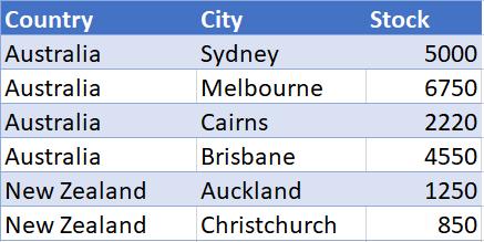
As we can see from the dataset pictured above, we have the breakdown of the inventory stock detailed by city, in Australia and New Zealand. After we bring the data into Power BI, we have to import a custom visual. In this case, we import a custom visual from the Marketplace, viz.
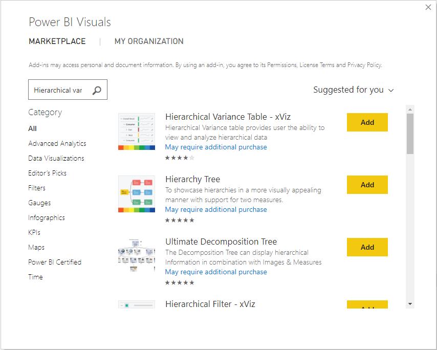
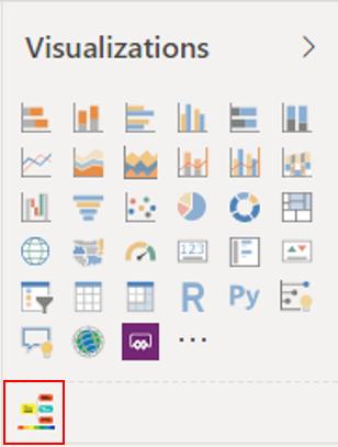
Searching for the Hierarchical Variance Tree returns with several options. We want the second option in this case, namely the ‘Hierarchy Tree’. Once located, we will add the visualisation into our Power BI file. The visualisation will appear under the Visualizations pane:
Creating such a visualisation in our report, we will see three areas where we can insert fields and measures: Value, Category and ‘ToolTip Value’ areas.
Let’s insert the Stock field into the Value area, and the Country field into the Category area:
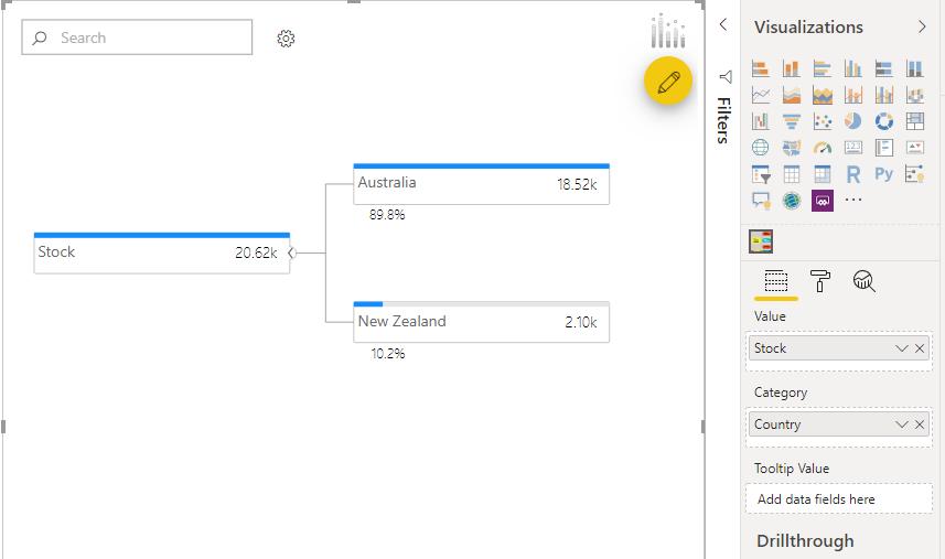
Presently, we have not established any hierarchies within the Category area. Therefore, the visualisation is breaking the data down by country and budget. At this time, we can see that of all our stock (20.62k), 89.8% (18.52k) of our stocks are allocated to Australia and 10.2% (2.10k) is distributed in New Zealand. The visualisation also displays a blue bar meter to illustrate the distribution.
If we insert the City field into the Category area we get the following result:
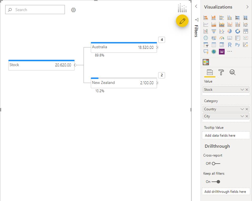
The number '4' in the top right corner of the Australia node indicates the number of cities or child nodes contained within Australia.
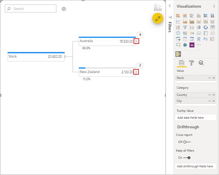
Click on the highlighted small arrows next to each country to expand the tree down to the City level:
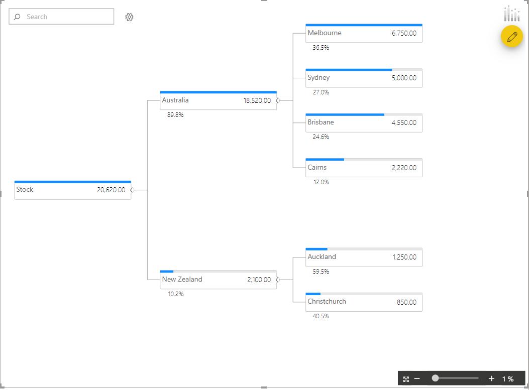
As you can see, the visualisation neatly breaks down the data by hierarchy levels and displays the percentage and raw breakdown of how much each child node (City) contributes to the parent node (Country). Melbourne contributes 36.5% and Sydney contributed 27.0% to the total in stock for Australia.
That’s it for this week, check back next week for the next week for more Power BI!
In the meantime, please remember we offer training in Power BI which you can find out more about here. If you wish to catch up on past articles, you can find all of our past Power BI blogs here.