Power BI Blog: Maximum and Minimum Points on a Line Chart
22 April 2021
Welcome back to this week’s edition of the Power BI blog series. This week, we will build on last week by looking at how to plot maximum and minimum points on a line chart.
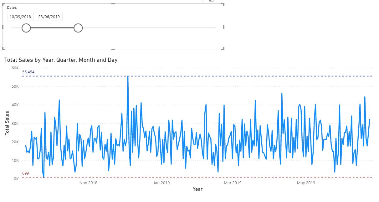
Let’s take a look at an example of a line chart:

Yes, it is the same chart from last week. Just a refresher, this line chart displays the Sales over the first half of 2019. We then created a chart that looked like this:

This chart had lines that highlighted the minimum and maximum ranges of data. However, what if we wanted something more subtle, such as two points in the dataset to highlight both the maximum and minimum points?
If we want to highlight the maximum and minimum points in this chart, we need to write the following measures.
To get the maximum point, I can write the following measure, Max Point:
Max Point =
IF(
MAXX(
ALLSELECTED(CalendarTable[Dates]),
[Total Sales])=[Total Sales],
MAXX(
ALLSELECTED(CalendarTable[Dates]),
[Total Sales]),
BLANK()
)
To get the minimum point, I can similarly write the following measure, Min Point:
Min Point =
IF(
MINX(
ALLSELECTED(CalendarTable[Dates]),
[Total Sales])=[Total Sales],
MINX(
ALLSELECTED(CalendarTable[Dates]),
[Total Sales]),
BLANK()
)
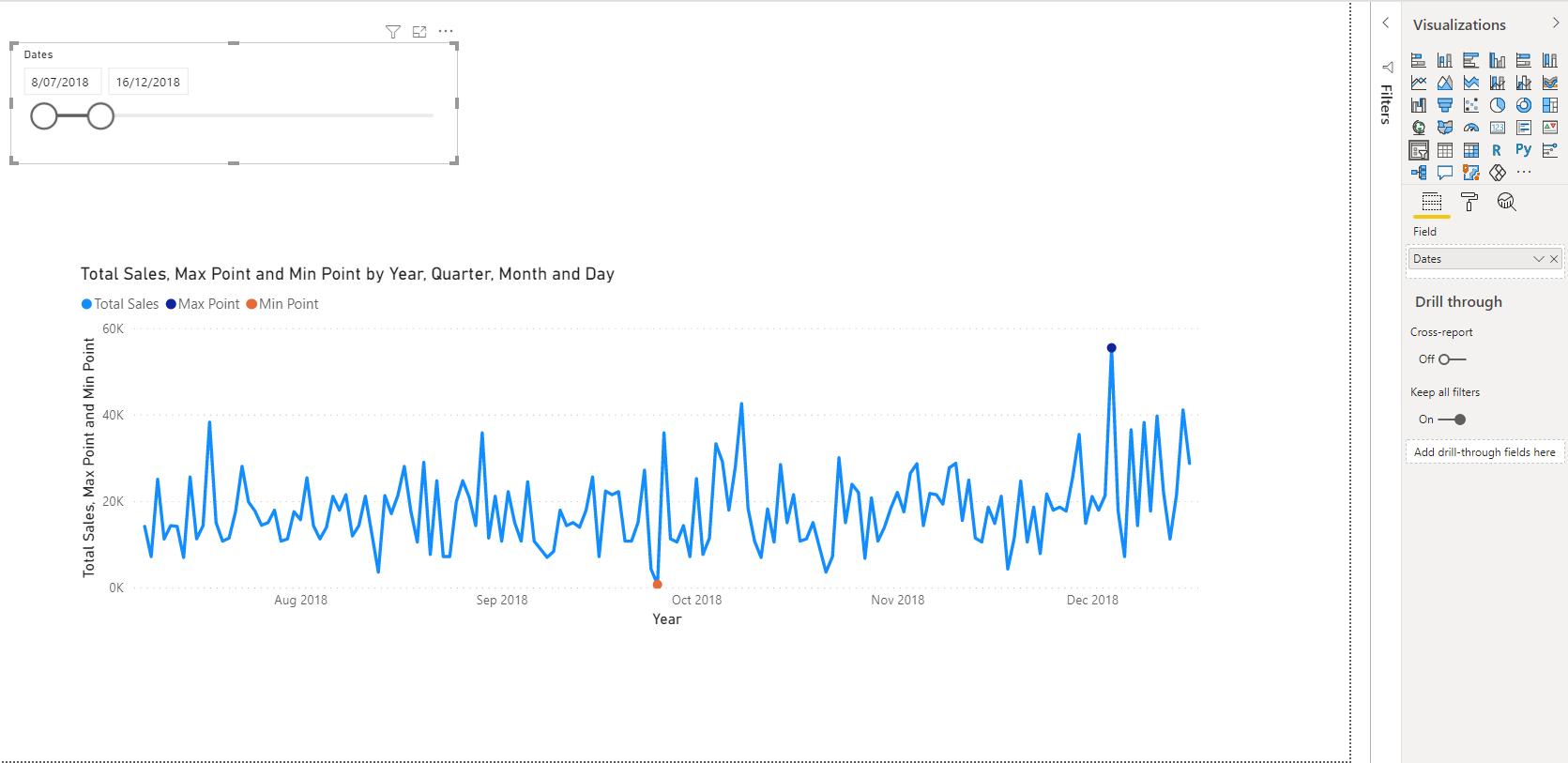
These two measures will display on my visual as follows:
The max and min point represented by the dots on the visual give us the desired solution. Just like the lines in the last blog, these points will shift around to highlight the highest and lowest points in our sales data based upon the slicer selection:

Voila! It works. Use this trick to identify and visualise Maximum and Minimum points on any line chart.
That’s it for this week! A quick and easy guide on how to add minimum and maximum lines to the Line Chart visualisation in Power BI. Join us next week for more on Power BI.
In the meantime, please remember we offer training in Power BI which you can find out more about here. If you wish to catch up on past articles, you can find all of our past Power BI blogs here.

