
Power BI Blog: Different Coloured Columns in a Stacked Column Chart
4 March 2021
Welcome back to this week’s edition of the Power BI blog series. This week, we will expand on the last week’s blog, this time with different coloured stacked column charts.
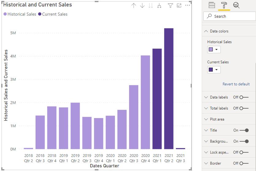
Last week we created the following chart, whereby the current year’s data is coloured differently to the historical data:
This works fine for that particular case. However, what if we also wanted to see the product category breakdown, say, in a stacked column chart?

As it stands, we are unable to include the Product Category field in the Legend if we have more than one field in the Values area. The solution here would be to create a new Product Category field that will not only distinguish between the products, but also between the years.
There is one hurdle. The Sales table, where the SalesAmount field is located, does not have the Product Category in it. The Product Category field is located in the ProductList table. Fortunately, we can create a relationship between the two tables using the ProductKey as the common key. You can read more about creating relationships here.

With that borne in mind, we can create some related columns in the Sales table. Navigating to the Data view of the report, we can create a custom column called Product Category with the following code:
Product Category = RELATED(ProductList[Product Category])
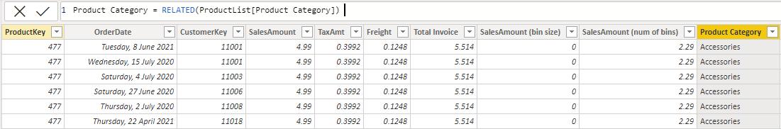
I have used the RELATED function to create a column that populates each row with the corresponding product category, similar to VLOOKUP, or INDEX and MATCH. You can read more about the RELATED function here.
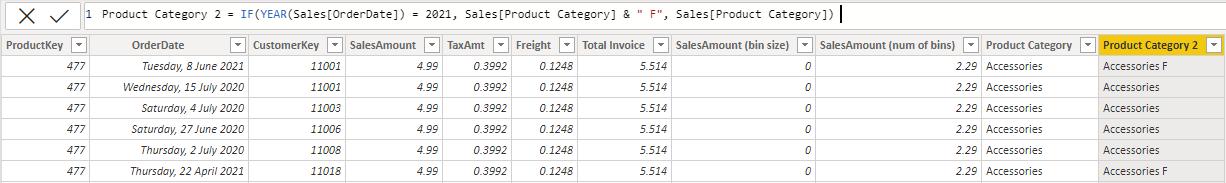
The next step is to create the conditional column that will consider the year. This is performed with the following code:
Product Category 2 = IF(YEAR(Sales[OrderDate]) = 2021, Sales[Product Category] & " F", Sales[Product Category])
Going back to the Report view, I can use Product Category 2 as the legend:

We can make some adjustments in the colours in the ‘Data colors’ option in the Format tab:

That’s it for this week! A quick and simple way to colour different columns in your stacked columns charts in Power BI, while factoring in different product types. Join us next week for more on Power BI.
In the meantime, please remember we offer training in Power BI which you can find out more about here. If you wish to catch up on past articles, you can find all of our past Power BI blogs here.