
Charts and Dashboards: Working Capital Adjustment Chart in Detail – Part 3
16 June 2023
Welcome back to this week’s Charts and Dashboards blog series. This week, we continue to explain how to create a Working Capital Adjustment Chart by looking at how we create the final section of chart data.
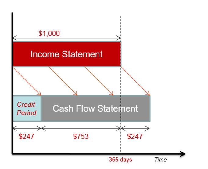
When modelling working capital adjustments, a chart is useful to help us visualise the cash flow figures against existing profit and loss projections. We looked at an overview of this in Working Capital Adjustment Chart, and we are returning to the topic by popular demand to look in more detail at the data behind the chart.
We will look at how we can take the following data:
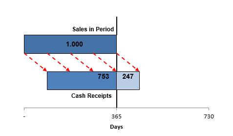
and create a dynamic chart like this:
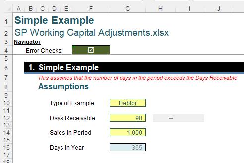
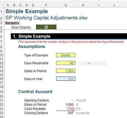
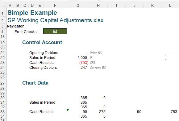
Last time, we created a ‘Control Account’:
This time, we will create the final section of ‘Chart Data’:
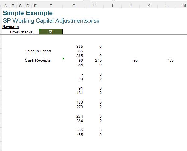
Note that the formatting of the cells in column G has been customised in the same way as the ‘Control Account’ section.
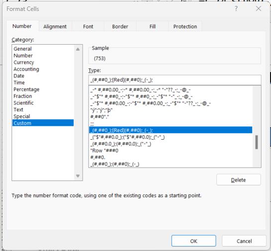
The format code is:
_(#,##0_);[Red](#,##0);_(-_);
This means that positive numbers will have no decimal places, negative numbers will be red with no decimal places and brackets, and zero [0], will be a hyphen. Finally, any text entered will not be shown. The underscores followed by a bracket [“_(” and “_)”] ensure all figures will align, by leaving space for a bracket.
Cells G30, G31 and G32point to the Days_in_Year defined name, therefore they all have the value 365. The label in cell D31 points to cell D22 and the label in cell D33 points to cell D23 and therefore have the values ‘Sales in Period’ and ‘Cash Receipts’ respectively:
Row 33 has four [4] values which help us to construct the chart. Cell G33 (‘Cash Receipts’ row) has the formula:
=IF(G22,G24/G22*Days_in_Year,)
In our example, this gives us the ‘Closing Debtors’ amount (currently 247) divided by the ‘Sales in Period’ (1000), which would be 0.247, and then multiplied by the Days_in_Year, giving us 90 (remembering we are not showing decimal places) for our example. Since we are dividing by cell G22, we check it is not zero [0] before we do the calculation. Note that cells J33 and G37 point to cell G33, and so contain the same value (90).
Cell H33 is given by the formula:
=Days_in_Year-G33
Which, for our example, gives us a value of 275. We also include the positive value of the ‘Cash Receipts’ in the same row in cell L33.
Cell G36 is populated with zero [0], which appears as a hyphen [-].
Cell G39 has the formula:
=Days_in_Year/4
If Days_in_Year has been input as 365, this will be 91 (with no decimal places).
G40 is the sum of G37 and G39, which in our example is 181 (90 + 91).
Cell G42 has the formula:
=Days_in_Year/2
With no decimal places shown, this is 183.
For the remaining values in column G, the day calculations are as follows:
- G43=G42+G37 (183 + 90 = 273)
- G45=G39+G42 (183 + 91 = 274)
- G46=G45+G37 (274 + 90 = 364)
- G48 = Days_in_Year (365)
- G49=G48+G37 (365 + 90 = 455)
In Column H, we have added hard-coded values in the cells to create the arrows on the chart as follows:
- H30, H32 and H34 are zero [0]
- H36, H39, H42, H45 and H48 are three [3]
- H37, H40, H43, H46 and H49 are two [2]
Next time, we will use this data to create our chart.
That’s it for this week. Check back next week for more Charts and Dashboards tips.