
Charts and Dashboards: Working Capital Adjustment Chart in Detail – Part 1
2 June 2023
Welcome back to this week’s Charts and Dashboards blog series. This week, we start to explain how to create a Working Capital Adjustment Chart by looking at how we manage the input data.
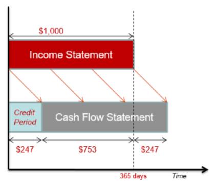
When modelling working capital adjustments, a chart is useful to help us visualise the cash flow figures against existing profit and loss projections. We looked at an overview of this in Working Capital Adjustment Chart, and we are returning to the topic by popular demand to look in more detail at the data behind the chart.
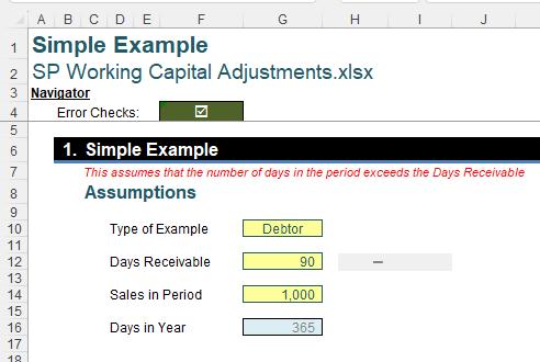
We will look at how we can take the following data:
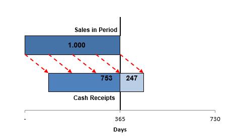
and create a dynamic chart like this:
To begin with, lets look at our ‘Simple Example’ in more detail.
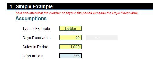
Note that we are assuming that the number of days in the period exceeds the value which is currently labelled as ‘Days Receivable’. In this example, this will always be the case, since we are using the ‘Days in Year’ as the number of days in the period.
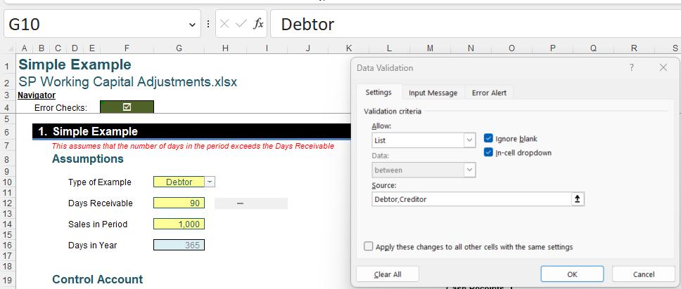
The ‘Type of Example’ is a dropdown, where we can choose a Debtor or a Creditor:
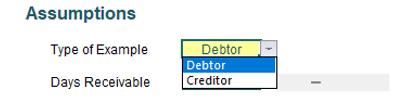
We have set this up using ‘Data Validation’ (available on the Data tab), and created a small list:
The label for the next input field in cell D12 is then constructed as a concatenation:
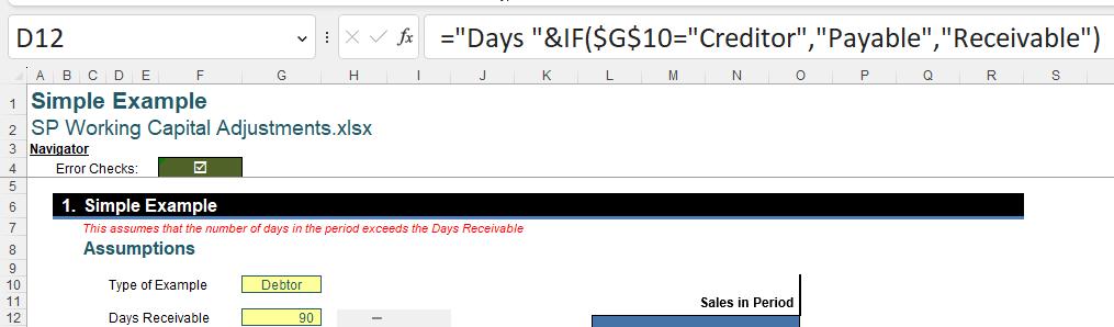
The formula in cell D12 is :
="Days "&IF($G$10="Creditor","Payable","Receivable")
The output will be ‘Days Receivable’ if cell $G$10 is not ‘Creditor’ and ‘Days Payable’ if cell $G$10 is ‘Creditor’.
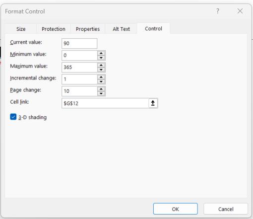
Note that the value in cell G12 can be adjusted using a scrollbar:

We
created the scroll bar, using the Form Controls options, which can be accessed
from the Insert dropdown on the Developer tab (if you do not have this tab,
simply add it back using File -> Options). We chose the ‘Scroll Bar’ icon.
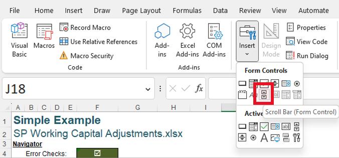
We opted to draw the scroll bar box to the right of cell G12. We could then right-click on the scroll bar box, choose ‘Format Control’ and link it to cell G12, thereby adjusting the value in this cell as we drag along the scroll bar.
The next label, in cell D14, is also created using a formula:
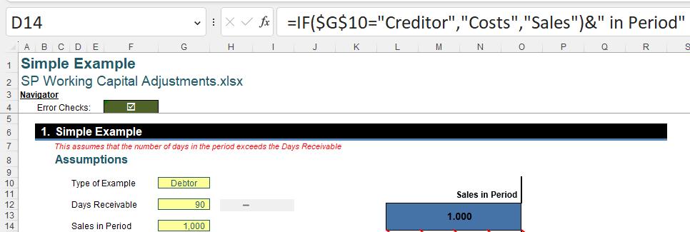
The formula for cell D14 is:
=IF($G$10="Creditor","Costs","Sales")&" in Period"
The output will be ‘Sales in Period’ if the value in cell $G$10 is not ‘Creditor’, and ‘Costs in Period’ if the value in cell $G$10 is ‘Creditor’.
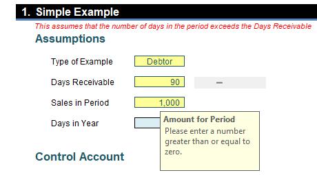
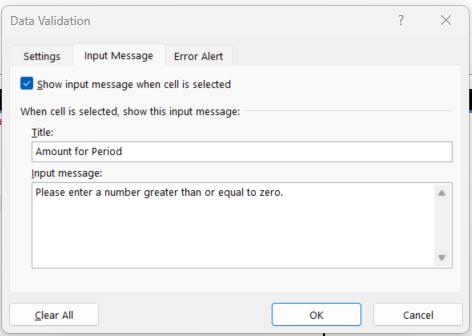
When the user chooses cell G14 a note appears:
This has been created using ‘Data Validation’:
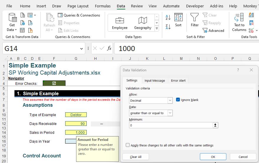
A decimal value greater than zero [0] must be entered, and we have specified the ‘Input Message’:
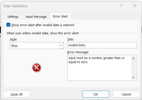
We have also created an ‘Error Alert’:
The final assumption for our chart is ‘Days in Year’in cell G16:
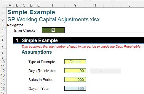
This value is not formatted as an input field, as we would not expect the user to need to change it.
Next time, we will look at the preparation of the data that is required in order to create the Working Capital Adjustment chart.
That’s it for this week. Check back next week for more Charts and Dashboards tips.