
Charts and Dashboards: The Waffle Chart
17 February 2023
Welcome back to our Charts and Dashboards blog series. This week, we’re going to look at how to make a Waffle chart.
The Waffle chart
If you are looking for a way to present your data to the hungry customer, you might want to consider the Waffle chart. It (sort of!) looks like a square waffle:
You can download the Excel file here to build this chart.
Our Excel file contains two [2] sheets, one named ‘Simple Waffle Chart’ and the other ‘Stacked Waffle Chart’. First, we will illustrate our example in the ‘Simple Waffle Chart’ sheet.
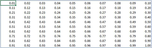
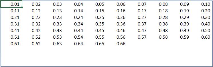
To start off we will create a table where it contains 1% to 100%. This task can be easily achieved by using the SEQUENCE function:
=SEQUENCE(10,10,0.01,0.01)
This function will create a 10 x 10 matrix and starting from 1% and increasing by 0.01 (i.e. 1%) for every cell it populates:
Then we will create an assumption cell nearby to input the percentage we want to display:
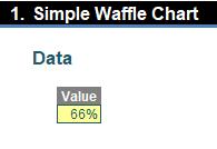
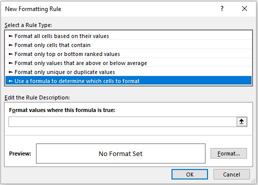
In this example, we will choose 66%. Then we apply conditional formatting (ALT + O + D or Home -> Conditional Formatting -> New Rule…) to this range:
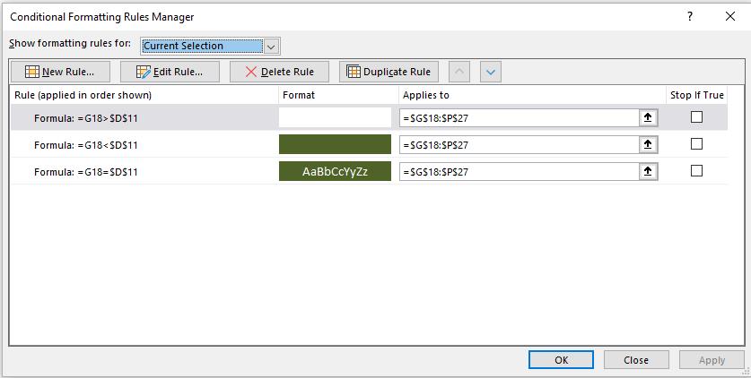
The assumption cell we have is in cell D11 and the 10 x 10 matrix is in cells G18:P27. We will use the ‘Use a formula to determine which cells to format’, viz.
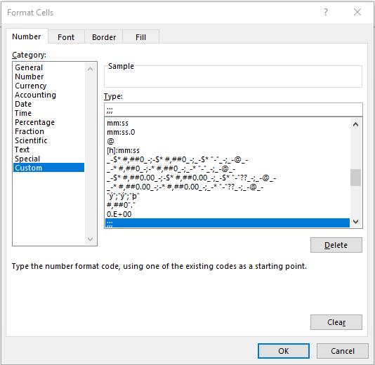
Then we enter the formula and the format we want here. Firstly, we want to hide any number that is higher than 66% which we use the following formula to determine:
=G18>$D$11
For the format, we will enter three [3] semicolons for the number format. This will make our text invisible:
Then we apply this rule to the cell which will give use the following:
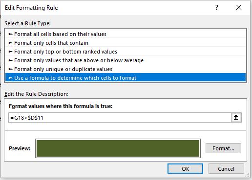
Next, we will create the green shade for all data that is less than 66% which we also use Conditional Formatting:
You should perform the same process here for number formatting and fill in the colour you want here. You can do formatting for the border colour here but in this example, we will not use Conditional Formatting for the border. For areas that equal 66%, we will use the following conditional formatting which we use percentage for our number formatting, white font and fill the same colour we have for the area under 66%. This will provide us with the following visual:
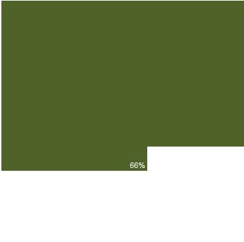
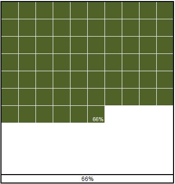
Then we select the whole matrix and add a bit of border formatting for this chart we will have the following visual:
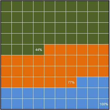
Using the same logic from this simple Waffle Chart we can create the Stacked Waffle Chart using a bit trickier conditional formatting here (always remember to highlight the entire range and write all formulae as if you were in the cell in the top left hand corner of the range that is to be copied across and down):
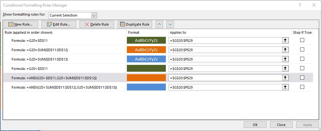
Cell D11:D13 is our input cells and G20:P29 is our 10 x 10 matrix. If we fill out all conditional formatting here correctly, we will have the following visual:

The Waffle is prepared; should you wish to have the chart in reverse (as in the second style displayed in the attached Excel file), you simply need to reorder the sequencing.
That’s it for this week, come back next week for more Charts and Dashboards tips.