
Charts and Dashboards: The Triangular Distribution Chart
15 September 2023
Welcome back to this week’s Charts and Dashboards blog series. This week, we explain how to create a Triangular Distribution Chart
The Triangular distribution is a simple and versatile tool to use for modelling uncertainty. With three [3] data points, we are able to start probabilistic analysis, these are: the minimum, the maximum and the most likely (the mode).
You can find our Excel file here, which allows you to plot the probability density of a triangular distribution at your chosen parameters.
Three-Point Estimation
When modelling a quantity with limited data available, we have the Triangular distribution.
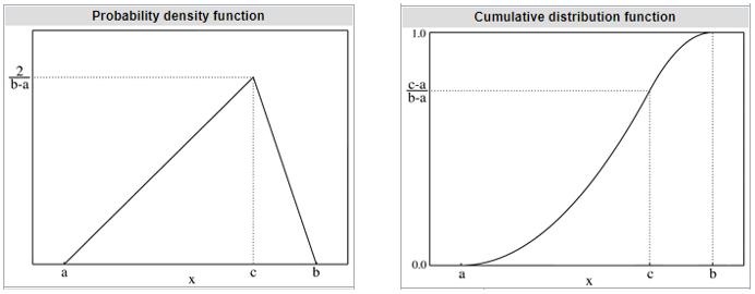
With this one-peak mountain shape (unimodal), the Triangular distribution might remind you of the famous Bell curve, or the Normal distribution. The Normal distribution is a well-developed probability distribution, used widely in statistical analysis and data science. It has two [2] parameters: the average and the standard deviation. However, to fit a Normal distribution on data, we need a sample that is large enough (>30), which might not be realistic when we want to make a quick decision based on limited information. In comparison, the Triangular distribution has a similar shape, whilst requiring only three [3] data points:
- the minimum value
- the maximum value
- the mode, namely the most probable value.
Then we can uniquely identify the distribution, since, as we all know, those three [3] points define a triangle. We can also work out height of the triangle using geometry:
Height = 2 × 100% / Base
where
Base = max – min
and 100% is the total probability underneath the curve.
This simple geometry of the triangle is also useful when we want to consider only parts of the possibilities, instead of 100%. For example, instead of the minimum and maximum values (of sales, or profit, etc.), we can ask the questions:
- What is the number you expect to beat nine [9] times out of 10?
- What is the number you don’t expect to beat nine [9] times out of 10?
The former is smaller than 90% of all possible numbers, and the latter is larger than 90% of all possible numbers. Then the overlapping probability in between, 80%, becomes area of the triangle. We can work out height of this triangle similarly:
Height = 2 × 80% / Base
Of course, this value of 80% may be replaced by any variable amount greater than zero [0%] and less than or equal to one [100%].
Modelling the Triangle Distribution in Excel
Given coordinates of the triangle’s three [3] vertices, we can solve for other points on the probability curve. Let’s have a look at how to model that in Excel. You can download our Excel file with this link.
We first have the minimum and the maximum as the base vertices of the triangle, and they have zero [0] vertical coordinates since the possibility of having a number smaller than the minimum is assumed to be zero [0] and likewise for the maximum.
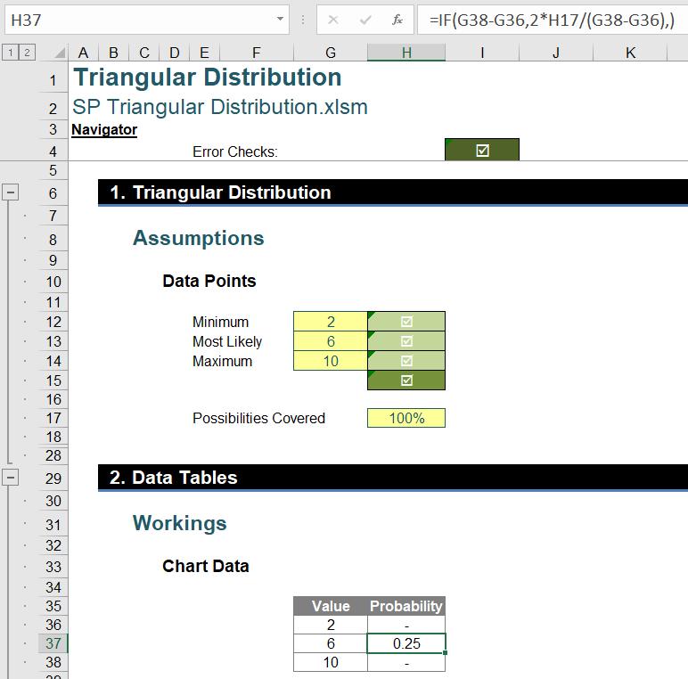
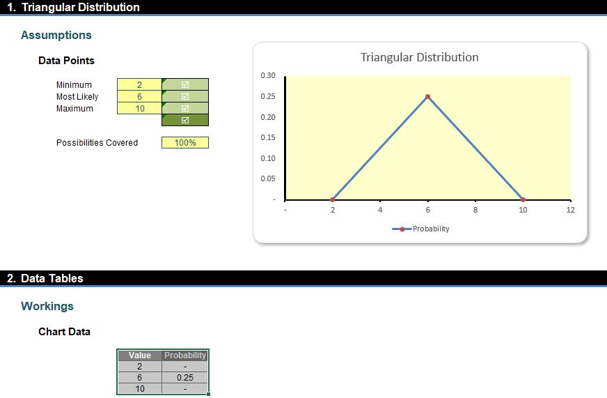
First, given the minimum, the maximum and the most likely, we can calculate the height of the triangle, which will also be the coordinate of the triangle’s top vertex:
=IF(G38-G36, 2 * H17 / (G38-G36), )
We used an error trap here to avoid #DIV/0! errors. When the base (G38-G36) is zero [0], the formula doesn’t calculate the division and only outputs zero [0]. Then, we may select columns Value and Probability and create a chart using Insert -> Charts -> Scatter with Straight Lines and Markers.
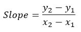
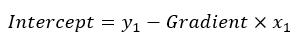
We can then calculate the slopes of the triangle’s edges by using the equation:
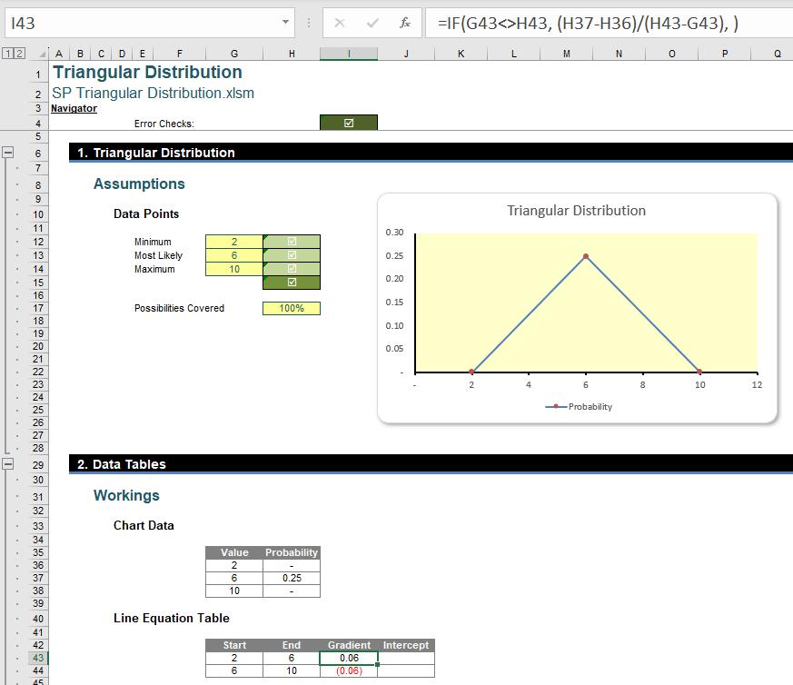
Here, we divide the difference of the vertical coordinates (H37-H36) by the difference of the horizontal coordinates (H43-G43), and we use an error trap to avoid #DIV/0! errors. We can finish by calculating the intercept points with this equation:
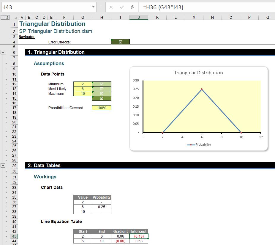
Now, we can calculate the probability of any points on the triangle.
We use the number seven [7] as an example here. We can calculate its probability by using the following formula
=IF(AND(G20>=G12,G20<=G13), I43*G20+J43, IF(AND(G20>=G13, G20<=G14), I44*G20+J44, ))
where we first check whether the number is on the left edge (G20>=G12 and G20<=G13) or on the right edge (G20>=G13 and G20<=G14), and then we use the corresponding line equation to calculate the intersection points with the triangle.
To plot a value point on the triangle, we can insert another Scatter chart and copy. First, we need to build columns of coordinates for plotting.
Excel connects points in a Scatter chart following the order as listed in the columns, so modellers need to be careful with this order to produce the visualisations they want. In the above example, we list coordinates for the y-axis marker, the probability point, and the x-axis marker. Here, we hardcoded a zero [0] x-coordinate for the marker on the y-axis (cell J36), and a zero [0] y-coordinate for the x-axis marker (cell K38). For other coordinate values we use the following formula to control input:
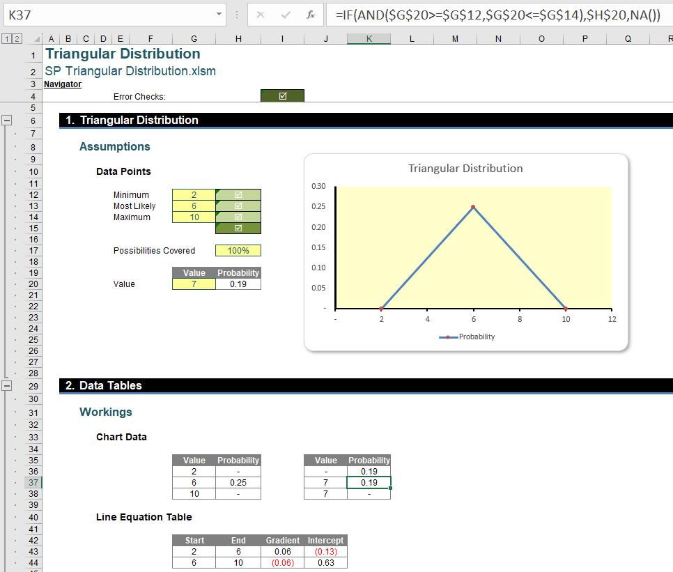
=IF(AND($G$20>=$G$12, $G$20<=$G$14), $H$20, NA())
where we check if the point is between the minimum and the maximum, and output #N/A otherwise. Any #N/A values will be treated as zeros in the Scatter chart. It is often – but not always – good practice to use #N/A values rather than zero values in a chart in case of a chart being continuous, or else may be switched to a continuous display such as a Line chart.
Next, by selecting these two [2] columns we can insert another Scatter chart:

Lastly, we can copy the lines to the original plot and format them to appear as assisting dotted lines:
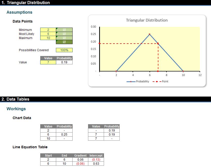
Now we have the model, we can calculate any points on the “triangle curve”.
That’s it for this week. Check back next week for more Charts and Dashboards tips.