
Charts and Dashboards: The Risk Bubble Chart – Part 4
10 February 2023
Welcome back to our Charts and Dashboards blog series. This week, we’re going to finalise our Risk Bubble chart.
The Risk Bubble Chart
In Part 1, we set out the headings and shape for our chart:
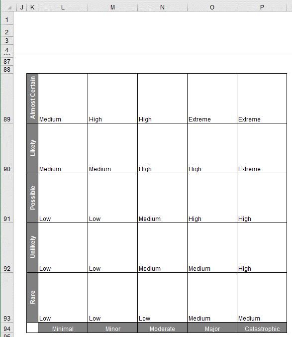
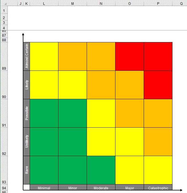
In Part 2, we coloured our risk table:
In Part 3, we prepared the data needed to create the bubbles for our chart:
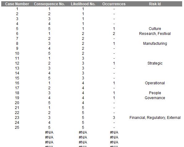
This time, we can plot our Bubble chart and finalise our Risk Bubble chart. We select the Consequence No., Likelihood No. and the Occurrences columns without the headers. Then we go to Insert -> Charts -> Scatter -> 3-D Bubble:
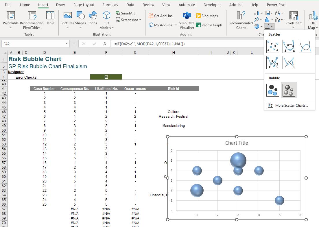
This will give us our Bubble chart:
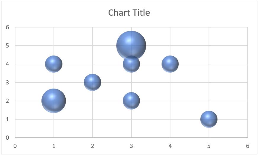
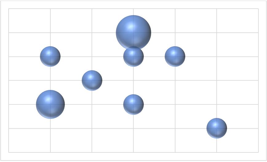
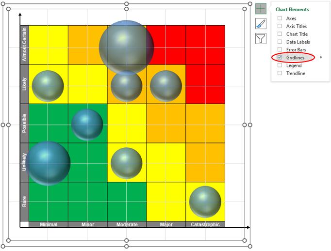
Let’s remove few elements of the chart that we don’t need here:
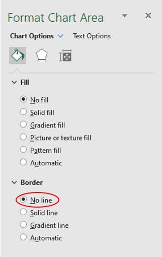
We set the ‘Chart Area’ to ‘No Fill’, which will make our chart appear transparent. Then, we place this chart on top of the risk table we created earlier:
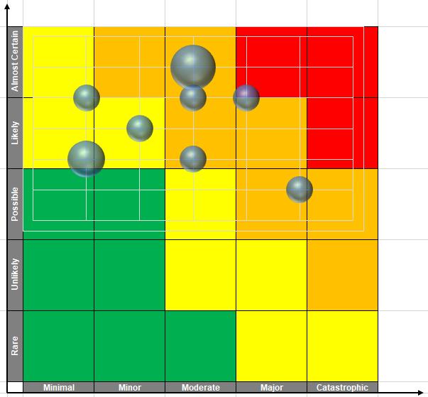
Care is now required to resize the chart so that it will fit the risk table precisely:
We then remove the Gridlines (either View -> Gridlines or the keyboard shortcut ALT + W + VG) from the chart:
and the border as well:
With this all completed, we may then double-click on the bubble(s). This will give us the following box:
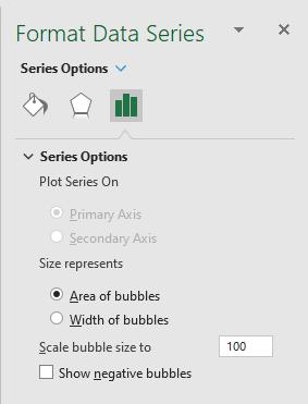
In the ‘Scale bubble size to’ we can set equal to 75, which will provide a nice visual here:
The last step here will be to name the bubbles. We click on the chart and press the plus button on the ‘Data Labels’ row select the black triangle and select the ‘More Options…’:
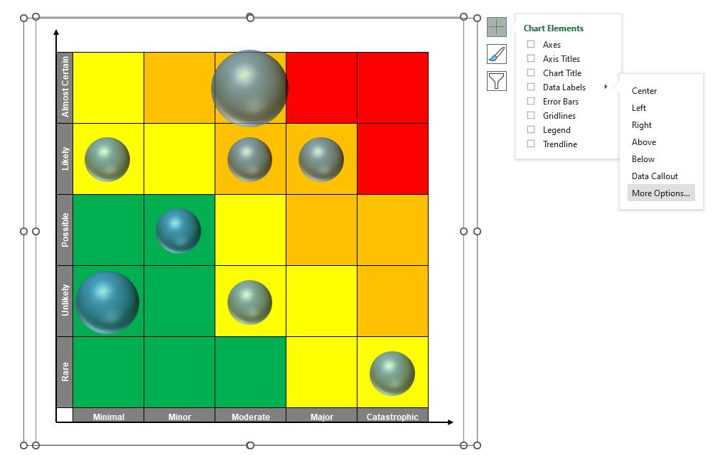
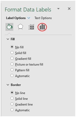
This will open the following ‘Format Data Labels’ pane, where we may select the ‘Label Options’:
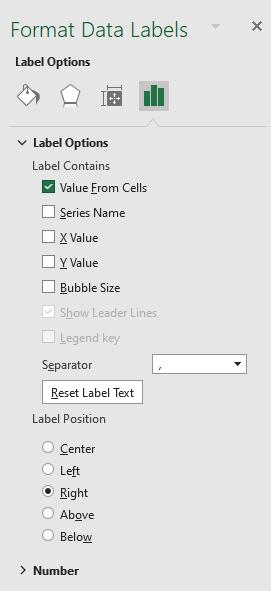
We will untick all the ‘Label Contains’ option that are available here and tick ‘Value From Cells’:
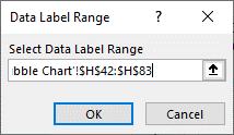
The ‘Data Label Range’ dialog box will appear:
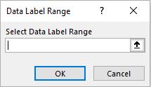
We select our Risk Id column here:
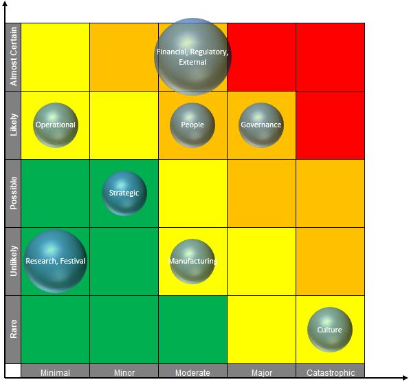
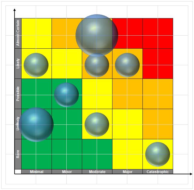
This will ensure that the name of the bubble will be updated together with our table. After repositioning our labels to be in the centre of our data points, and changing the font colour to white, we will have the following:

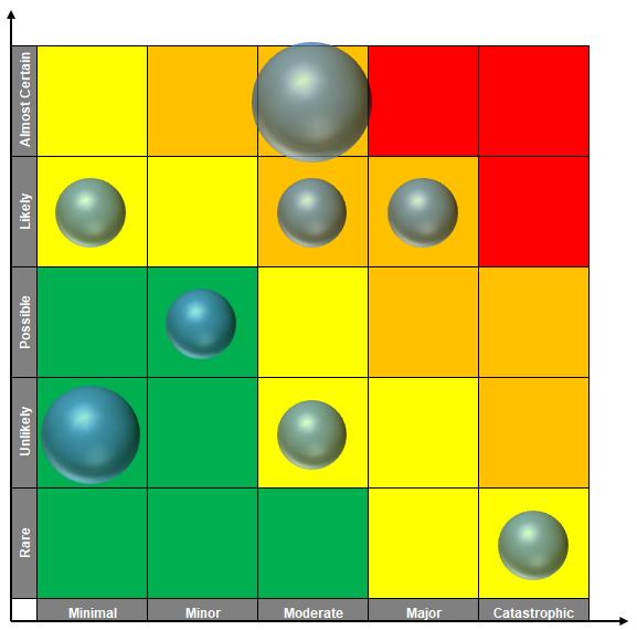
There we go, our Risk Bubble chart is created!
That’s it for this week, come back next week for more Charts and Dashboards tips.