
Charts and Dashboards: The Risk Bubble Chart – Part 3
3 February 2023
Welcome back to our Charts and Dashboards blog series. This week, we move into Week 3 of looking at how to make a Risk Bubble chart.
The Risk Bubble Chart
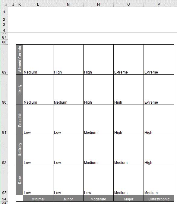
In Part 1, we set out the headings and shape for our chart:
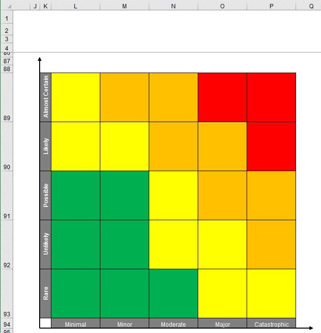
Last week, we coloured our risk table:
This week, let’s prepare the data needed to create
the bubbles for our charts.
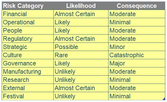
We will need to transform the data in the Risk_ Category table (shown below) to make the Risk Bubble chart.
We will need to calculate the number of possible combinations of Likelihoods and Consequences. To do this we must first count the number of possible Likelihoods and Consequences using the following formulae:
=COUNTA(LU_Likelihood)
and
=COUNTA(LU_Consequences)
We can then multiply these two values together to give us the number of possible combinations:
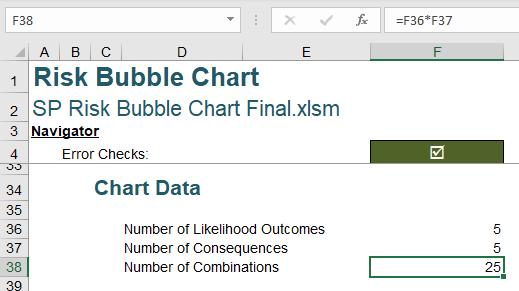
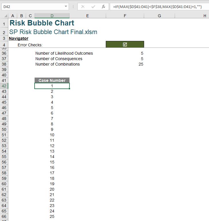
There are five [5] different Likelihood scenarios and five [5] different Consequence scenarios, so there are 25 unique ways to pair the Likelihood scenarios with the Consequence scenario (5 x 5). We will then want to generate a list counting up to this number of combinations. Our list will begin in cell D42 and will end in cell D83. You may have noticed that this is more than 25 rows, this is so that our Chart will be able to support up to 42 combinations in future. We use the following formula:
=IF(MAX($D$41:D41)<$F$38,MAX($D$41:D41)+1,"")
This will count up to our Number of combinations, as specified in F38 and then return blank cells in any extra rows we have included.
After adding in a column heading, we will have the following:
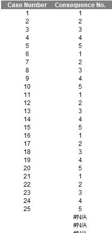
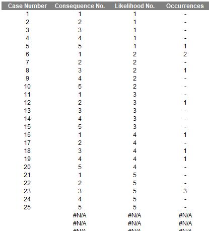
The next column we create is Consequence No, which generates case numbers from one [1] to five [5] repeatedly. This column will determine the xposition of the bubble on the risk table when we include it in the chart data.
We take the remainder of a division of the Case Number (in our example the first Case Number is in D42) by the number of Consequences. We can employ the MOD function to do that:
=IF(D42<>"",MOD(D42-1,$F$37)+1,NA())
MOD will create a loop of the numbers 0, 1, 2, 3 and 4; subtracting one inside the function and adding it back outside the calculation has the effect of looping 1, 2, 3, 4 and 5 instead. We have this inside an IF function, so that the calculation will only be performed when there is a Case Number in the first column, else an error will be returned (as this will not be graphed).
The data for the Consequence No. column will look like this:
The next column we will create is Likelihood No., this column will be slightly different from the Consequence No. column. In the first row of the ‘Likelihood No.’ column, we enter the following formula:
=IF(D42<>"",ROUNDUP(D42/$F$37,0),NA())
This formula will give us the following visual:
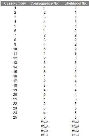
If you have a keen eye, you might spot an apparent problem with the formula above. Why are we referring to F37, the number of Consequences here? Well, if you only have three [3] likelihood scenarios here our table would stop at case number 15 and at that point, it includes all our combinations between likelihood and consequence. If we changed this formula to employ the COUNTA of LU_Likelihood the combination will not be correct. It seems counterintuitive, but it is true.
The next item on the list is the size of the bubble. To determine the size of the bubble, we simply count the number of occurrences within the Risk Categories of the Likelihood and Consequences specified in each row. We use the following formula:
=IF(D42<>"",COUNTIFS(Risk_Category[Likelihood],INDEX(LU_Likelihood,F42),Risk_Category[Consequence],INDEX(LU_Consequences,E42)),NA())
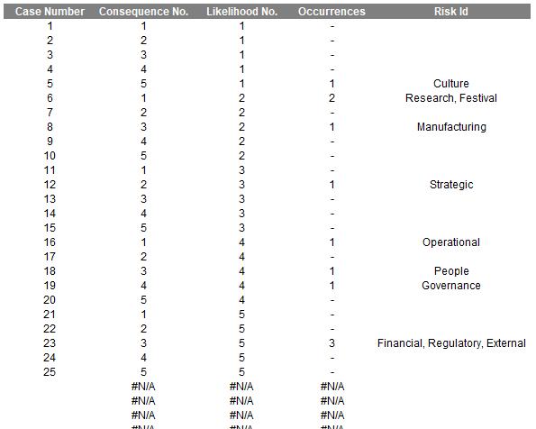
This formula counts how many Risk Categories have the Likelihood and Consequence as specified in columns E and F. This creates an Occurrences column as follows:
The last column we need is Risk Id. This column is used to name our bubbles. We will want a list of the relevant categories, separated by a comma and a space [, ], we can employ the TEXTJOIN function here to help us do that:
=TEXTJOIN(",",,IF(Risk_Category[Likelihood]=INDEX(LU_Likelihood,F42),IF(Risk_Category[Consequence]=INDEX(LU_Consequences,E42),Risk_Category[Risk Category],""),""))
This formula essentially looks for the Risk_Category values that have the relevant Likelihood and Consequences and then joins them together with the comma and a space as the delimiter between them. This formula will return the following:
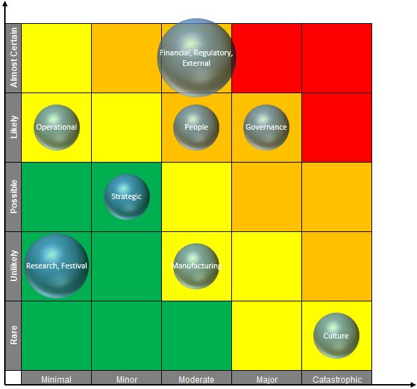
Next time, we can finally plot our Bubble chart. Yay!
That’s it for this week, come back next week for more Charts and Dashboards tips.