
Charts and Dashboards: Learning our Lines – Part 2
10 March 2023
Welcome back to our Charts and Dashboards blog series. This week, we offer a tip to create a chart that shows the deviation from the average.
We have some simple sales data:

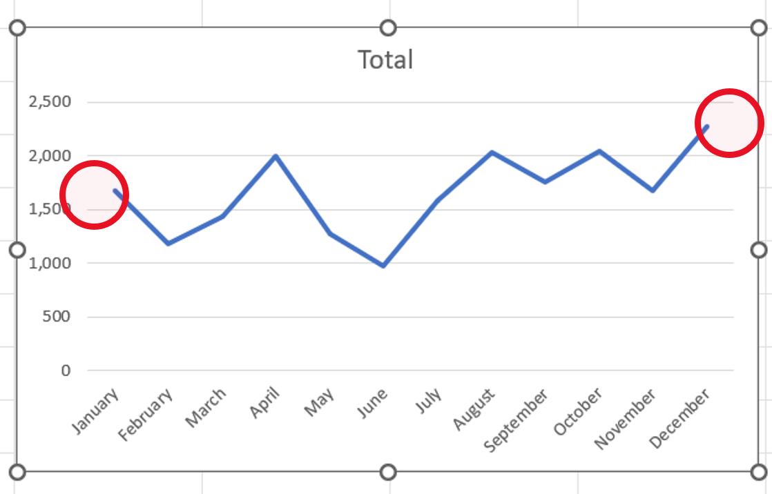
Last time, we created a Line chart to view the trend of the Total by Month. We looked at how to remove the gap between the end of the line and the ends of the horizontal axis:

This time, we’ll look at how we can create this chart:

We start with the same data, but we create some more columns.
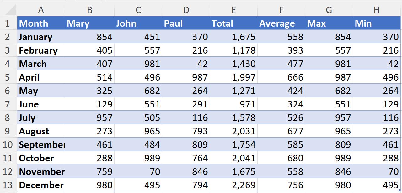
Average gives us the average salesperson’s sales, Max is the maximum, and Min is the minimum.
We then select the Month column, and the three [3] new columns, and choose a Line chart, as we did last week:

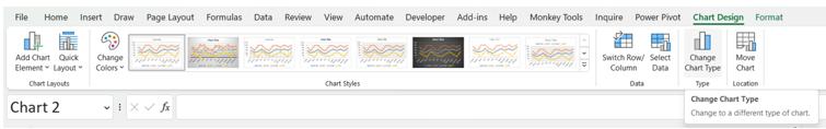
There are several ways to change the chart type for the data series. We can either right-click on an individual series, or we can select the chart and change the chart type by accessing the right-click menu or using the ‘Chart Design’ tab:
We change to a Combo chart:
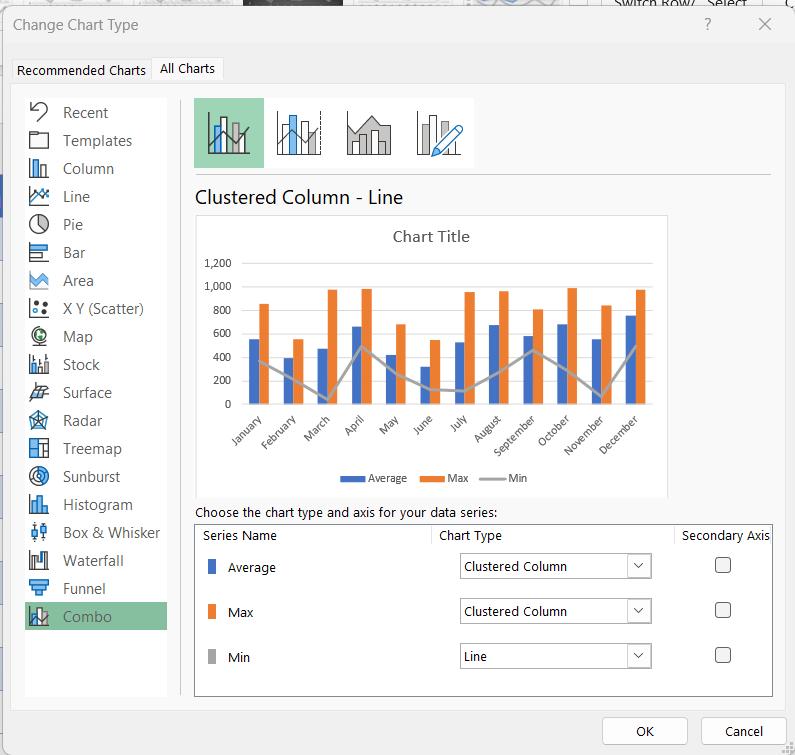
We then change Average to a Line, and Max and Min to Area charts.

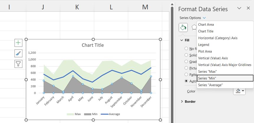
Our chart is now taking shape. Next, we select the Max data series and double-click to access the ‘Format Data Series’ pane:

We change the Fill to ‘Solid fill’ and choose a green colour:

We can then use the dropdown next to ‘Series Options’ to select each of the other series.
We change the colour of Min to white:
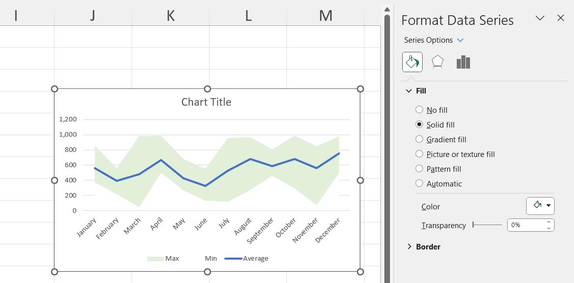
We change Average to a black solid line and reduce the Width:

We also apply the fix we used last week to make sure our data reaches the edges of our chart by formatting the horizontal axis so that the ‘Axis position’ is ‘On tick marks’:

We can then delete the legend and change the title:
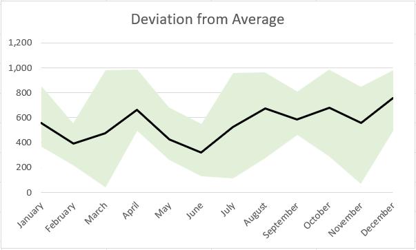
Our chart is complete.
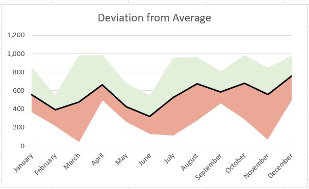
Next time, we’ll look at a variation of this chart which highlights the negative and positive deviation:
That’s it for this week, come back next week for more Charts and Dashboards tips.