
Charts and Dashboards: Custom Axes – Part 2
18 November 2022
Welcome back
to our Charts and Dashboards blog series. This week, we’re
going to continue looking at one way to customise our axes as we format the
axes we created last week.
Consider the following data:
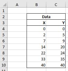
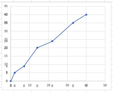
These are X and Y values to be plotted on a Scatter chart. Sounds simple enough, right?
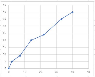
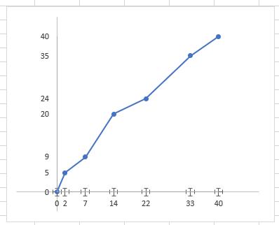
There we have it. But already we can see some issues. It’s hard to discern the exact value of each point as they sit between the gridlines. Let’s create custom axis to make these values easier to determine.
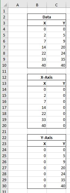
Last week, we created two new data series, one to act as the x-axis of our chart and one to act as the y-axis.
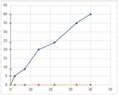
We plotted them on our chart:
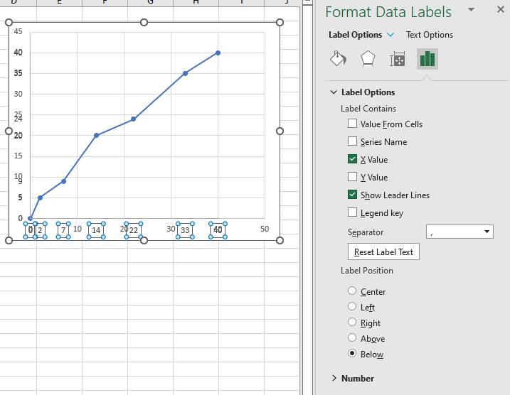
After changing the colour and adding data labels, we were left with an issue, which we will solve this week:
When we have added the data labels (this time below the data series) they are all displaying zero [0]. This is because the data labels are displaying the y-values. We can format them to amend this:
We want to remove the existing gridlines and hide the numbers on the default axis. Removing the gridlines is as simple as clicking them and pressing the DELETE key, but hiding the numbers will require us to adjust the number formatting:
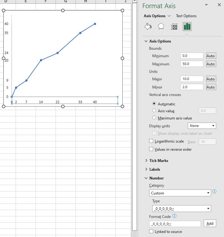
This will hide the numbers, whilst ensuring that the data labels remain aligned. Finally, having removed the default gridlines, we want to add custom gridlines that align with our custom axis. To do this, we will use ‘Error Bars’. We can add ‘Error Bars’ that we can customise to our x-axis data by selecting ‘More Options…’:
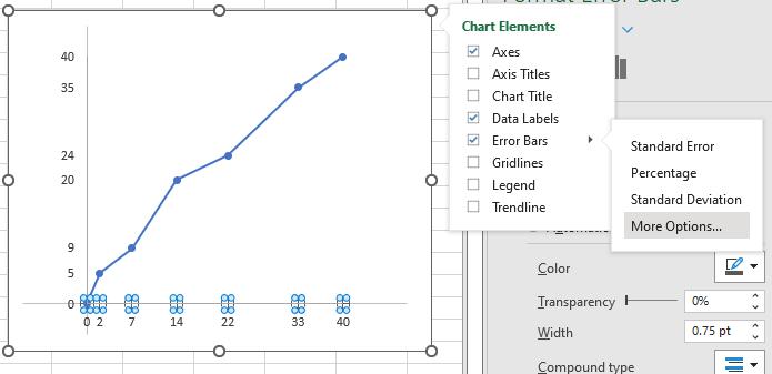
This has added error bars in both the x and y-directions:
Next time, we will format the ‘Error Bars’ to create out custom gridlines.
That’s it for this week. Come back next week for more Charts and Dashboards tips.