
Charts and Dashboards: Custom Axes – Part 1
11 November 2022
Welcome back
to our Charts and Dashboards blog series. This week, we’re
going to look at one way to customise our axes by creating data series for each
axis.
Consider the following data:
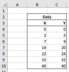
These are X and Y values to be plotted on a Scatter chart. Sounds simple enough, right?
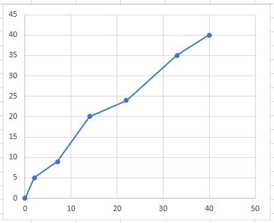
There we have it. But already we can see some issues. It’s hard to discern the exact value of each point as some of them sit between the gridlines. Let’s create custom axes to make these values easier to determine.
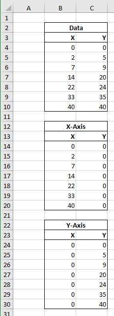
The first step is to create two new data series, one to act as the x-axis of our chart and one to act as the y-axis. To ensure that these series line up with the data plotted, we must take the x-values from the data for the x-axis whilst setting the y-values to zero [0] and vice versa for the y-axis, viz.
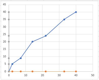
These can now be plotted on our Scatter chart:
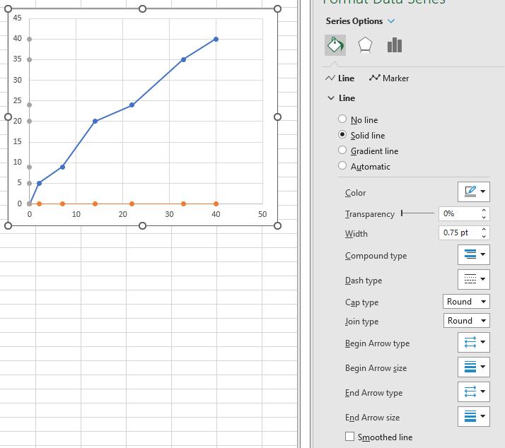
With these now plotted, let’s adjust the formatting of each of these new data series to make them look more like an axis. Starting with the y-axis, we adjust the colour of the line to a more suitable grey and reduce the width:
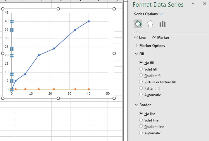
We can then remove the fill and line of the markers:
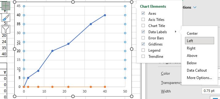
Finally, we can add data labels to the left of this data series:
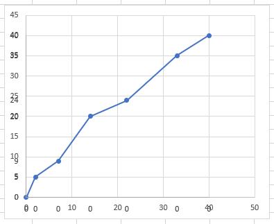
This is starting to look a little cluttered as we still need to remove the default axis, but before we do that, let’s replicate these changes in our x-axis data series.
Replicating the formatting should not create any issues, but when we have added the data labels (this time below the data series) these are all displaying zero [0]! We will explain how to deal with this next time.
That’s it for this week. Come back next week for more Charts and Dashboards tips.