
Charts and Dashboards: The Marimekko Chart – Part 1
22 September 2023
Welcome back to our Charts and Dashboards blog series. This week, we begin to “Mari-make” a Marimekko chart by preparing the data.
The Marimekko chart
The Marimekko chart is a visualisation of data from two [2] categorical variables. The name came from its resemblance to some Marimekko prints, and it is also known as the Mekko chart, the Mosaic plot or sometimes the Percent Stacked Bar plot.
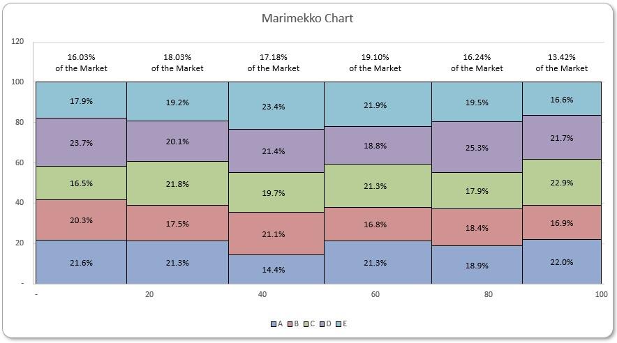
Each tile in the chart represents a cross-category of the two [2] variables and stacking them together makes it very easy to compare the relative sizes, and hence to compare the relative quantities.
To start building the chart, you can download our Excel file and follow the instructions. You can also use this link to download the complete file.
Prepare Data
We will use the following data for demonstration. It has been inserted as a Table Data, and it contains sales figures of five [5] products across six [6] different markets.
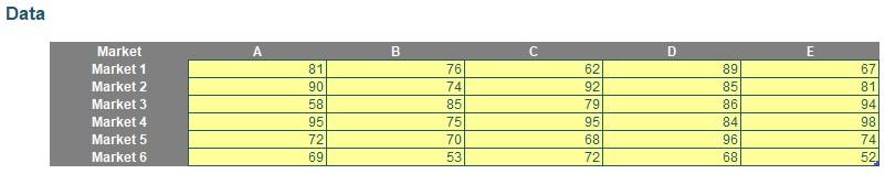
We will build a Marimekko chart with one [1] market in each column, stacking the products in that market vertically. Thus, we will need the sub-percentages of products within each market, for the heights of tiles in each column. Also, we need percentages of market subtotals over the grand total, for the width of each column. We will create a helper table and calculate these percentages.
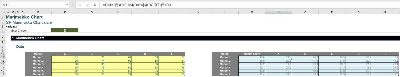
We create an empty Table Percentages matching rows with Data. This way, we can use Table row references very conveniently.

In the Table Percentages, we first calculate the sub-percentages of products within each market. For example, for product ‘A’, we use the following formula:
=Data[@A] / SUM(Data[@[A]:[E]]) * 100
Then, we calculate the percentage of each market in the grand total with the following formula:
=SUM(Data[@[A]:[E]]) / SUM(Data[[A]:[E]]) * 100
Thus, we have completed the Table Percentages:
Data for the Raw Chart
The secret of building a Marimekko chart is first obtaining trapezoids in a Stacked Area chart, and then transforming them to stacked rectangles. We will produce the following array from Percentages and then plot from it:
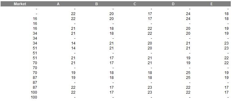
The first column will be a running total of Market Share from Percentages, but they are also being repeated three [3] times each. The other columns are the product percentages from Percentages, being repeated twice and with zero [0] values in between.
However, before constructing this array, let’s take a peek at how it materialises in a Stacked Area chart:
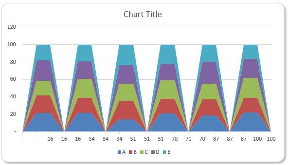
The distance between each trapezoid’s top in a column is a percentage, and the highest top of each column is 100. Also, repeating each product percentage twice creates these plateaus in the chart, i.e. the top edges of the trapezoids. The structure of the first column Market is crucial as well, but we can observe in the Stacked Area chart that the horizontal axis is only a list now, instead of a quantitative scale. After amending that, the chart becomes:
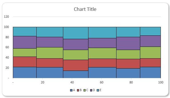
Hopefully, it’s easier to visualise our chart data now, that the zeros [0] in-between produce vertical edges between columns in the chart, given that we repeat a same running percentage total for the right-end of a market, the divider and the left-end of another market.
We will detail the steps to prepare the data and produce the chart. Let’s first create the array above. To obtain the array, we need three [3] helper columns. First, we build an index with length of about three [3] times the number of markets:
=SEQUENCE(COUNTA(Percentages[Market]) * 3 + 1, , 0)
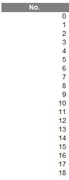
Here, COUNTA counts the number of non-blank cells and SEQUENCE is then used to generate the dynamic numerical list. Then, we build a Market Share Flag of the different markets, for displaying their cumulative percentages later:
=QUOTIENT(E22# + 1, 3)
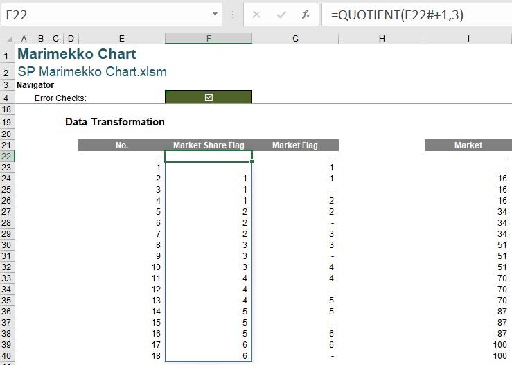
Similar to INT, QUOTIENT returns the integer part of a decimal. Then, we build a Market Flag that decides whether to display the product percentages or zero [0] values:
=ROUNDUP(E22#/3, 0) * (MOD(E22#,3) > 0)
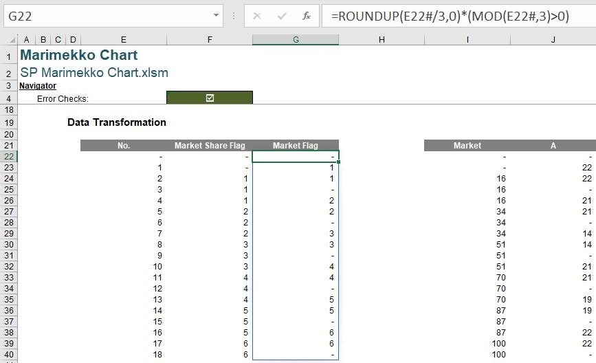
This formula rounds up the sequence of numbers divided by three, as long as the division provides a non-zero remainder.
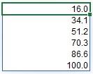
Now, we are ready to build the table for plotting. The first column Market lists the cumulative market percentages three [3] times each. To obtain a running total, we use functions SCAN and LAMBDA:
=SCAN(0, Percentages[Market Share], LAMBDA(x, y, x + y))
The function SCAN has the following syntax:
=SCAN ([initial_value], array, lambda(accumulator, value, calculation))
where:
- initial_value: this is an optional argument and represents the starting value for the accumulator
- array: this is a required value and represents the array to be scanned
- lambda: this is also a required value and represents a LAMBDA function called to scan the array, that consists of three [3] arguments:
- accumulator: the returned (aggregated) value from LAMBDA
- value: a value from array
- calculation: the calculation specified to aggregate values from array into the accumulator.
Here we have specified an addition as the calculation to produce running totals, and then the output from the SCAN function has the following form:
Then we use an INDEX function on the outside with Market Share Flag as the index, to list running totals of market percentages three [3] times each:
=IF(F22#=0, 0, INDEX(SCAN(0, Percentages[Market Share], LAMBDA(x, y, x + y)), F22#))
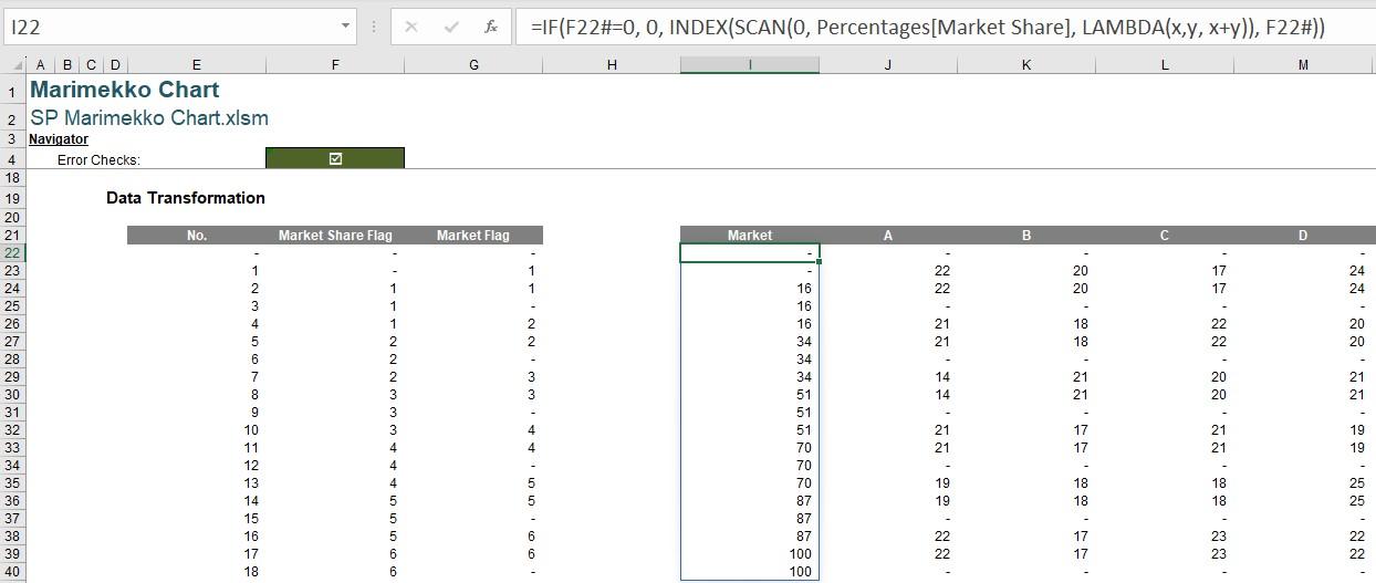
We also perform an IF check here for Market Share Flag being zero [0], to avoid inputting zero [0] in the INDEX function and outputting whole arrays of data.
Next, we create the columns of product sub-percentages, and we use Market Flag to list each figure twice with a zero [0]. For example, for product ‘A’:
=IF($G$22#<>0, INDEX(Percentages[A], $G$22#), 0)
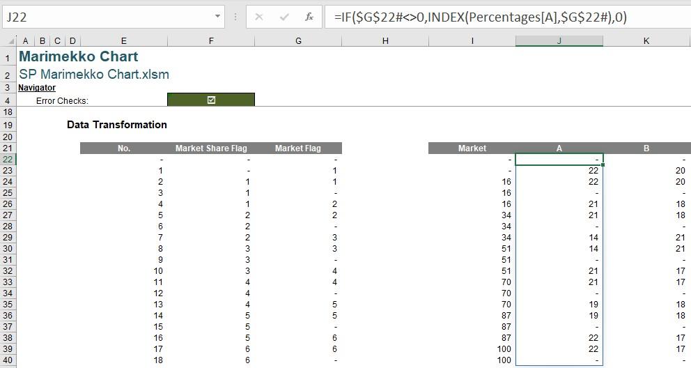
We have used an INDEX function with Market Flag as the index to list the percentage figures from Table Percentages. We use another IF check to avoid zero [0] arguments for the INDEX function, and also inserting the zeros [0] in-between. We repeat this formula for all products.
This is where we will leave it for this blog, next time we will use the data to build out the raw chart.
That’s it for this week, come back next week for more Charts and Dashboards tips.