
Charts and Dashboards: Venn Diagrams Part 3
14 January 2022
Welcome back to our Charts and Dashboards blog series. This week, I continue looking at Venn Diagrams, by adding dynamic labels to my example.
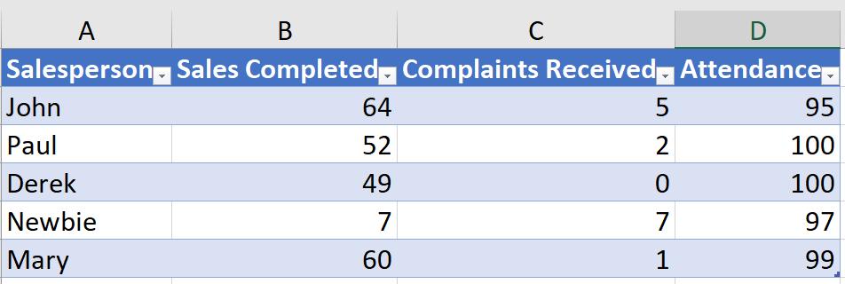
In Charts and Dashboards: Venn Diagrams Part 1, I had a very simple Table with some annual statistics for my salespeople:
I wanted a quick visualisation to show which of my salespeople have reached the standards set. These were:
- over 50 sales
- at least 98% attendance
- less than two [2] complaints.
Last time, I looked at some ways to change the formatting of Venn diagram I created:

So far, I have entered the names into the intersections manually in Text Boxes. This time, I want to automate this process.
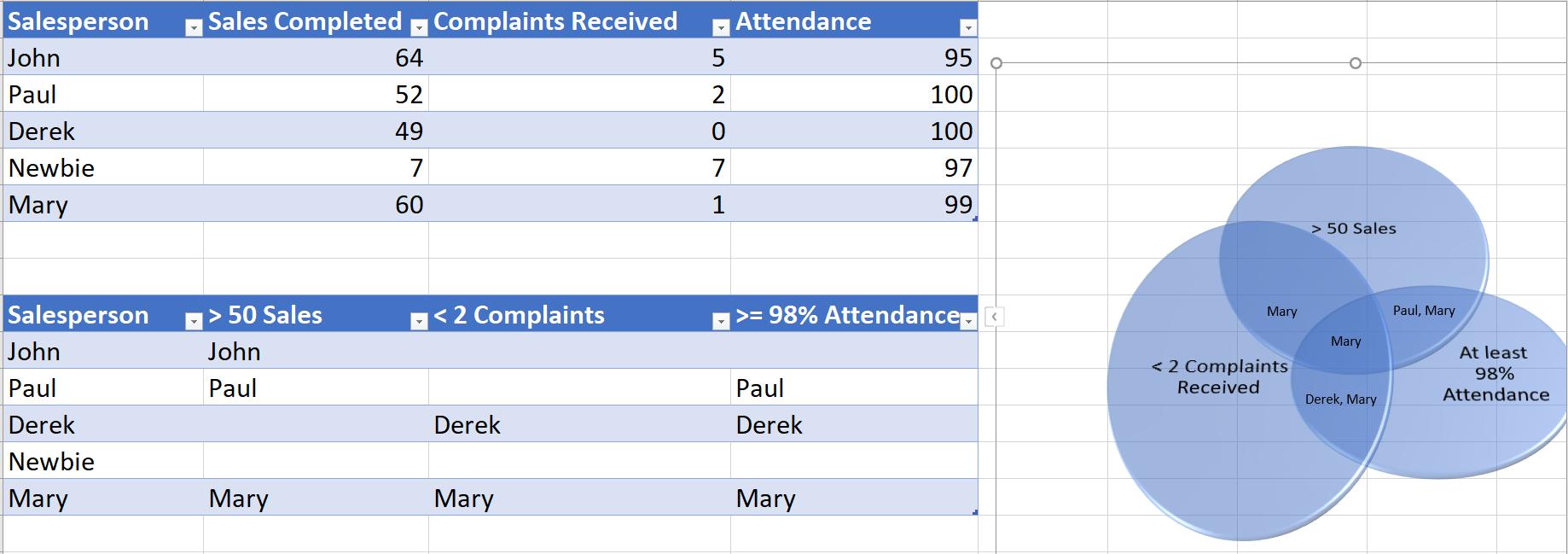
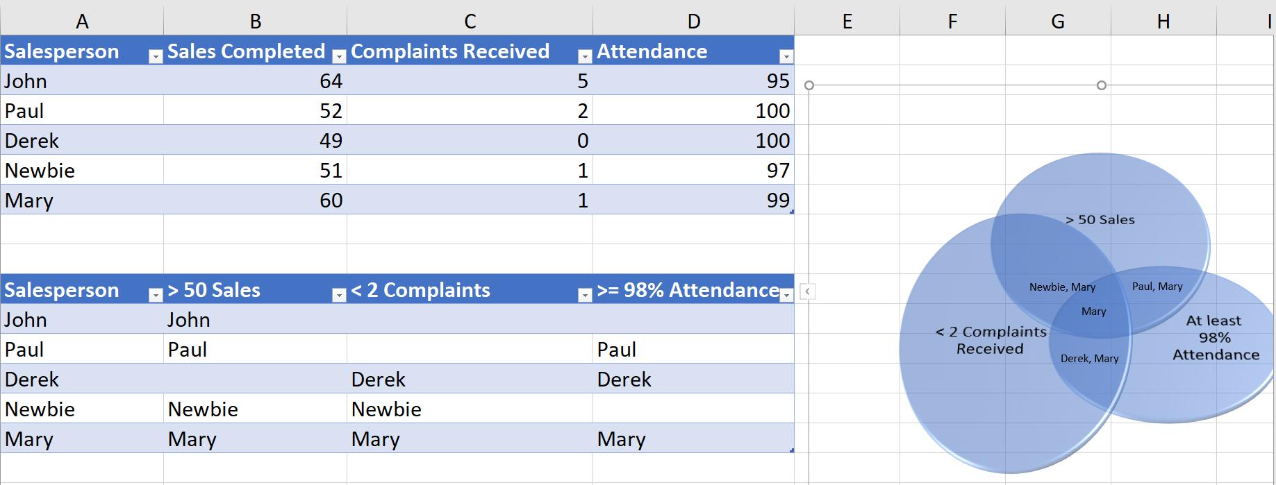
I start by creating a new Table which is based on my original data:

In my new Table, the columns are calculated as follows:
- Salesperson = $A2
- > 50 Sales = IF($B2 > 50,$A10,“”)
- < 2 Complaints = IF($C2 < 2,$A10,“”)
- >= 98% Attendance = IF(D2 >= 98,$A10,“”).
This makes it easier to spot who meets each criterion. I have used the names of the salespeople as the positive results so I can then group the salespeople that meet each criterion:

To group the salespeople, the formula I have used is:
=TEXTJOIN(", ",TRUE,B10:B14)
where the delimiter is a comma (,) and I have chosen to ignore empty cells.
I can extend this to calculate the label for the intersections:

For the new intersection Table, the Columns are as follows:
- Salesperson = $A10
- Sales/Complaints = IF(AND(B10 <> "", C10 <> ""), A20, "")
- Attendance/Complaints = IF(AND(D10 <> "", C10 <> ""), A20, "")
- Sales/Attendance = IF(AND(B10 <> "", D10 <> ""), A20, "")
- All = IF(AND(B10 <> "", C10 <> "", D10 <> ""), A20, "").
The concatenated values use the formula:
=TEXTJOIN(", ",TRUE,B20:B24)
which is dragged across to get all the intersection labels.
Finally, to get these values into my Venn Diagram, I edit one of the Text Boxes. I choose the Sales / Complaints intersection, which is now calculated in cell A27 in my spreadsheet:
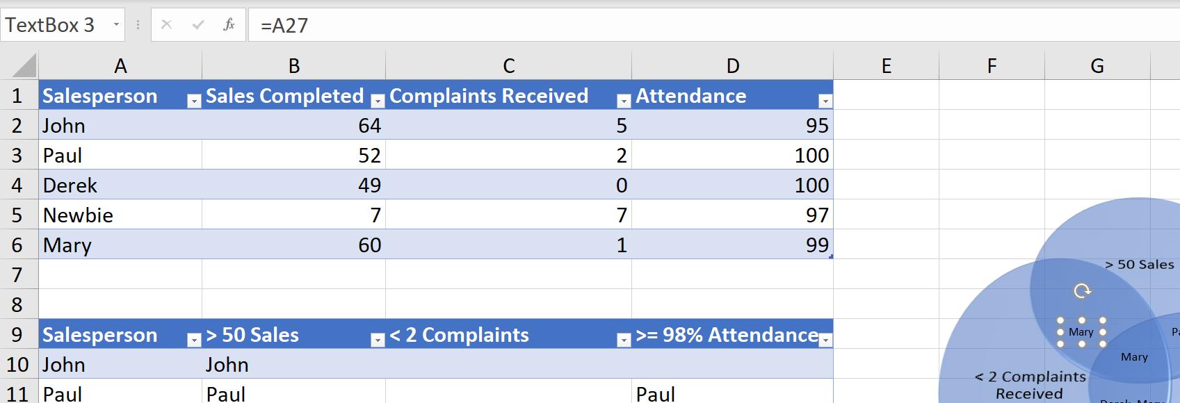
In the Formula pane next to ‘TextBox3’ I can link to A27. If this changes the size of the label, I can alter this in the options in the Home tab:
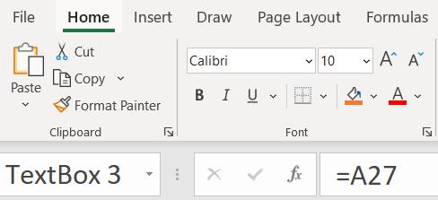
I have set this label to ‘Calibri 10’.
I repeat this process for the other Text Boxes:
News just in – Newbie has suddenly achieved 44 more sales and six [6] complaints have been resolved:
Having updated my first table with the new values, Newbie appears on the Venn diagram automatically. Well done, Newbie!
That’s it for this week. Come back next week for more Charts and Dashboards tips.