
Charts and Dashboards: Venn Diagrams Part 2
7 January 2022
Welcome back to our Charts and Dashboards blog series. This week, I continue looking at Venn Diagrams.
Last time, I had a very simple Table with some annual statistics for my salespeople.
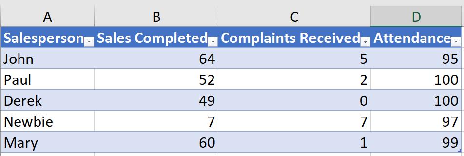
I wanted a quick visualisation to show which of my salespeople have reached the standards set. These were:
- over 50 sales
- at least 98% attendance
- less than two [2] complaints.
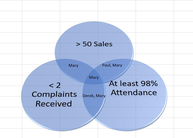
I created a Venn Diagram to show which salespeople met all the conditions, viz.
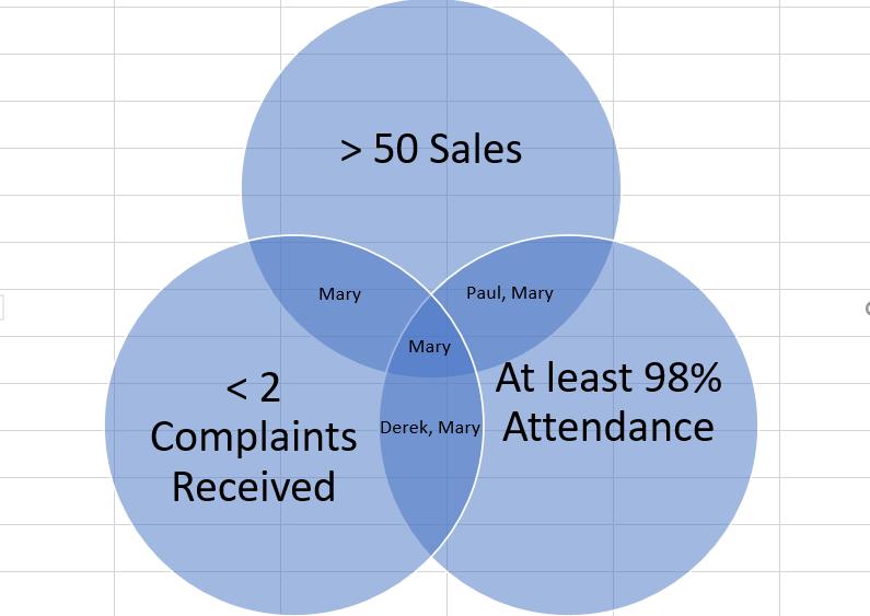
There are two aspects I need to improve. I will improve the formatting, and then populate the text boxes by calculating which salespeople should be in each category.
Whilst I improve the formatting, I will also look at some options available. Before I look at the detailed changes I can make, there are a number of forms that the Venn Diagram can take. These are available in the Layouts section on the ‘SmartArt Design’ tab, which I can access while I have the SmartArt selected:
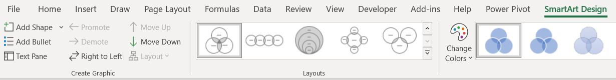
I can hover over each Layout option to see what effect it has on my Venn Diagram:
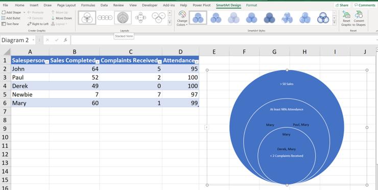
Note that I would have to move the Text Boxes I have created as they are not part of the automated features. The available layouts are currently Basic Venn, Linear, Stacked (as in the previous image), Radial and Interconnected Rings. In this case, the most appropriate layout for the data is the Basic Venn that I have chosen.
Having settled on the Layout, I look next at the SmartArt Styles. These are a quick way to match the look of the Venn Diagram to the rest of the presentation.
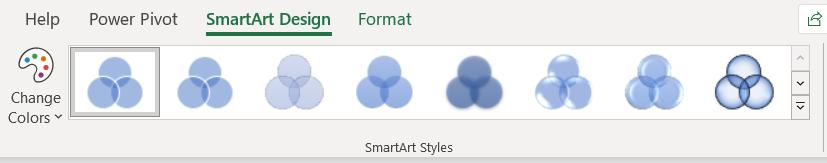
I can hover over each option to see which I prefer, and I choose a 3D Style:
I can click and drag any of the components of the chart to improve the presentation. I can also enlarge a circle to show it is more important. To do this, I select the circle and right-click:
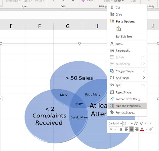
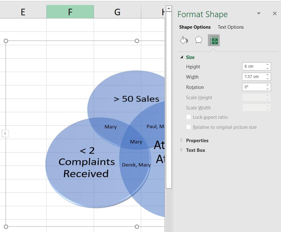
I can then access the ‘Format Shape’ pane where I can change each shape independently of the rest of the Venn Diagram.
I can also rotate a circle if I wish:
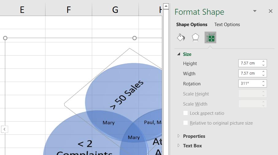
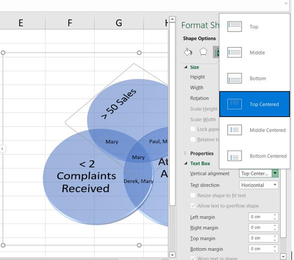
In the ‘Text Box’ section I can move the automated Text Boxes around:
My Venn Diagram is looking more interesting, as I have chosen to use the size of the circles to indicate the relative importance of the category:
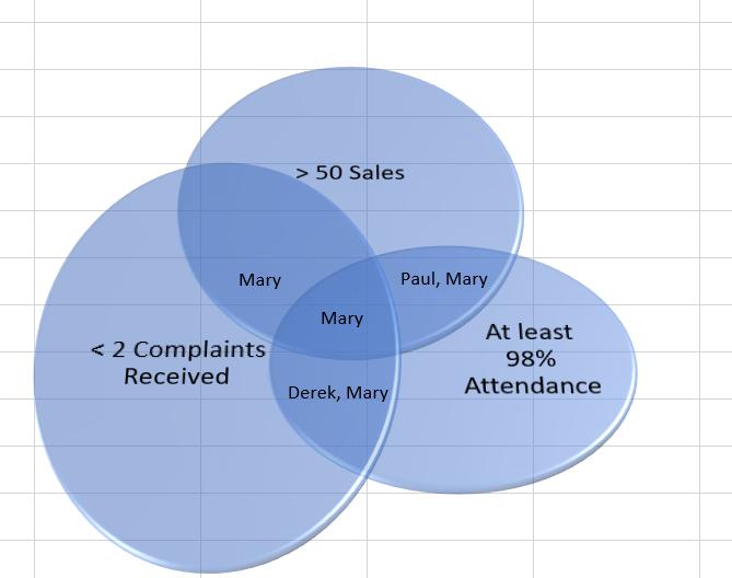
Usually, it’s not a good idea to use three-dimensional visuals as they do not translate well on paper or on screen. However, the point here is to show what is possible, not discuss whether you should do it!
In any case, I will continue working on my Venn Diagram next time...
That’s it for this week. Come back next week for more Charts and Dashboards tips.