
Charts and Dashboards: Sales Funnel Chart – Part 2
8 October 2021
Welcome back to our Charts and Dashboards blog seriesThis week, I again create a Sales Funnel chart, but this time using Excel’s built-in features.
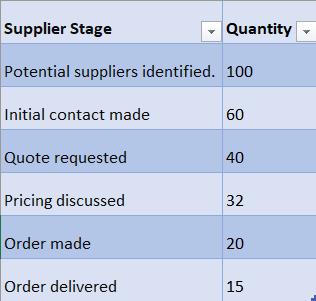
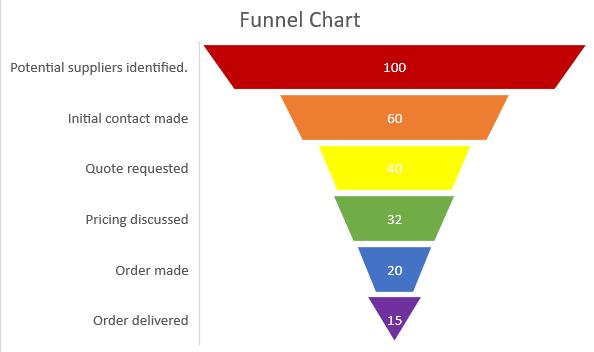
Until Excel 2016, Sales Funnel charts were not available as a standard chart. Last week, I looked at how to create the chart for users of older versions of Excel, and this week I compare that to the standard chart now available. The data I have selected for my chart is very simple: I am tracking down how many suppliers contacted by my salespeople actually end up delivering tent equipment to the company.
To select the Excel Funnel chart, I can choose ‘Recommended Charts’ from the Insert tab.
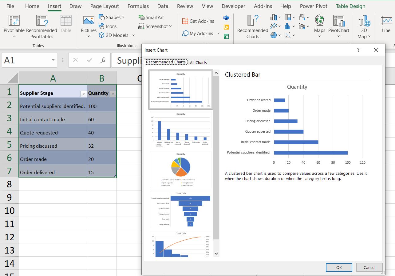
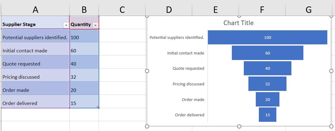
I can see that the Funnel chart is on the ‘Recommended Charts’ tab, so I can pick this.
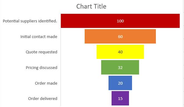
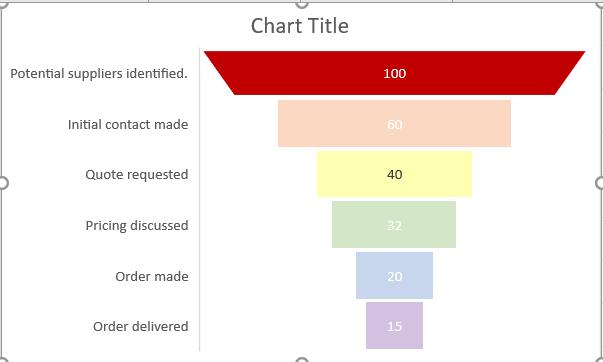
I can ‘Change Colors’ on the ‘Chart Design’ tab to quickly change the colour of all the bars so that it is the same as the manually created chart.
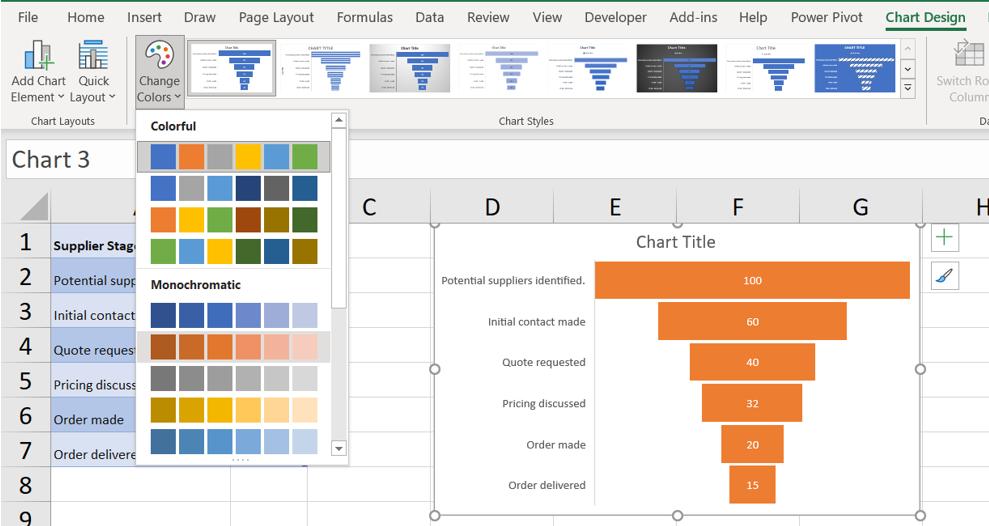
Well this could be a very short blog. Having shown how easy it is to change the colour, let’s see what else I can change.
I can select each bar individually by double-clicking on it, and give it a different colour.
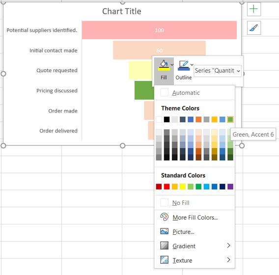
Each bar may have a different colour:
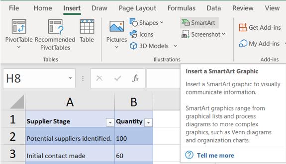
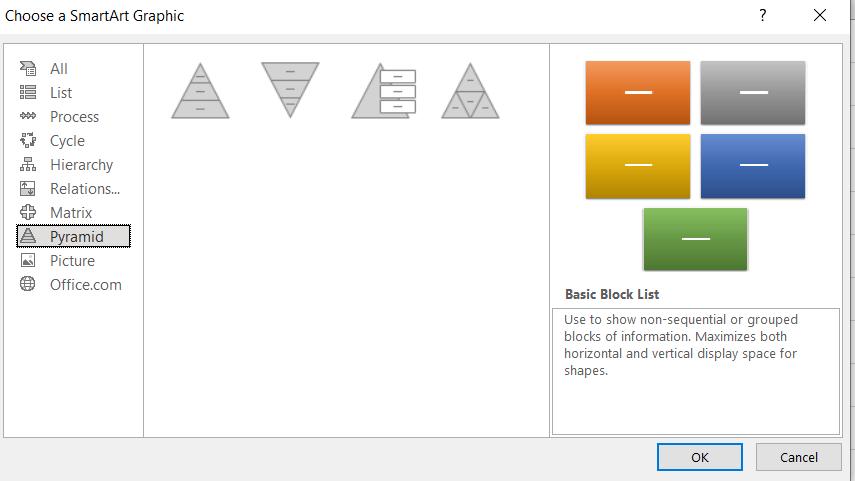
I can also change the shape of the bars, but this is more of a challenge. I go to the Insert tab, and choose SmartArt:
This opens a dialog.
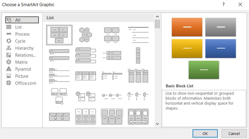
I choose the Pyramid option:
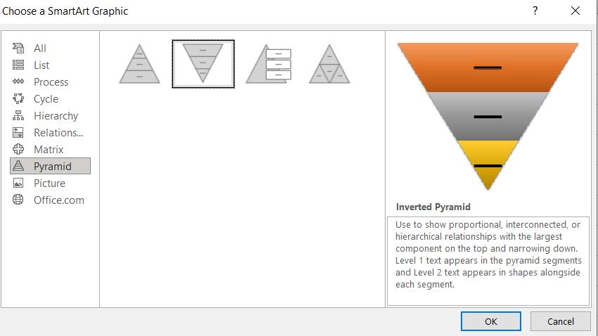
The second image looks like the Funnel chart, so I click this one:
Clicking OK gives me an Inverted Pyramid:
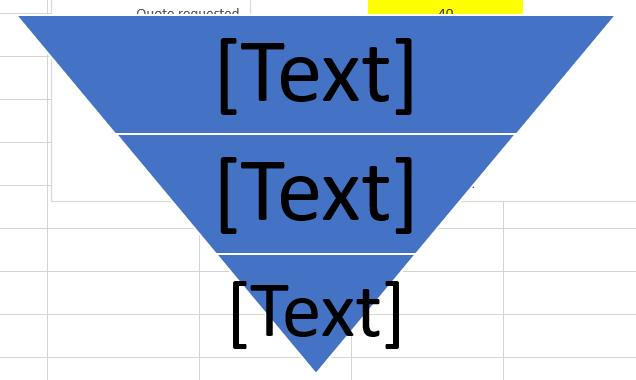
It doesn’t have enough bars yet, so I can click on ‘Add Shape’ in the ‘SmartArt Design’ tab, until I have six [6].
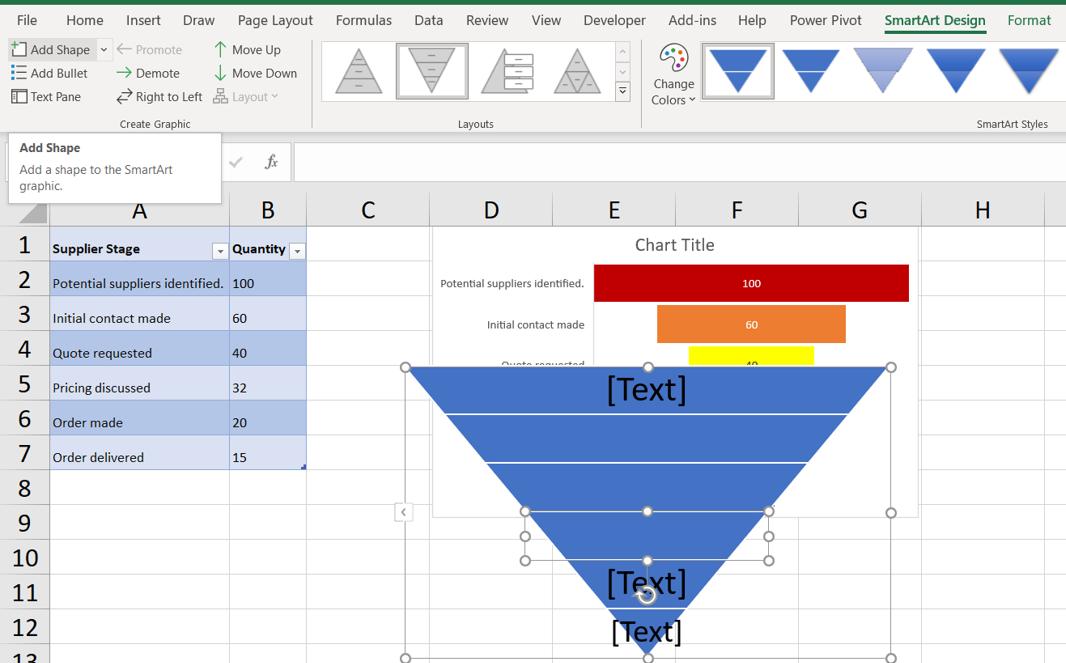
This is all very well, but how does it link to my table of data? I can right-click on the shape, and I have options:
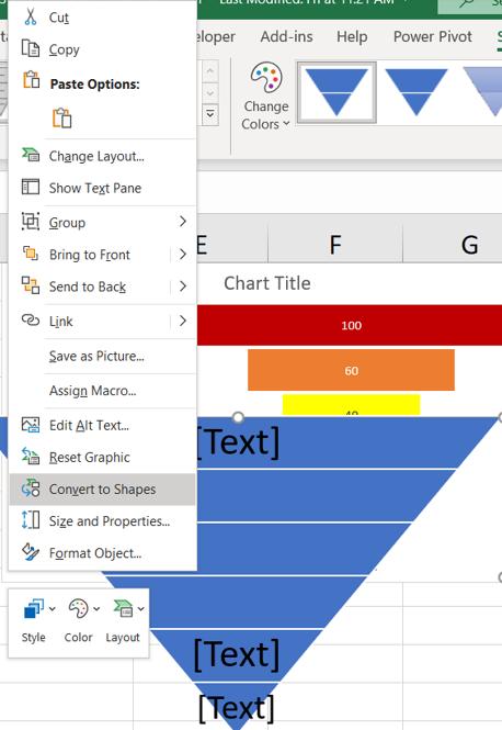
I choose to ‘Convert to Shapes’.
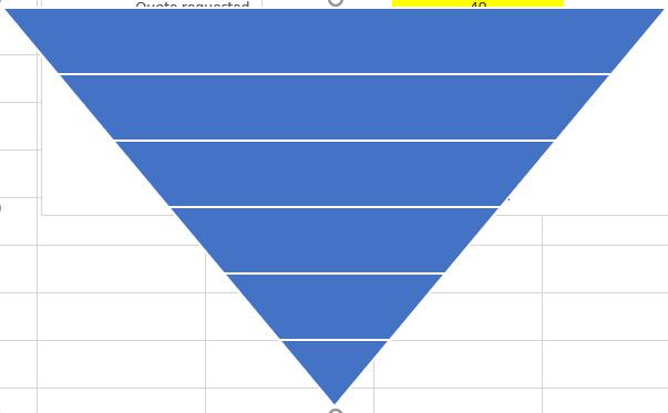
This shape would make a good Funnel chart. I can change the colours to match the Funnel chart I created:
Now I want to copy each of the shapes in the Inverted Pyramid, and paste them into the Funnel Chart. To paste each shape in, I go to Fill in the ‘Format Data Point’ pane:
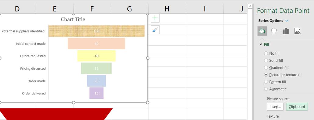
When I choose ‘Picture or texture fill’ I have the option of using the Clipboard as the ‘Picture source’, so I do this:
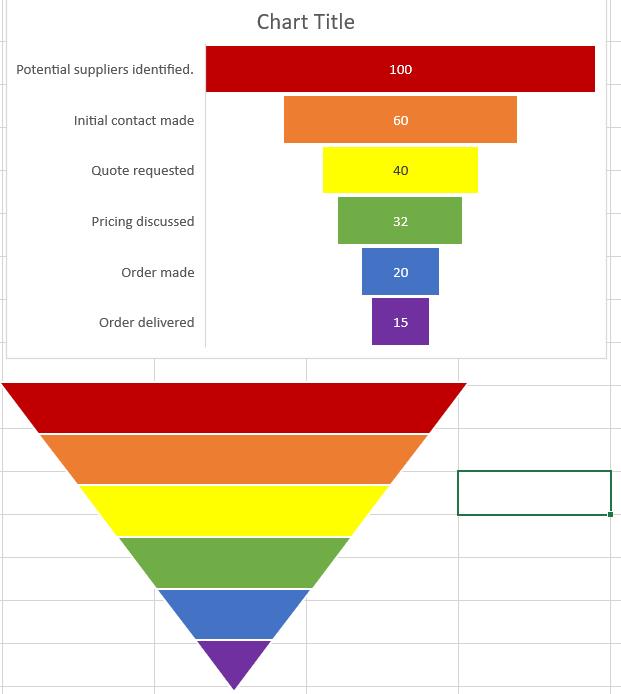
I repeat this for the other bars, and add a title: my Funnel chart is finished!
That’s it for this week. Come back next week for more Charts and Dashboards tips.