
Charts and Dashboards: Sales Funnel Chart – Part 1
1 October 2021
Welcome back to our Charts and Dashboards blog series. This week, I create a Sales Funnel chart.
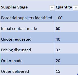
Until Excel 2016, Sales Funnel charts were not available as a standard chart. This week, I look at how to create the chart for users of older versions of Excel, and next week I will compare this to the standard chart now available. The data I have selected for my chart is very simple: I am tracking down how many suppliers contacted by my salespeople actually end up delivering tent equipment to the company.
I start by adding a helper column to my Table, Data:
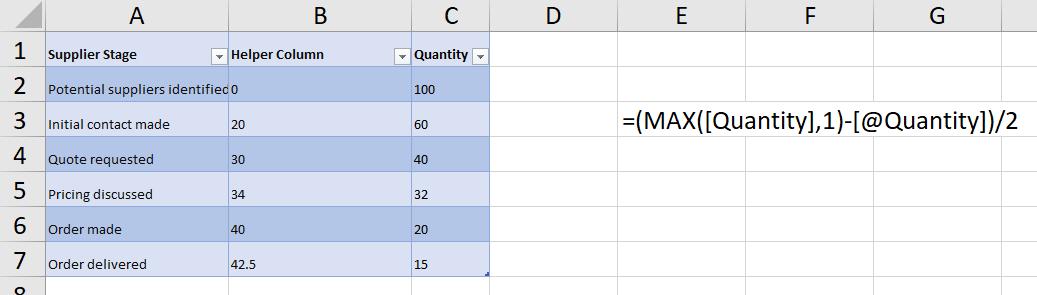
This is taking the largest Quantity value, subtracting the current Quantity, and dividing by 2. The top row is always 0.
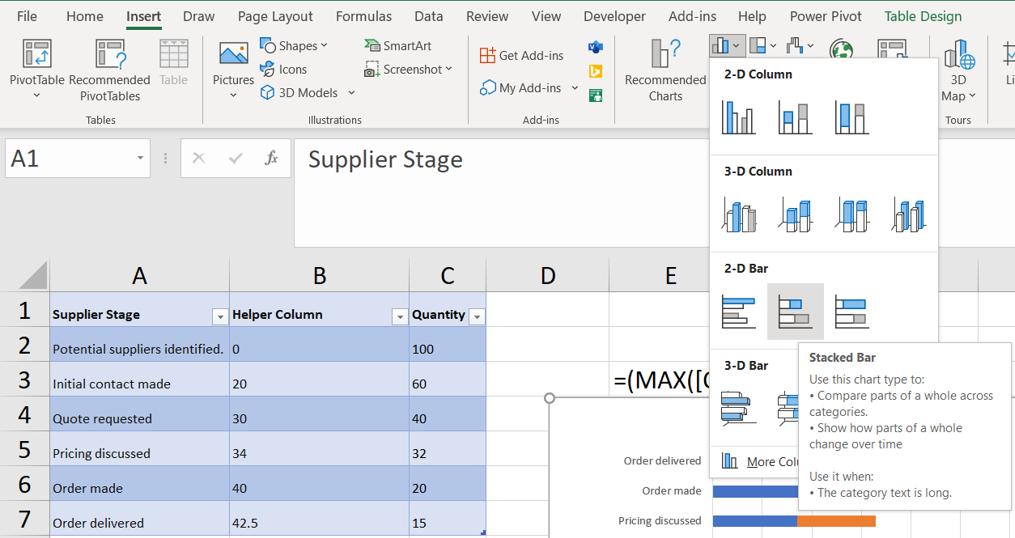
Next, I select the data, but not the columns, and choose a Stacked Bar Chart from the Charts section of the Insert Tab.
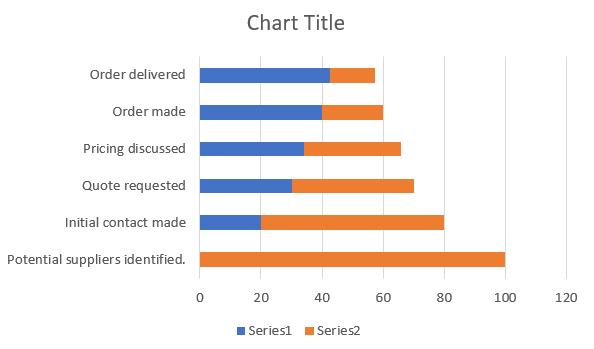
This gives me a Stacked Bar chart:
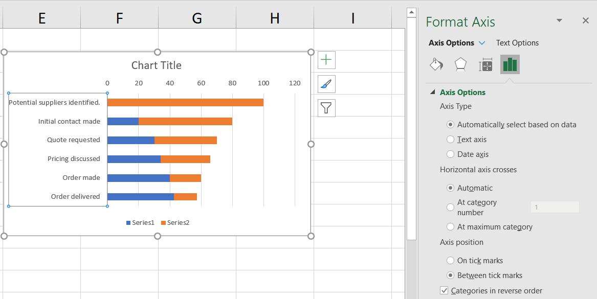
I select the Vertical Axis, and right-click to access the Format Axis pane. In the ‘Axis Options’, I tick the ‘Categories in reverse order’ box.
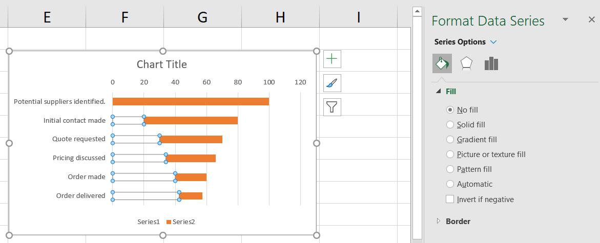
Next, I select Series1 (the Helper Column) and in the Format Data Series pane, I remove the colour by selecting ‘No fill’:
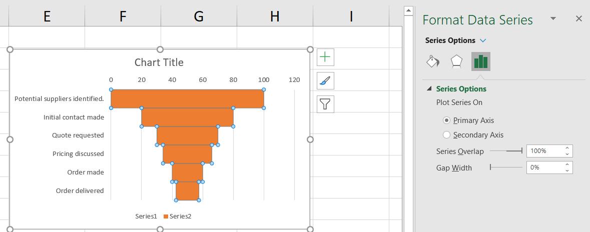
This is starting to take shape now. To remove the gap between the bars, I go to the Format Data Series pane for Series2.
Now I can tidy up. I remove the Legend, Gridlines and the Horizontal Axis by selecting, right-clicking and choosing ‘Delete’.
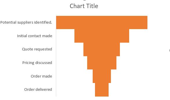
Next, I improve the look of the bars by using Format Data Series to choose blue to match the table, and I add a border. I also add Data Labels using ‘Add Chart Element’ from the ‘Chart Design’ tab.
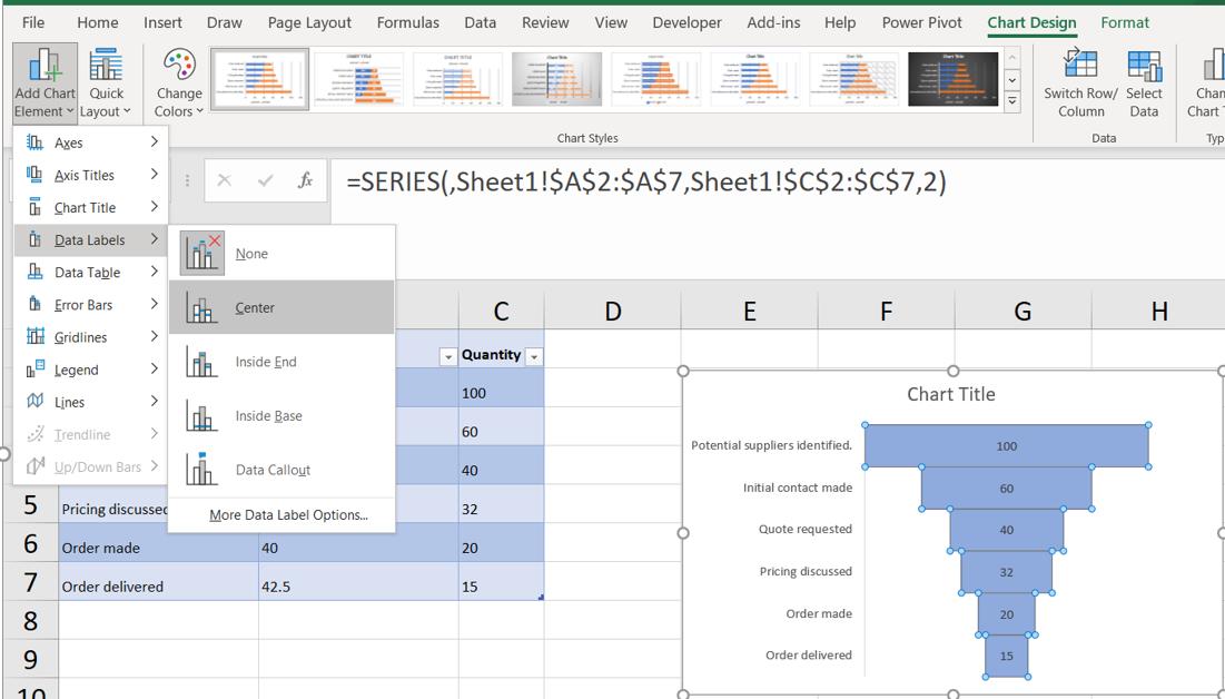
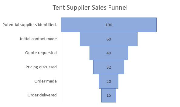
Finally, I change the Chart Title, and my chart is ready:
Next time, I’ll look at how the standard Excel 2016 Sales Funnel Chart compares to this.
That’s it for this week. Come back next week for more Charts and Dashboards tips.