
Charts and Dashboards: Pareto Power
20 August 2021
Welcome back to our Charts and Dashboards blog series. This week, I make my manually created Pareto chart interactive
In Problem Solving with Pareto Charts, I was analysing some complaint data for our Tent Hire business.
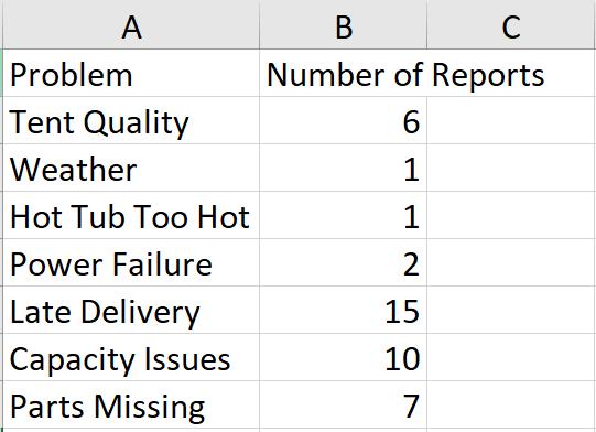
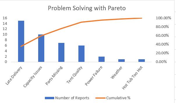
I wanted to create a Pareto chart, so that I could quickly identify which issues to look at in order to significantly reduce the Number of Reports. I did this by creating a combination of a Column Chart and a Line Chart, viz.
I can improve this, to allow the user to specify a percentage of complaints to resolve, and then highlight the problems that need to be solved in order to reach that percentage.
In order to do this, I start with the data that I created for Problem Solving with Pareto Charts:
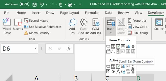
I plan to use a Scroll Bar to allow the user to change the percentage of reports to be resolved. To insert a Scroll Bar, I go to the Developer tab and choose the ‘Scroll Bar’ icon from the ‘Form Controls’ part of the Insert section (beware the classic "gotcha" selecting the ActiveX control instead).
Having placed the Scroll Bar where I want it, I can right click and choose ‘Format Control’.
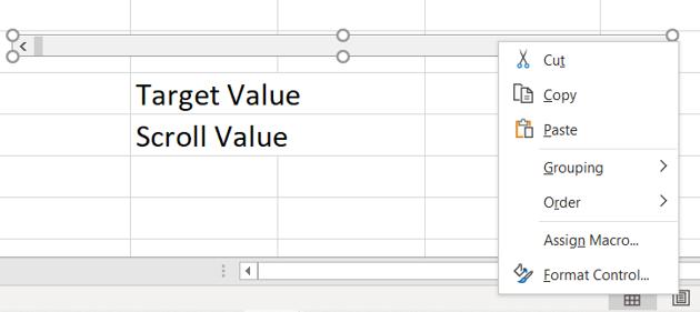
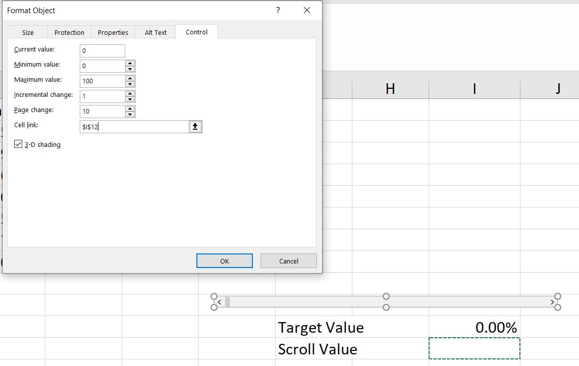
I plan to link the Scroll Bar to a cell which I call Scroll Value. This will also link to another cell, styled as a percentage, which I call Target Value. In the ‘Format Control’ dialog, I take the default minimum, maximum and increments.
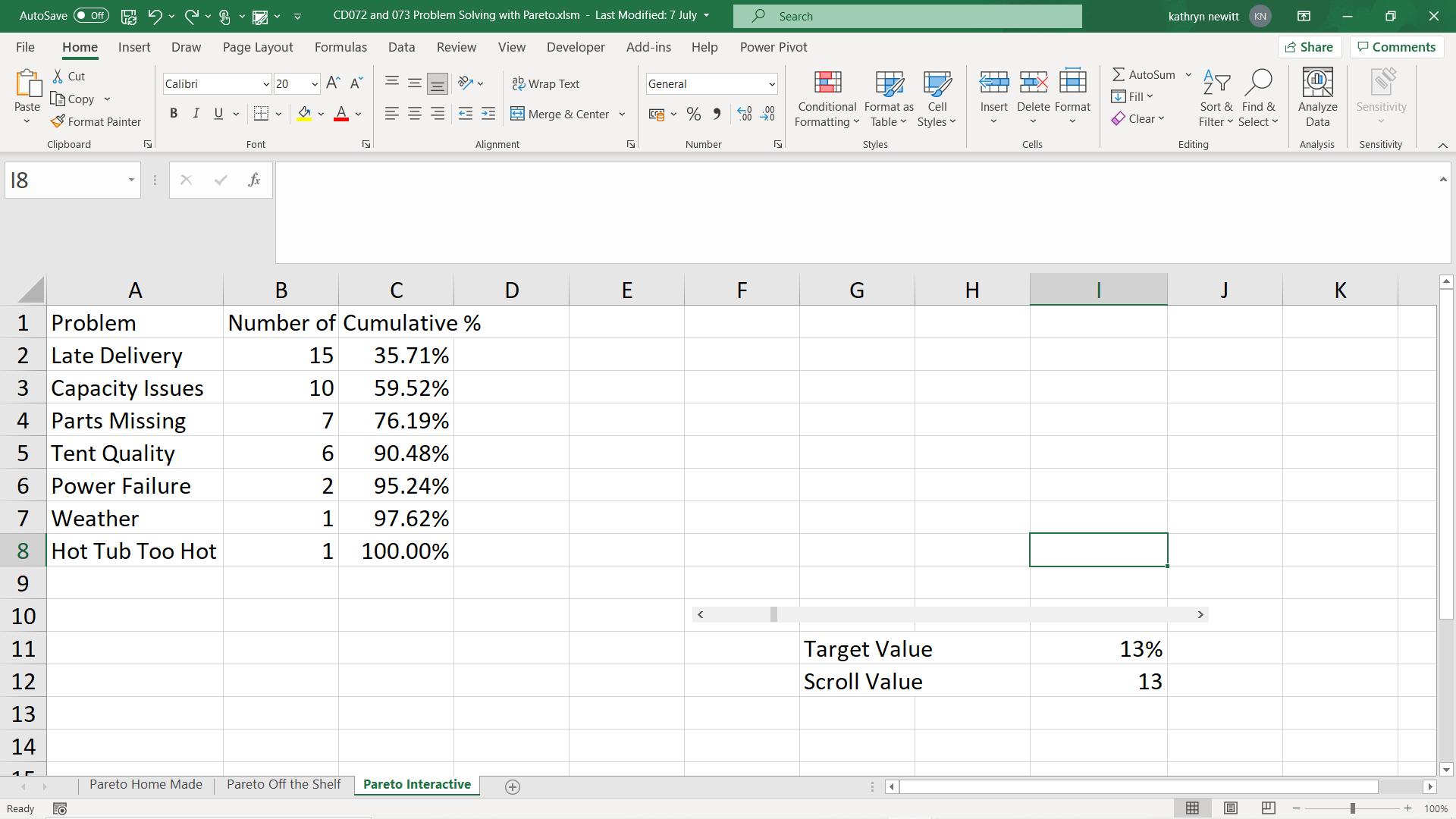
I also link the scroll bar to my Scroll Value cell. The formula I use for Target Value is:
= I11/100
I need one more value to highlight the correct bars: I need to know which value from the Cumulative % column will meet the required target. I create another cell which I give the title Cumulative Value.
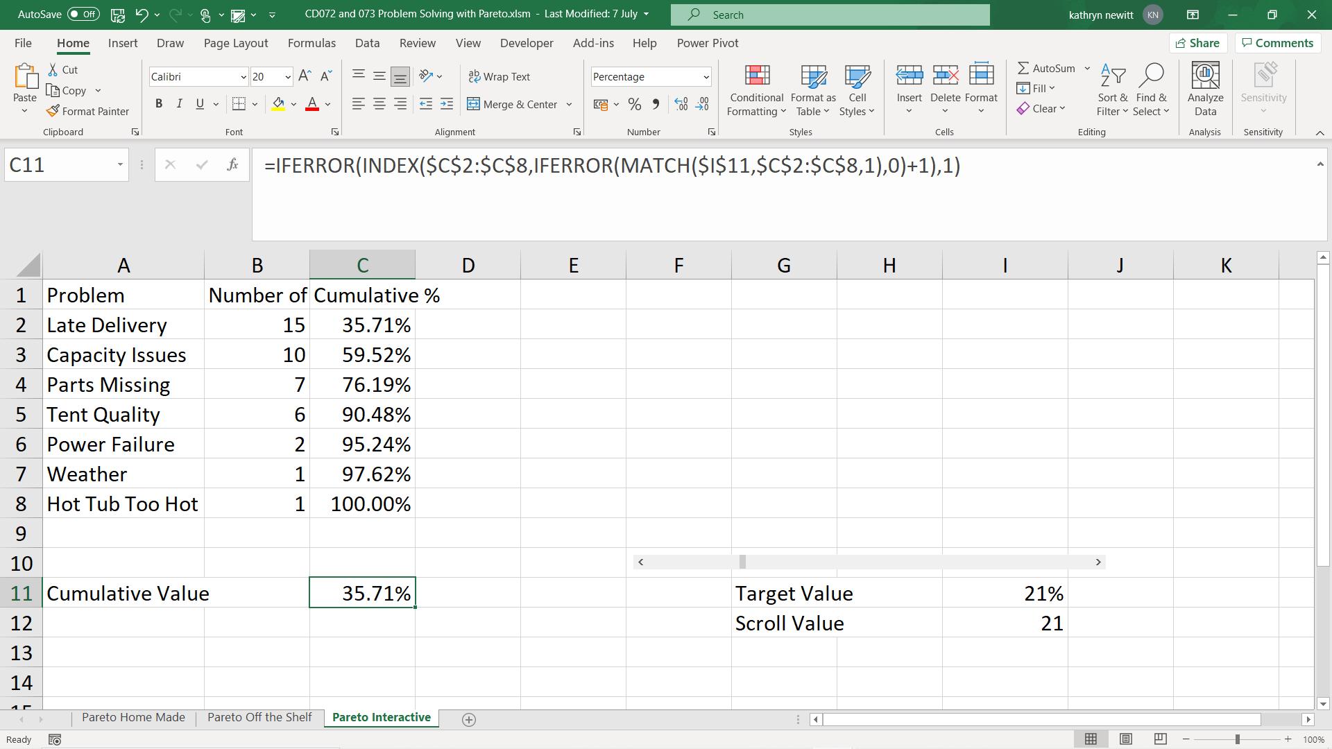
The formula for Cumulative Value is:
=IFERROR(INDEX($C$2:$C$8,IFERROR(MATCH($I$11,$C$2:$C$8,1),0)+1),1)
This will give me the bar that will solve enough complaints to meet or exceed the Target Value.
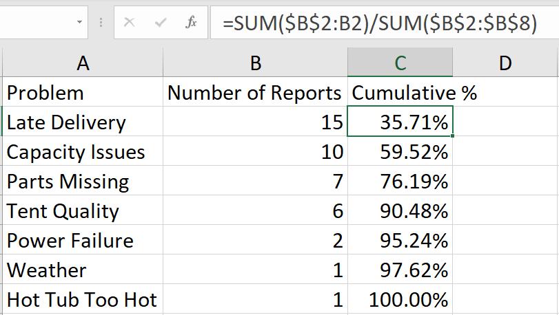
If Target Value is 21%, then I would just need to solve my ‘Late Delivery’ problems, which would resolve 35.71% of the reports.
Next, I create two new columns on my table to indicate which bars will be less than the target, and which will be more.
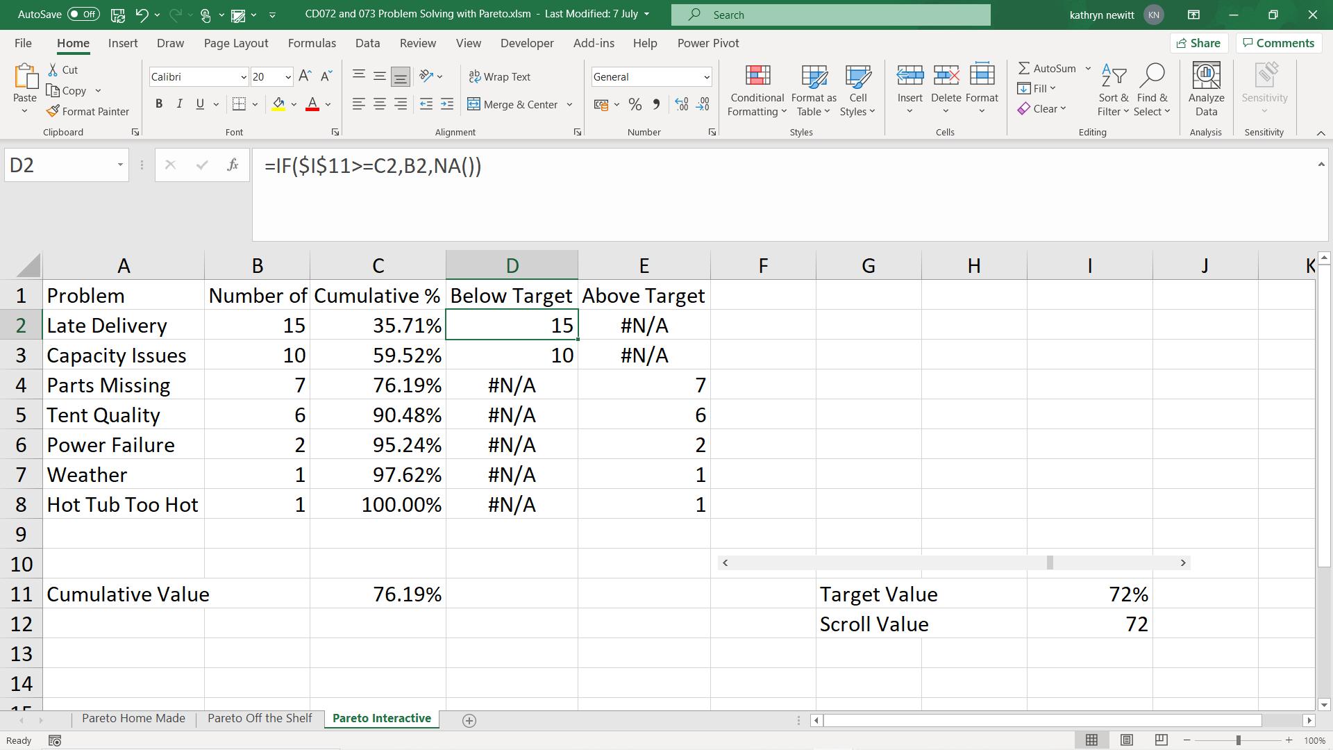
Below Target has the formula:
=IF($I$11>=C2,B2,NA())
Above Target has the formula:
=IF($I$11<C2,B2,NA())
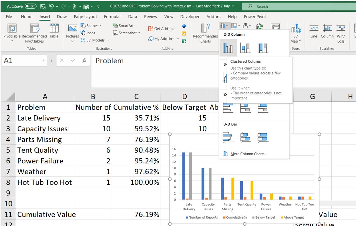
Now I am ready to construct the chart. I select the data in my table, and on the Insert tab I choose to insert a Clustered column chart.
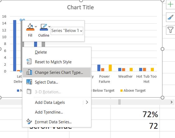
Having positioned the chart above the Scroll Bar, I can right click on any bar to ‘Change Series Chart Type’.
Choosing a Combo Chart, I change the Cumulative % to a Line on a Secondary Axis.
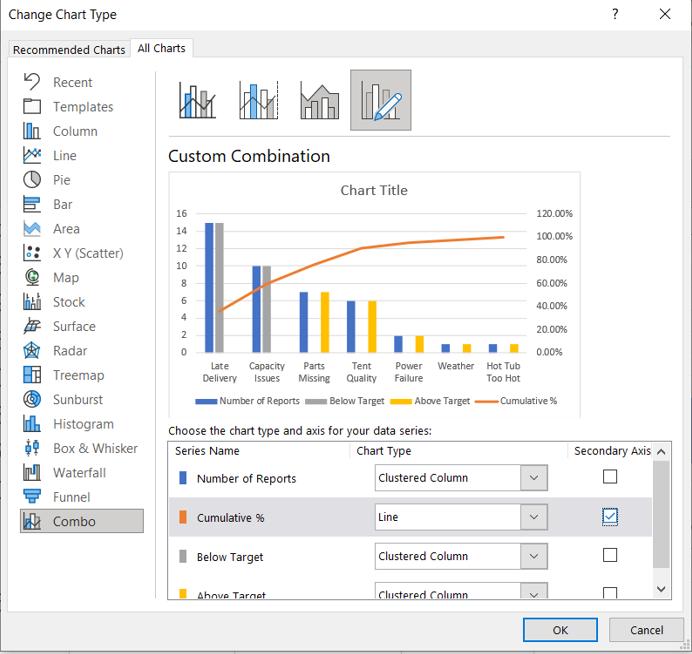
I don’t need to show the Number of Reports, so I right click and delete this data series. I also right click on the Below Target and Above Target bars and change their colour to red and grey respectively.
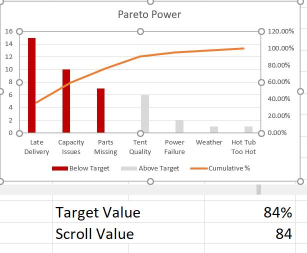
Now when I move the Scroll Bar left and right, the number of red bars increases and decreases to show me which problems must be solved to meet the Target Value.
That’s it for this week. Come back next week for more Charts and Dashboards tips.