
Charts and Dashboards: Problem Solving with Pareto Charts
6 August 2021
Welcome back to our Charts and Dashboards blog series. This week, I look at a Pareto chart.
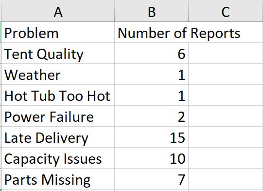
Our tent hire business has had a few complaints. I need to analyse the data.
I am going to create a Pareto chart. Now Pareto charts are in some versions of Excel – but not all (they first came out in Excel 2016). Since other versions of Excel are still in use, to begin with I shall create one from first principles. But don’t worry, I will show a simpler way next week for those that can do it that way.
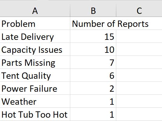
The idea is present the data so that it’s easy to identify which issues to look at in order to reduce the Number of Reports. Before I create my chart, I need to sort the data in descending order, according to the Number of Reports. I can do this using the ‘Sort and Filter’ options on the Home tab.
I need another column where I work out the Cumulative Percentage. This is the Number of Reports for each Problem divided by the total Number of Reports, expressed as a percentage, and then summed to create a running total.
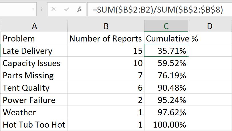
The formula is:
=SUM($B$2:B2)/SUM($B$2:$B$8)
which is the sum of the Number of Reports from the top to the current cell, divided by the total Number of Reports. I make sure that the data type of Column C is Percentage.
I select all my data, and I create a Clustered Column Chart from the ‘2-D Column’ options in the dropdown from the Column Chart icon in the Charts section.
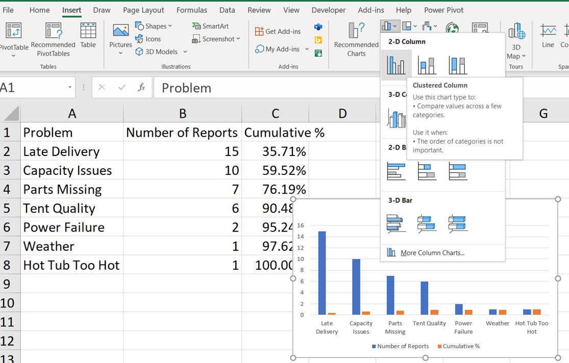
The series for Number of Reports and Cumulative % are currently bars. I right click on any of the bars and select ‘Change Series Chart Type’.
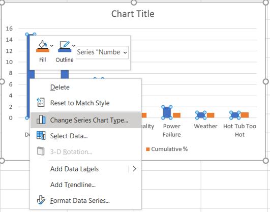
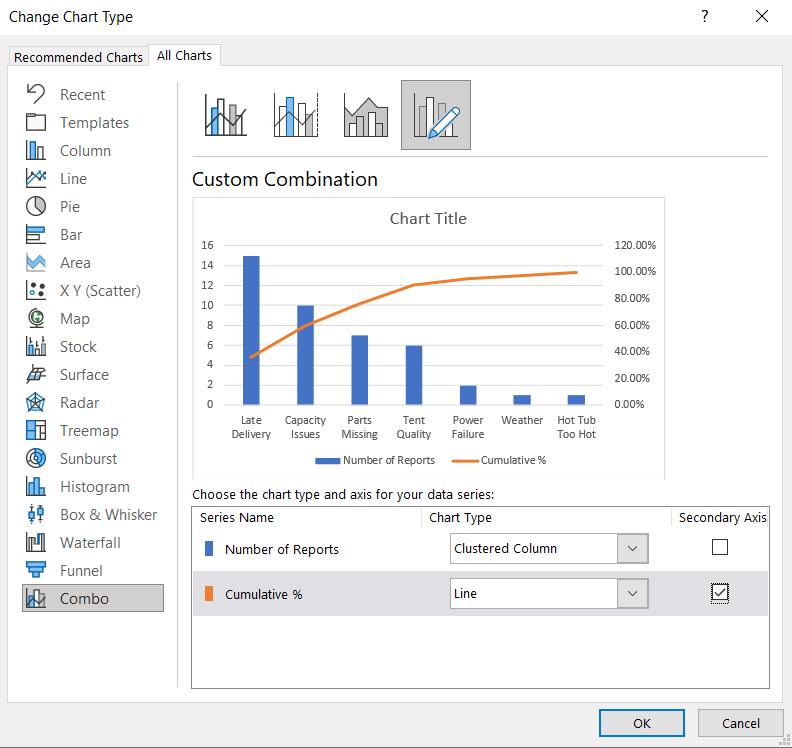
In the ‘Change Chart Type’ dialog, I leave Number of Reports as a Clustered Column chart and I change Cumulative % to a Line Chart. I also check the ‘Secondary Axis’ box for Cumulative %.
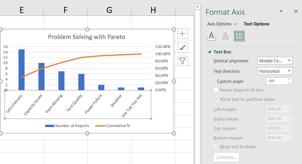
I change the ‘Chart Title’ and right-click on the horizontal axis to access the ‘Format Axis’ pane and change the angle of the labels. I do this in the ‘Text Options’ tab where I set the ‘Custom angle’ to minus (-) 50%.
I also select the right-hand Vertical Axis to set the maximum value to 100%: in the ‘Format Axis’ pane in the ‘Axis Options’, I set Maximum to 1 to achieve this. Note that the Major Units should remain at 0.2 to ensure the Axis increments are set at 20%.
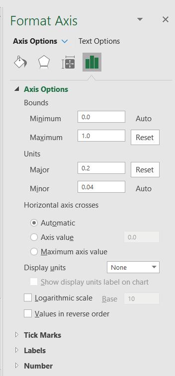
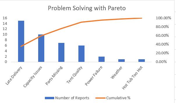
I also remove the Gridlines to make the Line Chart stand out more. My Pareto chart is complete. It is now clear that in order to resolve 80% of the Number of Reports, I need to fix three of the Problems: “Late Delivery”, “Capacity Issues” and “Parts Missing” – which is easier than controlling the weather!
That’s it for this week. Come back next week for more Charts and Dashboards tips.