
Charts and Dashboards: Pareto Plus
13 August 2021
Welcome back to our Charts and Dashboards blog series. This week, I look at the Pareto Chart option available in Excel 2016 onwards.
Last time, I was analysing some complaint data for our Tent Hire business.
I wanted to create a Pareto Chart so that I could quickly identify which issues to look at in order to significantly reduce the Number of Reports. I did this by creating a combination of a Column Chart and a Line Chart – which is what you used to have to do in Excel.
However, since Excel 2016, there is now an option to create a Pareto Chart more simply.
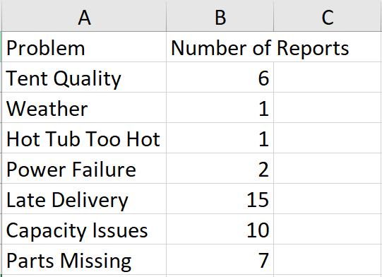
I will start with the data I used last time.
Unlike the method to create a Pareto Chart by combining a Column Chart and a Line Chart, I will not need to add any other columns or sort my data into descending order.
I select my data and then go to the Insert tab, where there is a Statistic Chart icon in the Charts section. In the dropdown in the Histogram section, there is a Pareto Chart option.
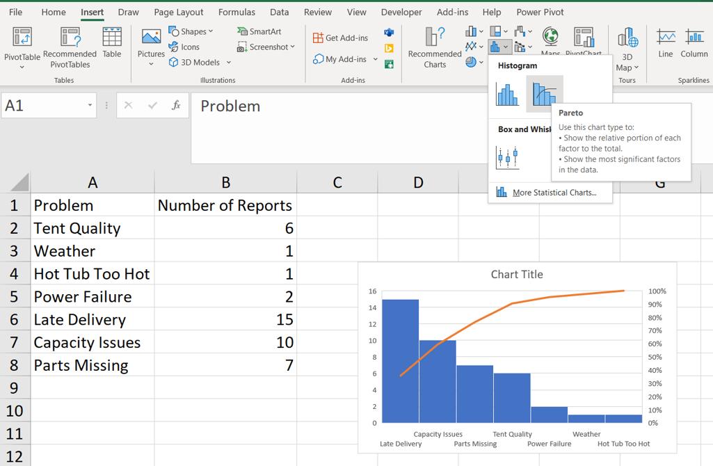
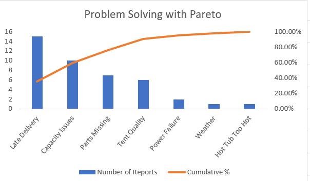
Already, I can see that this is going to save me work. The Problem labels appear on the Horizontal Axis and the Columns indicate the Number of Reports which have automatically been arranged in descending order. The Cumulative Percentage has been calculated automatically and is represented by a line. I click on the icon to create the Pareto Chart and drag it to where I want it on the sheet. All I need to do is format the chart. I start by right-clicking on the Horizontal Axis to access the ‘Format Axis’ Pane.
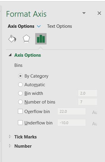
Like a Histogram, the Pareto has Bins. The default option for data like mine, where there is data (Number of Reports) and text (Problem) is ‘By Category’. If I only had a single column of data, the default would be Automatic. I would be able to change from the automated values by altering the width and number of bins (which includes the Overflow and Underflow bins). The Overflow and Underflow bins would allow me to group together all values over or under a value (which I would enter). As I have categories I wish to use, I leave the Bins set to ‘By Category’.
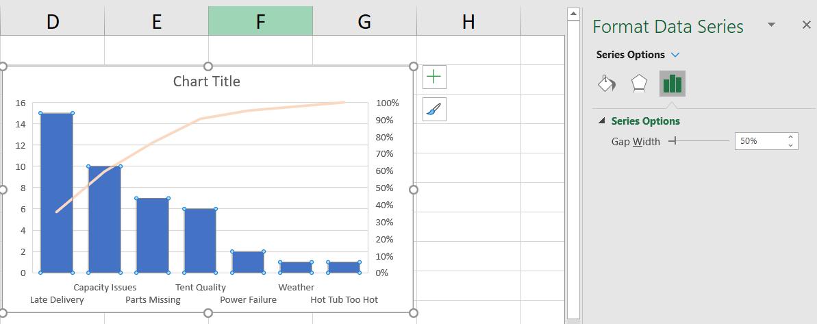
If I want to change the width of the bars, I can right-click on any bar to access the ‘Format Data Series’ Pane and change the ‘Gap Width’.
There are disadvantages to creating an ‘off the shelf’ Pareto Chart. The formatting options are more limited than for the Pareto Chart I created last week. For example, I would like to change the text direction:
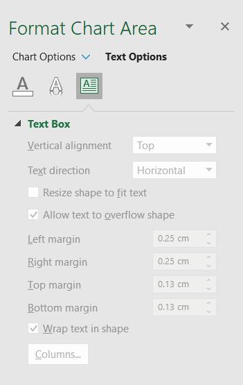
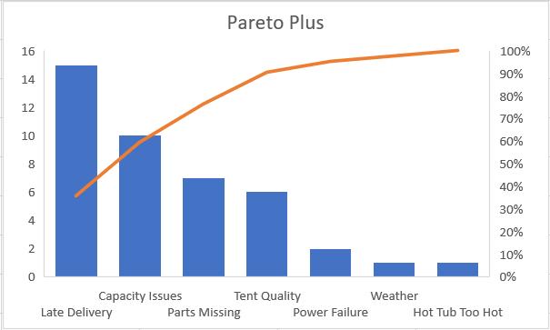
However, everything is ‘greyed out’. Personally, I prefer to use the combined Column Chart and Line Chart approach to have more control over the final presentation, but this method does save time. Hopefully, more customisation will be available in future versions of Excel. I click on the Chart Name and rename my chart, and right-click on the grid lines to delete them and my Pareto Chart is ready:
That’s it for this week. Come back next week for more Charts and Dashboards tips.