
Charts and Dashboards: Multiple Bullet Charts – Part 2
20 November 2020
Welcome back to this week’s Charts and Dashboards blog series. This week, we consider formatting the multiple bullet charts in Excel, created in last week’s blog.
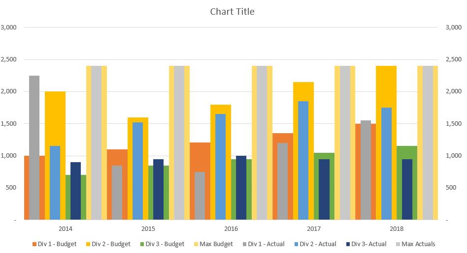
Last week, we talked about creating the initial multiple bullet charts through creating the column charts and changing the chart type to ‘Clustered Column’ charts:
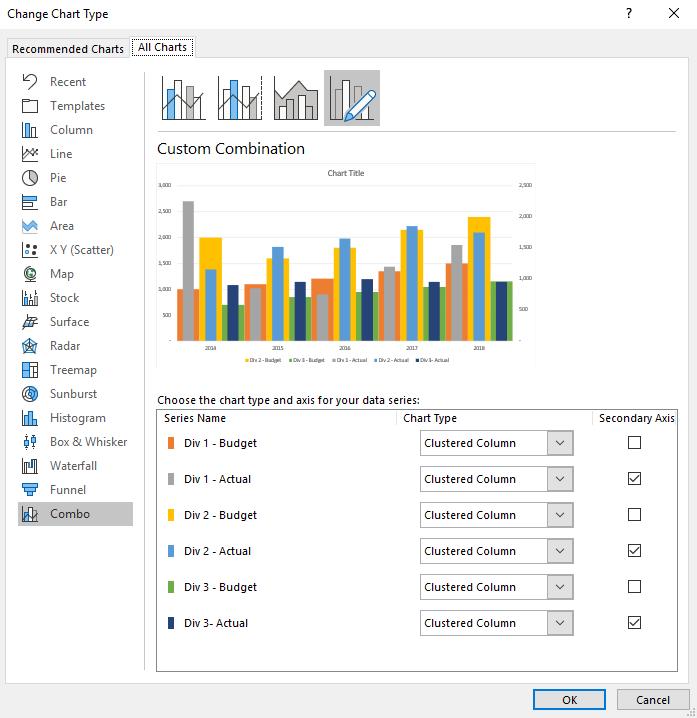
Now, we need to do further formatting to the chart.
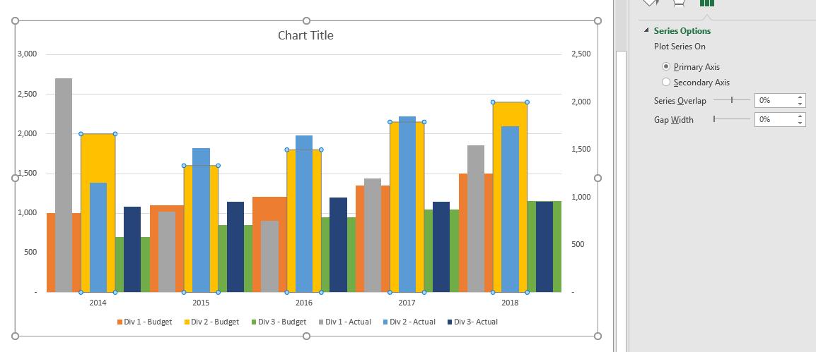
First, we remove the Year series from the chart. Then, we change adjust the format of the data series to make it appear like a bullet chart. We do this by changing the ‘Series Overlap’ and ‘Gap Width’ values in the ‘Format Data Series’ panel. We adjust the ‘Gap Width’ of the budgeted series to 0%.
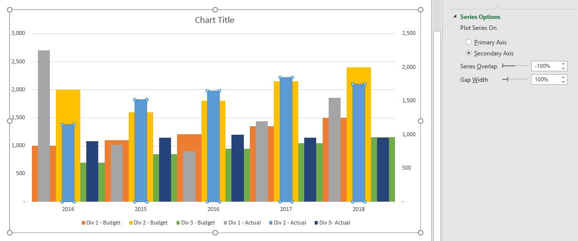
To format the primary axis data series, we set the ‘Series Overlap’ to -100% and ‘Gap Width’ to 100% (of course you can vary these settings to create a slightly different chart):
Our chart is starting to come together. At this point we have two things to deal with:
- The axes have different maximum amounts – this will cause confusion as our budget amounts are being compared to our actual amounts that are on different axes
- We do not have clear spacing between the years. This may make it difficult for end users to read the chart.
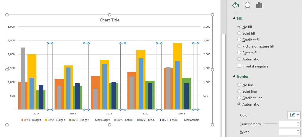
To deal with these two issues, we can include new data series that will ‘control’ the maximum amount in the axis. We do this by using the MAX formula to retrieve the maximum amount from our data:
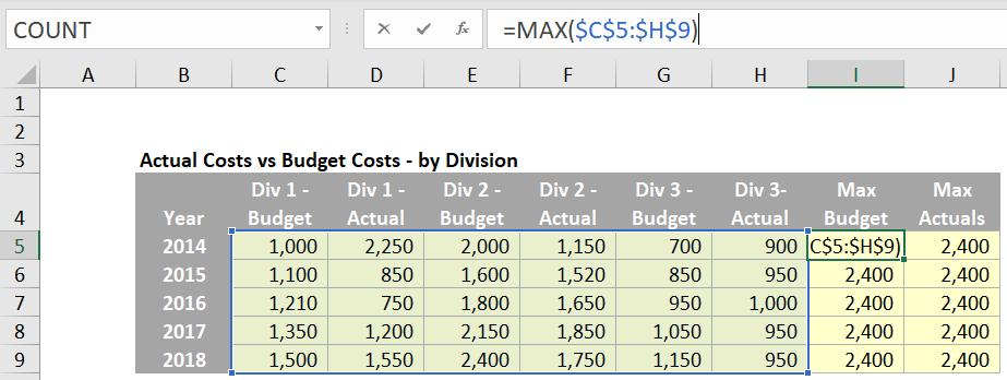
This will insert a new data series into the chart that will always have the maximum value from the dataset:
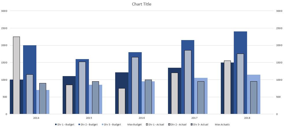
The two axes are now set to the same maximum amounts.
We then format the two new data series with ‘No fill’, which essentially renders them invisible:
Two birds one bar… wait, was it stone? That would conclude it for our chart, if we did not care for colour. We should apply a different colour palette:
Of course, you do not have to pick these exact colours, but we’ve tried to pick a pallet that looks somewhat desirable. The final adjustments to the chart are:
- Delete the ‘Max Budget’ and ‘Max Actuals’ series from the legend
- Hide the secondary axis
- Add spaces to the end of the years data, e.g. use “2014 “ instead of “2014”, so that the years appear to centre in their respective groupings
- Give the chart a name.
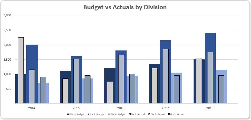
There we have it: a versatile Multiple Bullet chart.
That’s it for this week. Check back next week for more Charts and Dashboards tips.