
Charts and Dashboards: Multiple Bullet Charts – Part 1
13 November 2020
Welcome back to this week’s Charts and Dashboards blog series. This week, we begin looking at creating multiple bullet charts in Excel.
Financial modelling is not always about complex depreciation schedules, financial statement analyses, scenario managers and long, complex formulae. Sometimes, a picture can tell a thousand-word story. With this borne in mind, let’s take a look at a useful chart you may require from time to time – the Multiple Bullet Chart:
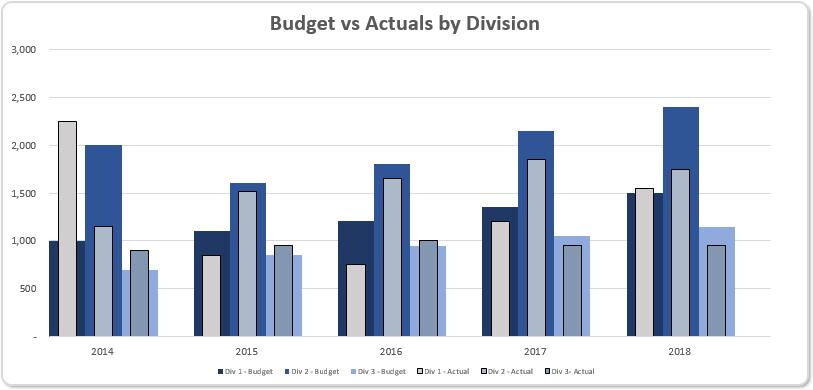
Here, we create a single chart in Excel that will display the target amounts and have the actual amounts flow through like a bullet chart for each time period. The problem is, Bullet charts – never mind “multiple” ones still don’t actually exist in Excel.
So, let’s create one.
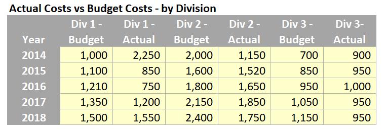
The first step is to format our data properly in a way that we can plot it on a chart in Excel. We will be using the following dataset in the current format:
With the data in hand, we can create the chart. As part of this solution we will be using Clustered Columns chart in Excel, by highlighting the table and clicking on Insert -> Clustered Column (from the Charts group of the Insert tab of the Ribbon):
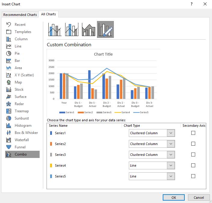
Interestingly, it will typically default to Combo (even on this command) and you may need to toggle all of the chart types to be ‘Clustered Columns’. If that glitch doesn’t happen for you, that’s great, you have missed a step!
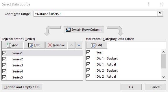
Then right-click on the chart and choose ‘Select Data…’ in the ‘Select Data Source’ dialog box, where we can switch the row / column data.
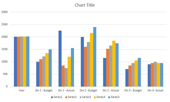
The chart should look something like this now:
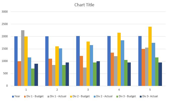
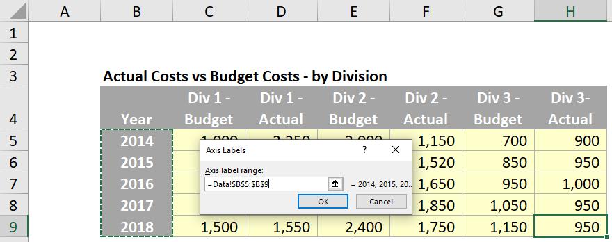
Notice that the x-axis is labelled as 1, 2, 3, 4 and 5 when we want it to be 2014, 2015, 2016 and so on… Therefore, return to the ‘Select Data Source’ dialog and edit the horizontal ‘Axis Labels’:
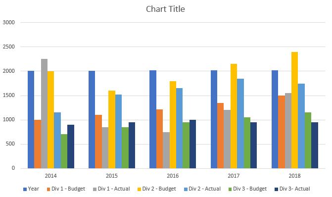
Great; now we have our years in order.
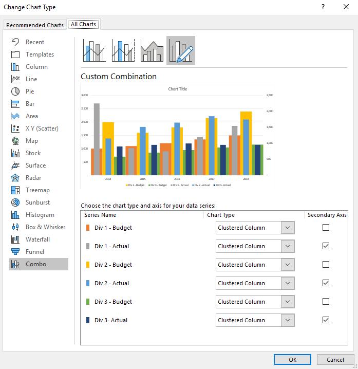
The next step is to organise the columns into primary and secondary axes. Click on the chart, then click on the Design tab on the Ribbon, and then the ‘Change Chart Type’ option. This brings up the ‘Change Chart Type’ dialog, where we can assign different data series onto a secondary axis. In this case we will assign all of the Actual series to the secondary axis (this is because the secondary axis is displayed on top). We will see the first sight of our multiple bullet charts:
We will need to do further steps to format the chart to our liking, but that’s for next week…