
Charts and Dashboards: Conditional Chart Labelling – Part 3
18 March 2022
Welcome back to our Charts and Dashboards blog series. This week, I take the next step towards creating conditional chart labels by exploring how I can apply conditional formatting in data labels.
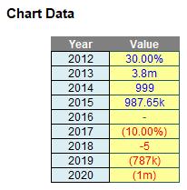
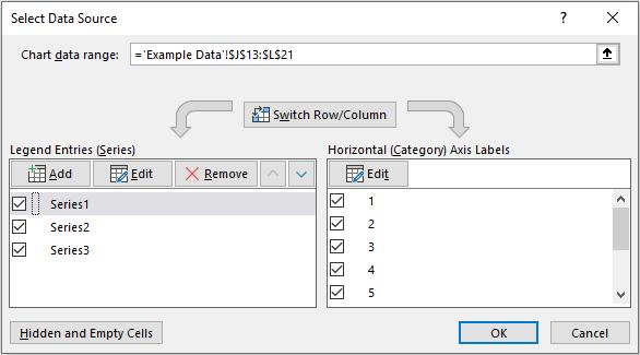
I have the following chart data:
“All” I have to do is create the associated Excel chart with replicated label formatting:
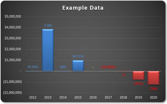
Do you see the need for supposed conditional formatting in the chart? I require positive values to be blue, zeros to be yellow and negative values to be in red – both labels and fill colours. It is possible, but I need to break the task down into various steps.
Essentially, there are several steps:
- Understand how I can create multiple number formats in Excel, never mind in a chart data label
- Create the basic chart
- Create the formatting in the data labels, realising custom number formatting will not work and conditional formatting may not be applied
- Make the solution robust enough to cope with saving the file and re-opening.
Last week, I looked at step 2, where I created the basic chart. This week I move onto step 3, where I explore how I can solve the seemingly impossible task of creating conditional formatting in the data labels.
Step 3: Creating Data Label Formatting
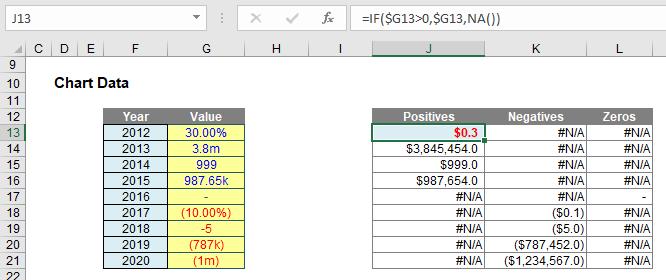
The data labels cannot be created using custom number formatting. I will have to get more creative. If I select the data labels and then format the selection, the ‘Format Data Labels’ pane will appear:
I need to change the label contents from Value to ‘Value From Cells’. This means I can select a different cell – such as text – associated with these values. Then, it’s easy.
Therefore, I create a second “helper” table:
These three added fields create text strings that mimic the number formatting using Excel’s TEXT function. In its simplest form, TEXT has the following form:
=TEXT(value to be formatted, “Format required”)
The formatting in inverted commas (speech marks) follows the same syntax as custom number formatting, except I cannot use speech marks for text (a backslash should be used instead). Therefore, the three formulae added are:
- The formula for positives (e.g. cell J13) is given by =IF(ISNA(J13),".",TEXT(J13,IF(J13>=10^6,"#,##0.0,,\m",IF(J13>=10^3,"#,##0.00,\k",IF(J13<1,"0.00%","0")))))This formula checks to see whether the number is positive (IF(ISNA(J13), …) – if there is an #N/A error in cell J13 then the number is not positive and no further formatting is required. When this happens a period (.) is displayed. The character is subjective; I use it as it is difficult to see, and text labels misbehave if they are allowed to be completely empty or just contain a space.The rest of the formula uses TEXT to format the positive number appropriately in millions, thousands, percentages or just as an integer
- The formula for negatives (e.g. cell K13) is given by=IF(ISNA(K13),".",TEXT(-K13,IF(-K13>=10^6,"(#,##0,,\m)",IF(-K13>=10^3,"(#,##0,\k)",IF(-K13<1,"(0.00%)","-0")))))
- The formula for everything else – which should be zeros (e.g. cell L13) is given by=IF(ISNA(L13),".",IF($G13=0,"-",NA()))
This is much simpler, but just allows for any possible text that has crept through.
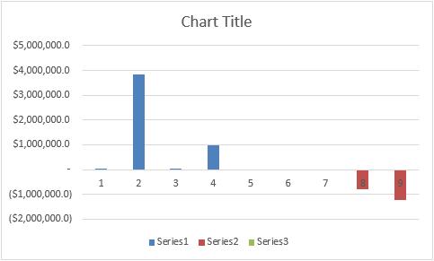
If the ‘Value From Cells’ selects these ranges rather than the ‘Values’, the chart will be generated just as we require (having placed the chart over my “helper” tables):
I’m finished! Well, not quite, as I will show next week when I look at how to make this fragile solution more robust.
That’s it for this week. Come back next week for more Charts and Dashboards tips.