
Charts and Dashboards: Conditional Chart Labelling – Part 2
11 March 2022
Welcome back to our Charts and Dashboards blog series. This week, I take the next step towards producing conditional chart labels by creating the chart.
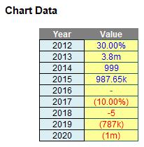
I have the following chart data:
“All” I have to do is create the associated Excel chart with replicated label formatting:
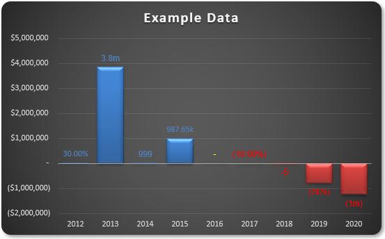
Do you see the need for supposed conditional formatting in the chart? I require positive values to be blue, zeros to be yellow and negative values to be in red – both labels and fill colours. It is possible, but I need to break the task down into various steps.
Essentially, there are several steps:
- Understand how I can create multiple number formats in Excel, never mind in a chart data label
- Create the basic chart
- Create the formatting in the data labels, realising custom number formatting will not work and conditional formatting may not be applied
- Make the solution robust enough to cope with saving the file and re-opening.
Last week, I addressed step 1, where I looked at how I can have multiple number formats. This week I move onto step 2, creating the chart.
Step 2: Create the Chart
This isn’t so hard, once I realise that if I want the data labels to be three different colours (blue for positives, red for negatives and yellow for zeros) and I want the columns to be different too (blue for positives, red for negatives, blank for zeros), then I will need to separate the data into positives, negatives and zeros:
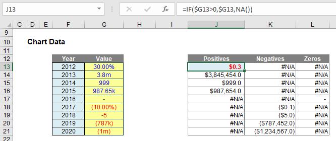
Here, I have added a “helper” table:
- Positives: J13 contains the formula =IF($G13>0,$G13,NA()). This puts the corresponding number in this cell if it is positive, else #N/A is returned. #N/A is different to zero, in that charts (depending upon which chart type is selected) will usually ignore these values (zeros are “noticed”)
- Negatives: K13 contains the formula =IF($G13<0,$G13,NA()), which returns only the negative values
- Zeros: L13 contains the formula =IF($G13=0,$G13,NA()), which returns only the zero values.
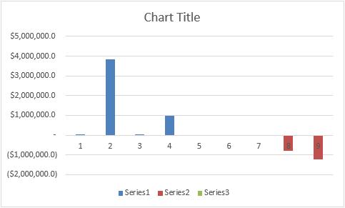
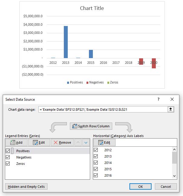
If you select cells J13:L21 and insert a Stacked Column Chart (ALT + N + C1, then choose Stacked Column Chart), you will create a chart as follows:
Right-clicking on the chart and selecting ‘Select Data…’ from the shortcut menu summons the ‘Select Data Source’ dialog, viz.
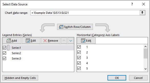
By editing the Legend Entries (Series) and the Horizontal (Category) Axis Labels, I can replace ‘Series1, ‘Series2’ and ‘Series3’ with ‘Positives’, ‘Negatives’ and ‘Zeros’ respectively, as well as swap out the integer counters for the Year:
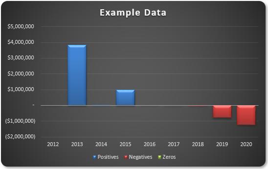
A little formatting here and there (e.g. reducing the columns’ gap widths, changing columns, adding a title) works wonders:
It appears I am nearly there. All I need to do is add the data labels. What could be simpler? Well, understanding Schwarzschild’s solution to Einstein’s field equations on general relativity, for one.
Adding data labels is simple enough, by selecting the chart and adding chart elements (clicking on the big plus [+] button) viz.
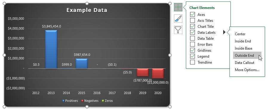
The data labels may be aligned outside end (above and below the non-negative and negative columns respectively), but what about formatting? Given I have three series, having blue for positive labels, red for negative labels and yellow for zeros is straightforward. However, how do I mirror the number formatting for positives and negatives when each has more scenarios than custom number formatting can deal with? I cannot use conditional formatting with data labels, so my earlier trick is redundant here. I will leave you pondering that: next time I will provide the answer in step 3, where I create data label formatting.
That’s it for this week. Come back next week for more Charts and Dashboards tips.