
Charts and Dashboards: A Bar Chart with Dynamic Ordering – Part 2
4 June 2021
Welcome back to this week’s Charts and Dashboards blog series. This week, we will continue to talk about the bar chart with dynamic ordering.
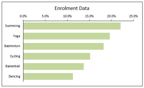
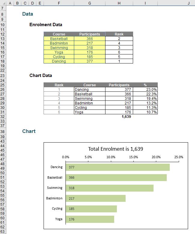
In Part 1, from the enrolment data, we used the RANK function to get the order of the course by the number of participants and created an initial bar chart with ordering, similar to the one below:
This week, we will continue to work to get the chart more presentable.
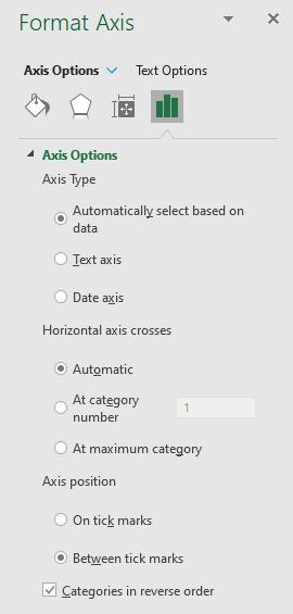
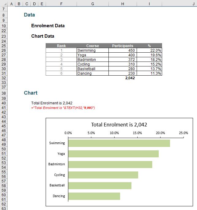
Even though the Chart Data has been sorted by descending order, the bar chart is still in ascending order. To reverse the order, right-click on the vertical axis and choose ‘Format Axis’. Under the ‘Format Axis’ pane, check ‘Categories in reverse order’ option.
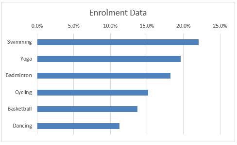
The chart is now in the correct order.
We will do some further formatting to the chart:
- right-click on the data series and choose ‘Format Data Series’, and choose a colour to your liking
- under the ‘Format Data Series’ pane, reduce the ‘Gap Width’ to 50%
- right-click on the horizontal axis and choose ‘Format Axis’
- under the ‘Format Axis’ pane, let Line be ‘Solid line’
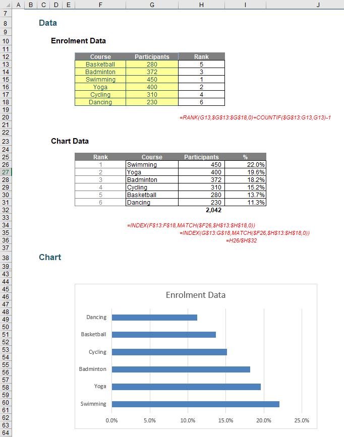
- under the ‘Tick Marks’ option, choose Outside for ‘Major type’
- right-click on the vertical axis and choose ‘Format Axis’
- under the ‘Format Axis’ pane, let Line be ‘Solid line’
- click on the chart, and under the ‘Format Chart Area’ pane, let Border be ‘Solid line’.
The chart should now appear like the one below:
To create a more memorable chart, we can change the chart title to tell a better story by creating a formula-driven chart title content cell, i.e. cell D40 and link the chart title to this cell to create a dynamic chart title.
We can also add data labels to the chart:
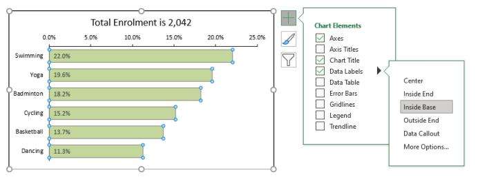
Instead of using data labels as a percentage (while the chart is already based on the proportion of course participants), we can point the data label to the number of participant column, i.e. cells H26:H32.
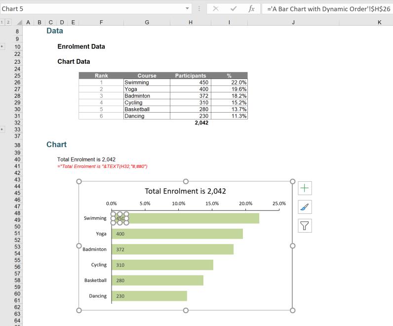
The chart should now present like the one below:
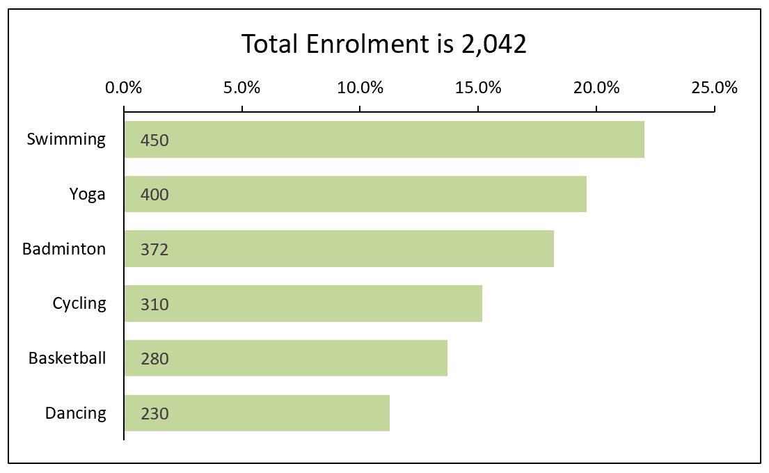
If we randomly change the enrolment data, all of the chart elements will be updated.
That’s it for this week. Come back next week for more Charts and Dashboards tips.