
Power Pivot Principles: Creating PivotCharts from the Power Pivot Data Model
22 December 2020
Welcome back to the Power Pivot Principles blog. This week, we will talk about creating PivotCharts from the Power Pivot Data Model.
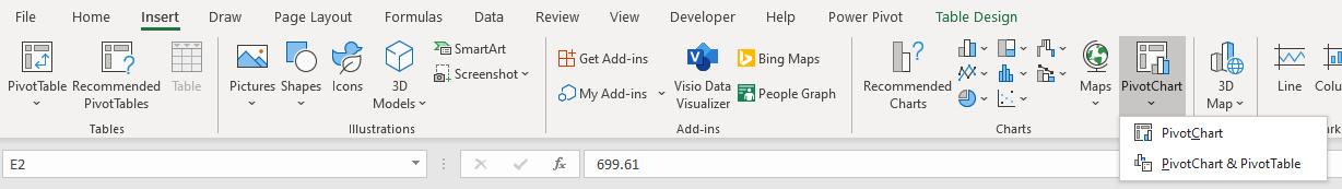
In Excel, from a data table, we can create a PivotChart and a PivotTable from the Insert tab on the Ribbon and interact with the chart through filters.
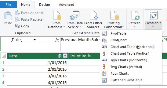
However, there are more options for both PivotTables and PivotCharts from the Power Pivot Data Model. In this blog, we will walk through these options. To create a PivotTable or PivotChart, navigate to the PivotTable group in the Home tab of the Power Pivot window.
What makes this ‘powerful’ is the functionality to create a dashboard directly from the Data Model, without the need of manual formatting and alignment, as it allows us to draw multiple charts or tables.
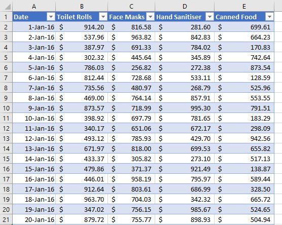
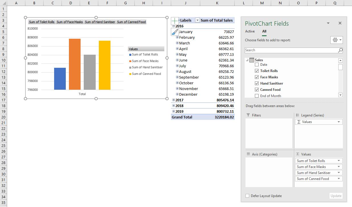
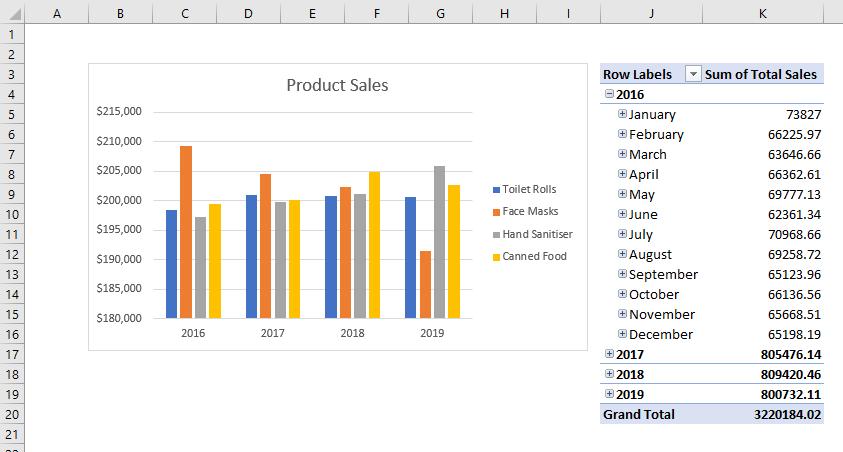
Let’s consider a simple example. I have a Sales data set of four product types in 2016-2019, which is already loaded to the Power Pivot Data Model. A Calendar table is also created.
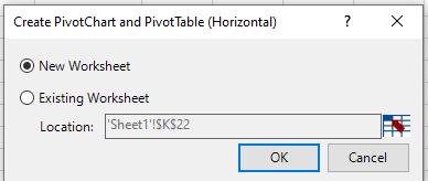
I navigate to the Home tab -> PivotTable and select ‘Chart and Table (Horizontal)’ and choose to load it into a new worksheet.
In the PivotChart Fields, I drag ‘Toilet Rolls’, ‘Face Masks’, ‘Hand Sanitiser’ and ‘Canned Food’ to the Values field and get their sum. In the PivotTable, I want to view the Total Sales by date.
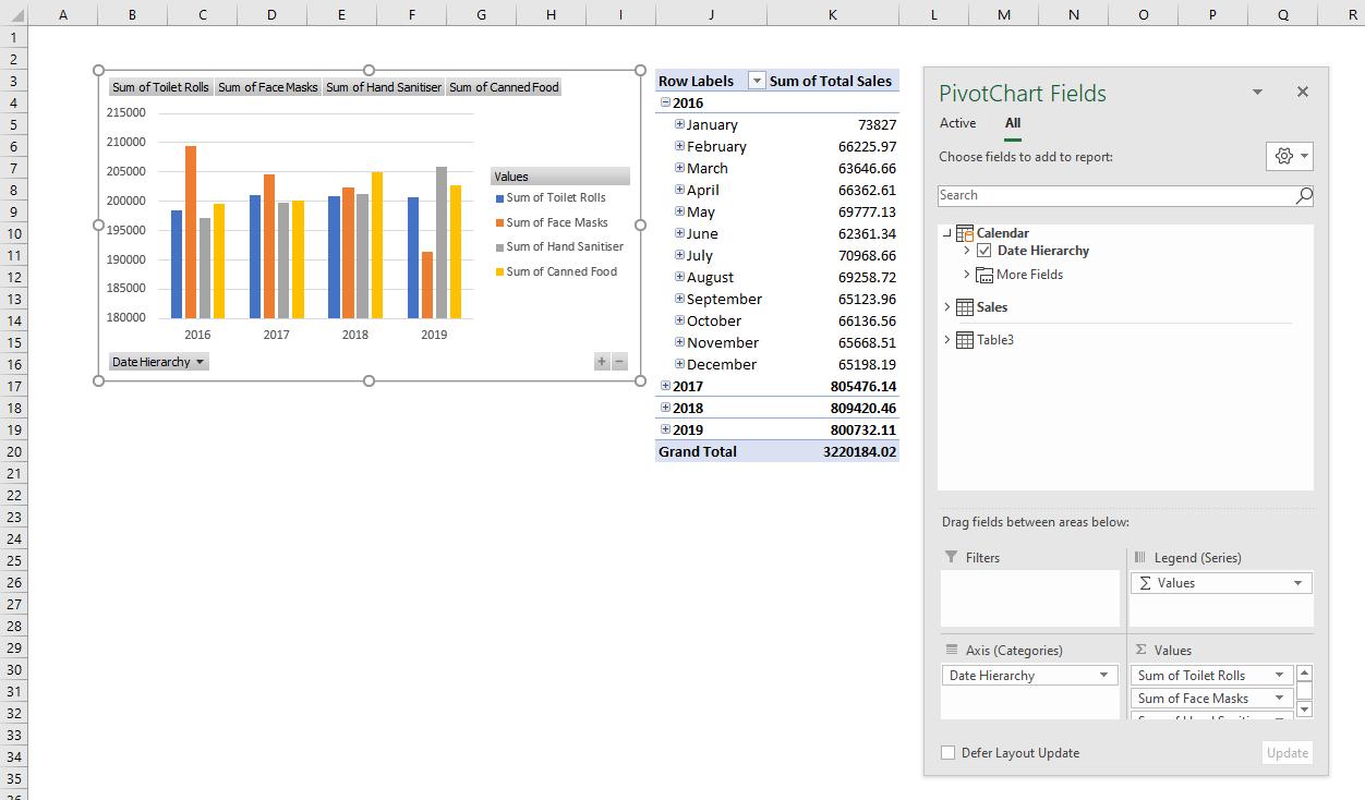
If the ‘Date Hierarchy’ is added to the PivotChart Axis field, the chart will now look like the one below:
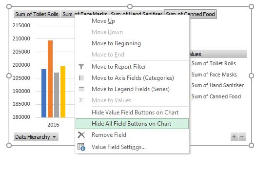
There is no added value in displaying the grey field buttons; right-click on one of them and choose ‘Hide All Field Buttons on Chart’ and all of them will thus be hidden.
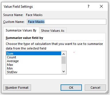
To change the name of the fields so that they won’t be shown as ‘Sum of …’, in the PivotChart Fields List, click on the field and choose ‘Value Field Settings…’.
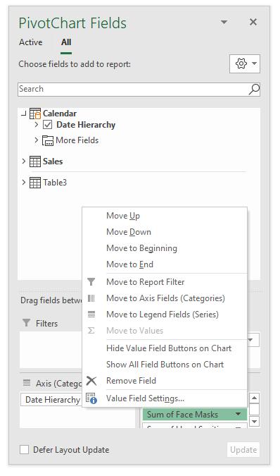
A ‘Value Field Settings’ dialog will appear, where I can customise the field name.
Then, I add the Chart Title and format the Chart Axis to have a complete mini dashboard:
There are more tips I could tell you about creating PivotCharts from Power Pivot Data Model, but that’s for next week!
Stay tuned for our next post on Power Pivot in the Blog section. In the meantime, please remember we have training in Power Pivot which you can find out more about here. If you wish to catch up on past articles in the meantime, you can find all of our Past Power Pivot blogs here.