
Charts and Dashboards: PivotChart – Part 2: Interactivity
22 May 2020
Welcome back to this week’s Charts and Dashboards blog series. This week, let’s continue to talk about PivotChart.
To recap, last week, we talked about PivotChart and how to create one. PivotCharts are complimentary visual representations of data in PivotTables. They display any data currently in a PivotTable in a chart, with that they also inherit the flexibility and interactivity of PivotTables.
From the following data that I have:

I created the PivotChart and PivotTable as this one:
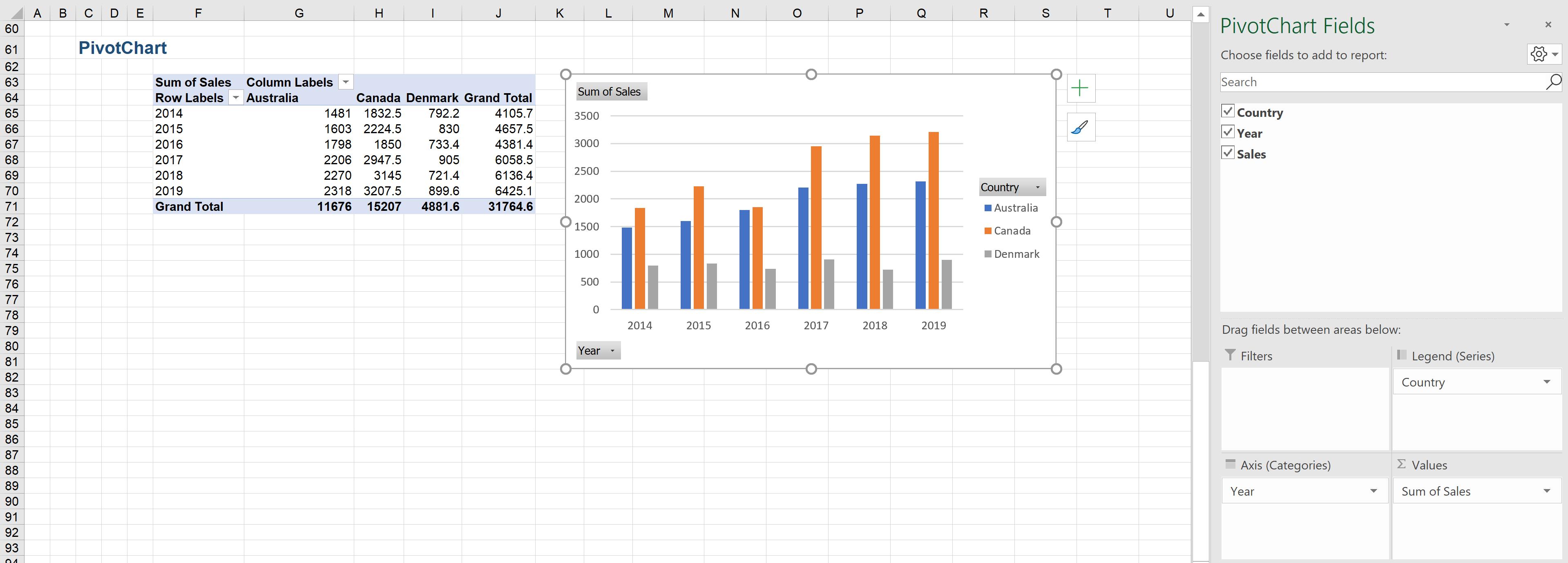
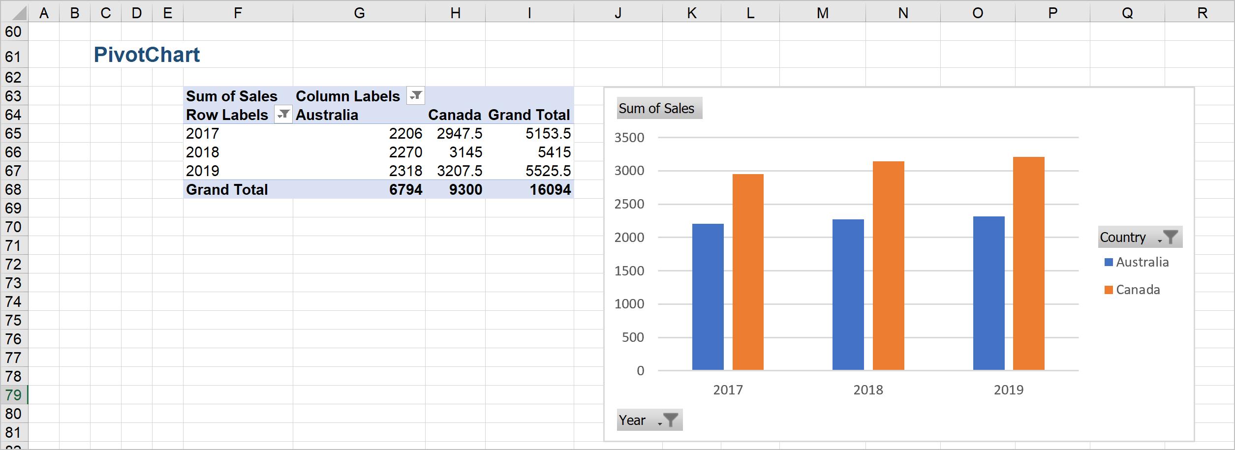
PivotChart allows interactivity with the chart. I can apply filters to the data by clicking on the downwards arrow next to ‘Year’ and ‘Country’ fields:


These filters will also apply to the PivotTable linked to the PivotChart. For example, if I choose to see only Australia’s and Canada’s sales in three most recent years – 2017, 2018, 2019, both PivotChart and PivotTable are adjusted based on new filters, and note the filter icons in the ‘Year’ and ‘Country’ fields of PivotChart and PivotTable:
That’s it for this week, check back next week for more Charts and Dashboards tips.