
Power BI Blog: Xenagogue to Markup Lists - Part 3
26 April 2018
Welcome back to Power BI Tips!
Last week we performed transformations on the XML file from the RBA's RSS feed with the Power Query Editor. Now the data is ready to be put in use. Let's create one that shows just the USD exchange rate.
We're going to use the multi-row card visualisation. Card visuals are great for showing data at a glance by making the figure you are looking for stand out on the report. A multi-row card shows more than one value from a data set.
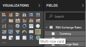
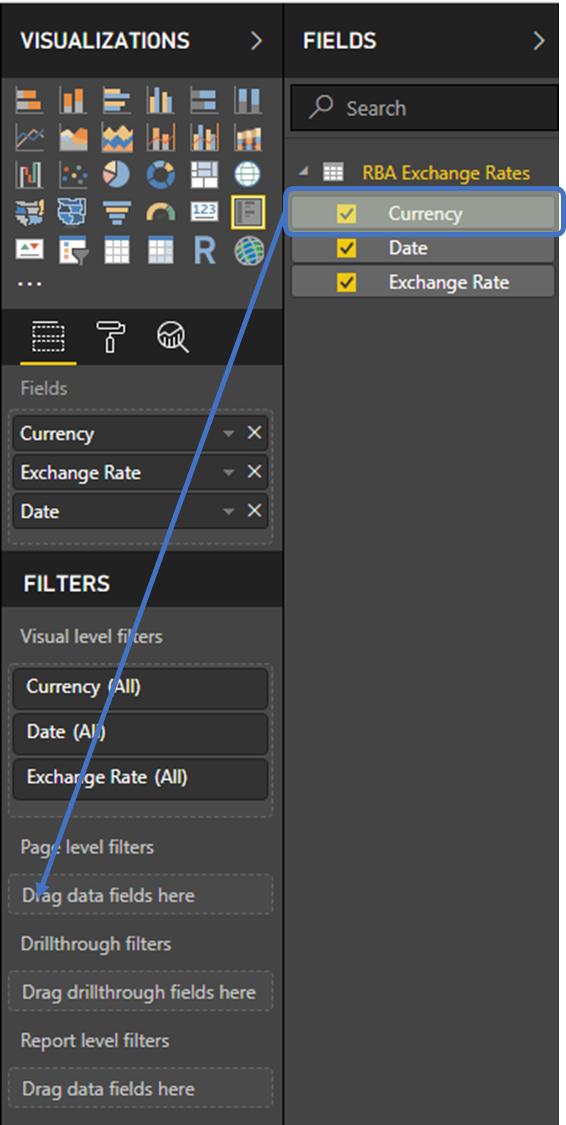
Click on the “Multi-row card” which is the 5th visual on the 4th row of the Visualizations pane.
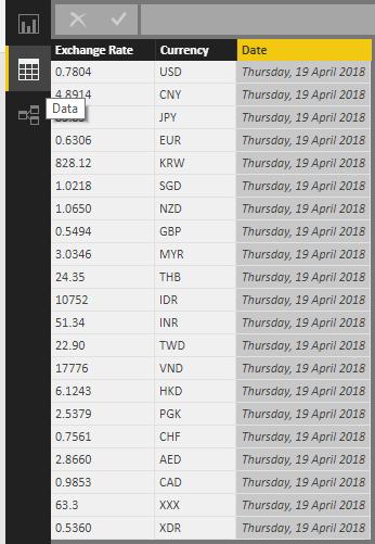
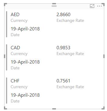
Check all the fields and let’s see what we’ve got!
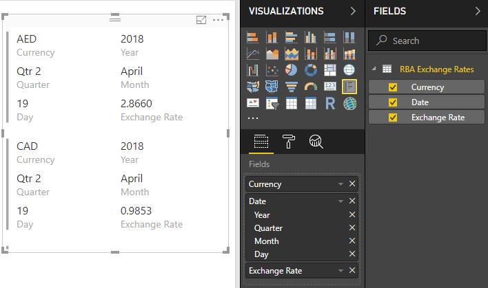
This displays our entire table in card format. But notice how our date has been segmented into Year, Quarter, Month and Day? This is because Power BI has put everything into a Date Hierarchy to be used when drilling down different time periods in other visuals. However, we’d like to display the date as one line in this case.
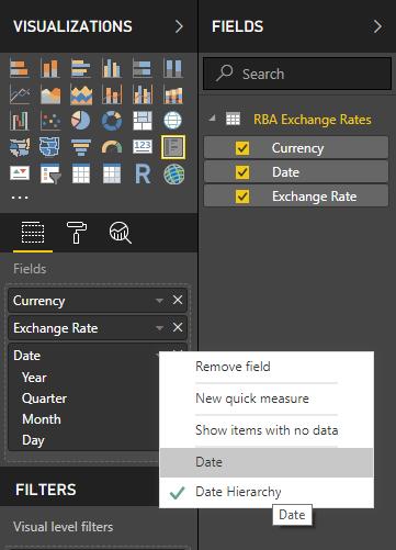
To do that, in the Fields section, click on the drop down menu arrow next to Date. In the menu, there’s a tick mark next to “Date Hierarchy”. Select “Date” just above it to remove the hierarchy segments.
Check the effect it has on our visualisation:
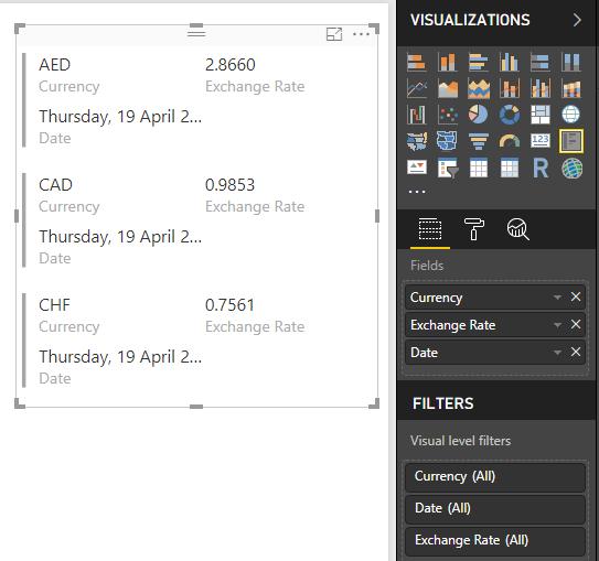
Notice now that our date has displayed in long format instead. How do we change the format if we wanted to have it in a shorter dd-MMMM-YYYY format?
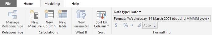
Click onto the Data tab on the left to see our tables.
Click on the Date column. Under the Ribbon, go to the Modeling tab. In the Formatting group, we can see Format: under Data type:
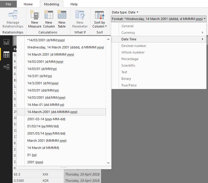
Click on Format: and we’ll see a list of data types but the only one that won’t be greyed out will be the Date Time as those formats can be applied to the data type in this column. Click on the arrow next to it to see our options and select the appropriate format.
This will format our date in the way we would like it displayed.
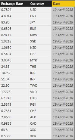
Snapping back to our report, our visualisation will be updated.
What if I only wanted to see one currency, specifically the US exchange rate?
We can filter the data displayed by using the “Filters” section of the Visualizations pane.
Drag and drop Currency from “fields” into “Page level filters”.
The data will display as a series of checkboxes for filtering.
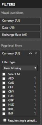
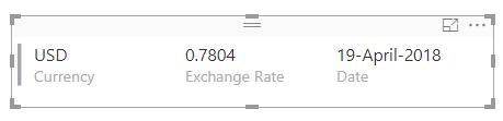
Check “USD” and see how the display changes:
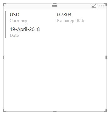
Great! We can see just USD exchange rate as expected.
By using the boundary markers on the edges and centre of the sides we can resize the visual. I’m going to resize it so it’s only as tall as the row and wider, so the data can be displayed in over one line not two.
Terrific!
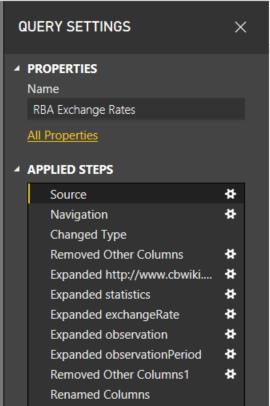
One last thing needs to be done for web refresh – let’s go back to the Power Query Editor. On the Ribbon under “Home” category, click “Edit queries”.

On the “Query Settings” pane on the right, click the gear button next to “Source”.
You’ll see this pop up:
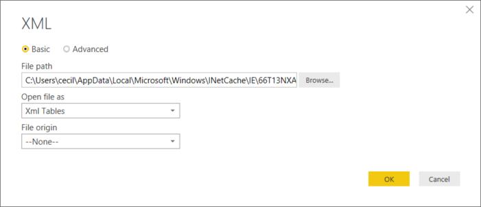
Notice how the file path is very strange? It’s because Windows downloaded a temporary file to work from. This is because an XML import is a file import, and when we pasted the link into the file dialog, Windows downloaded a temporary copy which is what the long path name is pointing to.
So instead, put the web address of the RSS feed here.
Power BI will give the following prompt:
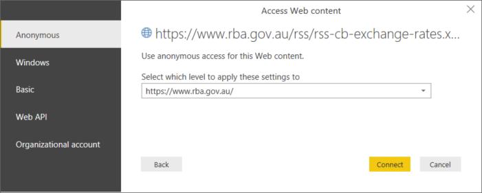
Click “Connect” to grant it anonymous access to the web site (i.e. does not require login credentials). Then “Close & Apply”.
Now it will update each time you press refresh in Power BI – and the current exchange rate will appear on your reports and dashboard.
Hope you enjoyed that! This same logic is easily applied to other feeds and can easily be reworked from the federal bank of your choice.
The file for this exercise here.
Next time we’re going to start a new project and use Get Data with a JSON file.
Tune in next week for more Power BI Tips.