
Power BI Blog: Text isn't Limiting! - Part 5
5 April 2018
Welcome back to Power BI Tips!
Last week using the US Historical Population Estimates we created our first DAX formula. Now we have categorised our data by decade, how can we focus the view on a specific decade?
Enter the Slicer visualisation. Using it will be very familiar to PivotTable lovers who adore using them in Excel. A Slicer is used to “slice and dice” and easily filter information.
Slicers are powerful tools that let the end user interact with the Reports in Power BI, allowing them to focus on the data that they need to make decisions. A good example of this is when sharing report information with store managers. Each store manager needs to know the same metrics as each other, but only the store they oversee is relevant to them. The Regional Manager would need a combined report to view the entire portfolio.
It can be found on the fifth row, second column of the Visualizations pane:
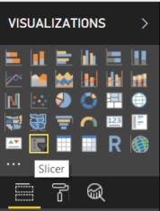
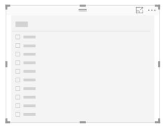
Ensure that you have NOT clicked on any other existing visualisation as clicking on a different option will convert it to the newly selected one. Click "Slicer" and a box will appear.
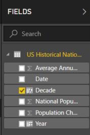
Click on the newly created Decade column on the "Fields" pane:
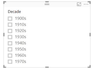
Our Slicer will change to now show a list with the different available decades!
Click on 1940s and see what happens to the existing Line Chart.
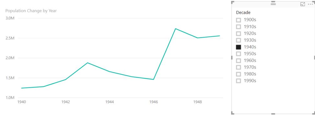
Notice how the visualisation changes to show only the data in the 1940s.
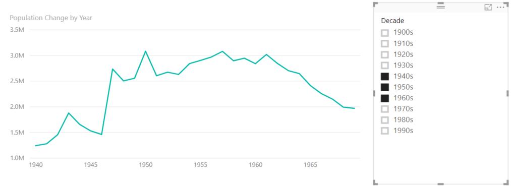
We can multi-select items like in Excel when using the filters in a PivotTable, however the default is that it shifts focus when selecting another item. To multi-select, hold down the CTRL key to select two or more items. Here I’ve selected the 1940s, 1950s and 1960s.
However, seeing all the options on the Slicer can be unnecessary as it takes up real estate on the report page. We can convert this to a drop down that can sit more discretely on top of the report.
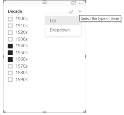
When the mouse is hovering the visualisation, two buttons on the top right appear: an eraser to “Clear Selections” (and reverts to showing all available data) and a down arrow which can convert the slicer to a Dropdown.
After clicking “Dropdown” the visualisation changes to this:
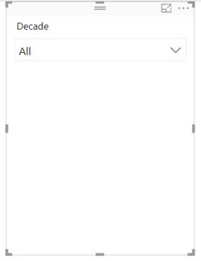
We can resize the visualisation and use it like a filter menu in a PivotTable.
Another important note on Slicers and where it differs from Slicers in PivotTables in Excel is that is defaults to act on EVERY visualisation you see on that Page. In Excel, you must specifically connect a Slicer to multiple Tables.
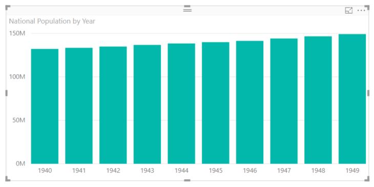
Let’s create a Clustered Column Chart like we did in the Excel-sior exercise.
Notice how our chart automatically snaps to the 1940s decade:
This concludes our Text file example. If you enjoyed it or have any questions/suggestions, feel free to leave feedback here.
The sample Power BI file for this exercise can be found here.
Tune in next time for more Power BI Tips!