
Power BI Blog: Excel-sior Part 3
1 March 2018
Welcome back to Power BI Tips.
Last week we cleansed our NASA Lab Facilities dataset that we imported from an Excel file and now we've got a workable table in Power BI.
Let’s start with something super simple - a basic column chart to see how many facilities each Agency operates.
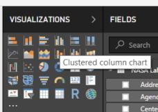
On the right hand side, you'll see the "Visualizations"and the "Fields" panes. Select the clustered column chart (Row 1 Column 4) of the “Visualizations” menu.
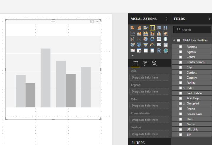
You’ll see a box in the Report section (the big white space) with the shadow of the column chart:
Under the “Fields” pane check the box next to Agency.
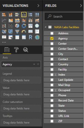
Note how in the “Visualizations” menu you can see that Agency has appeared in the “Axis”
Go back to the fields pane and click on Agency to drag it into the “Value” field and we’ve just made our first visualization!
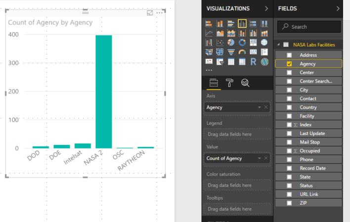
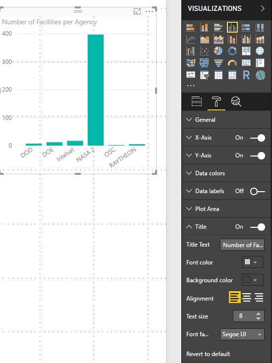
Let’s change the title to Number of Facilities per Agency. We can do that by going into the paintbrush icon in the “Visualizations” pane and expanding the “Title”. There edit the "Title Text" property and it will update the chart accordingly.
Nice and easy does it!
Find the sample Power BI file for the Excel-sior exercise here.
Have a go with your own workbooks and you'll excel at it in no time.
Tune in next week for more Power BI Tips.