
Power BI Blog: Waffle Chart (cont'd)
4 July 2019
Welcome back to this week’s Power BI blog series! This week, we’ll continue to have more fun playing with amazing visual effects of Waffle Chart.
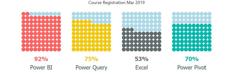
Last week, I introduced a cool Power Bi’s custom visual: Waffle Chart. Waffle Chart presents proportional data in a 10x10 dimension, which allows easier visualisation and comparison of small percentages. I also created a beautiful chart of my Course Registration in March 2019:
Aren’t the dots too boring? Knowing that, the developer also allows more visual effects to Waffle Chart by applying SVG Path for various colours and shapes.
I’ve found an easy way: I use https://thenounproject.com/ to search for an icon depending on my topic of presentation, next I save the icon as SVG file, and then I go to https://kiewic.com/paths/ to convert the SVG icon file into a usable path.
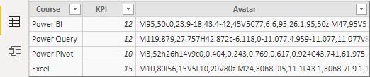
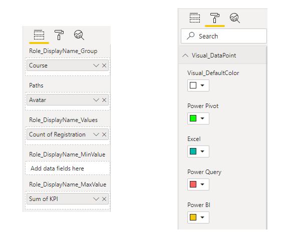
Here after getting the path for icons related to my courses, I put them in another column called “Avatar” in my Excel’s KPI table for each course, and I load it back to Power BI.
Then in Report view, I drag “Avatar” to the Paths field, and I choose colours for the corresponding courses in Visual_DataPoint.
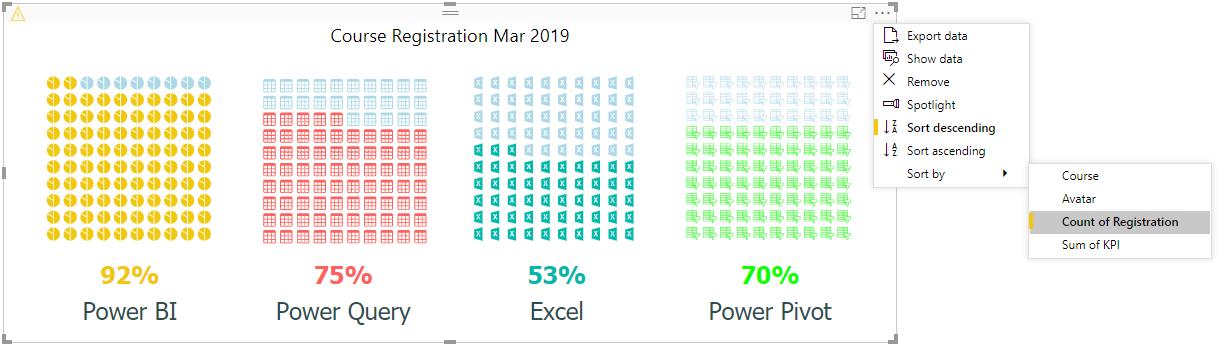
And now each of the courses all has different icons and colours, which makes the visual more interesting.
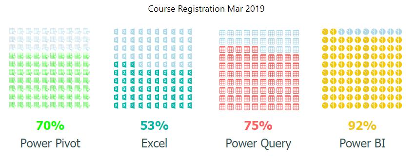
But wait, I need one more step since I wish to put the course registration performance in a proper order. I mouse over the chart, then I click the three-dotted icon at the top left-hand side and choose ‘Sort descending’ and ‘Sort by’ – “Count of Registration”.
It’s worth noting here that the course KPIs are not equal, and the visuals are sorted by the number of registrations, not the KPI percentage. So, while Excel's performance compared to KPI is only 53%, which is less than Power Pivot's 70%, because there are more registrations in the Excel course than in the Power Pivot course, Excel is being reported in front of Power Pivot in the visualisation.
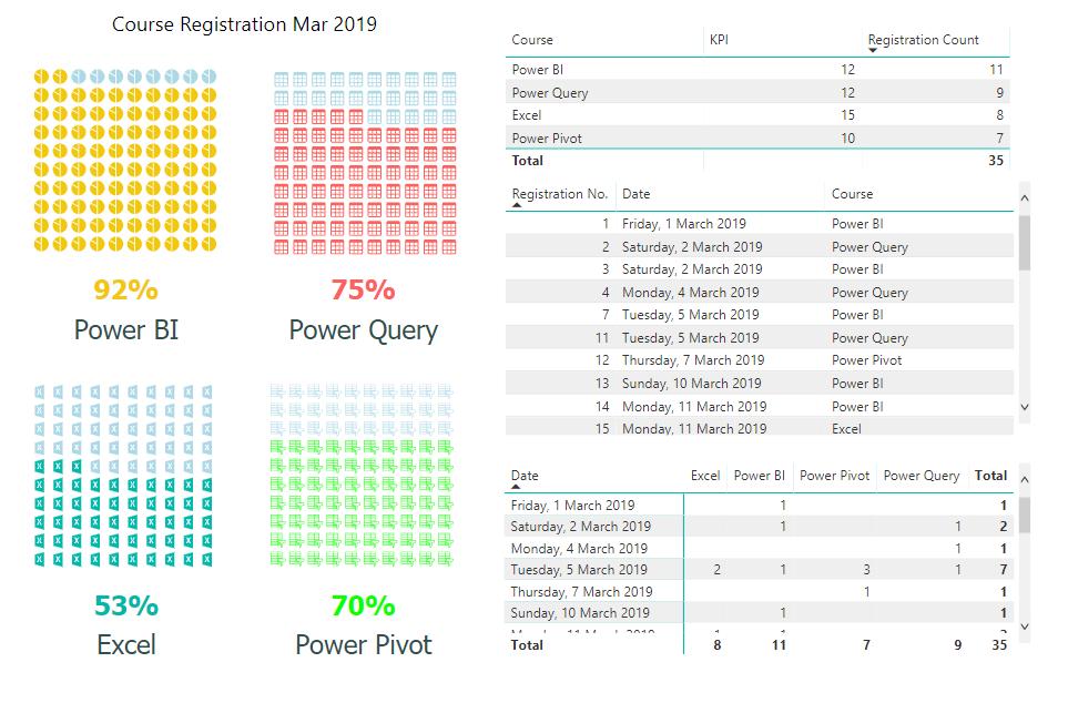
To make the chart and figures more transparent, I add a few tables to the dashboard and rescale the Waffle Chart area.
Finally, it’s neat!
That’s it for Waffle Chart, have fun drawing your chart.
Stay tuned for the next blog in the Power BI series. See you then!